|
Tomorrow, (Sunday, December 4th), the results from the Hall of Fame's 2023 Contemporary Era Committee ballot will be announced. The ballot consists of 8 players that made their primary impact after 1980, and you can view the players on the ballot here. With this in mind, I thought I would take a break from my Player Value research to see what my Hall of Fame predictive model thought of these candidates, as well as share my own thoughts and provide the current version of Player Value for each candidate's career. I'll go over some details of my Hall of Fame predictive model and its use on the 2022 ballots first; feel free to skip ahead if you'd just like to see the model's and my thoughts on the 2023 Contemporary Era ballot candidates. Hall of Fame Predictive Model Overview I first introduced my model and used it on the 2022 BBWAA ballot here. I entered the model into the 2021 Fall USCLAP competition during my final semester in college, and it ended up finishing in 2nd place. You can view the winners here, and the official report here. The report dives into the nitty gritty of the model, if you are interested in predictive modeling and learning those fine details. As a quick(ish) summary, the model is intended to only be used on position players that finished their careers after 1957, and that did not use steroids or have some other obvious scandal that is the primary deterrent of the Hall of Fame induction. There are some players, such as Barry Bonds and Pete Rose, that are statistically pretty obvious Hall of Fame inductees, but that are left out because telling the model that someone of their caliber isn't a Hall of Famer would confuse it, since it only considers their performance on the field. While I could have keyed in a "character clause" predictor in the model to handle this, I felt it easier to just exclude the players in question. Gold Gloves and other awards are fairly important predictors of whether a player is in the Hall of Fame, and earlier years (i.e. pre-1957) lacked many of these awards, so the model would unfairly judge these earlier players. Since pitchers are judged on an entirely different basis than position players, it didn't make sense to predict them using the same model, so pitchers are excluded as well. Lastly, Negro League players and stats are not incorporated in the model. While these leagues were basically equally competitive as the Major Leagues at the time (as seen by the dominance of early transition players like Jackie Robinson and Roy Campanella), they played far shorter seasons and have less recorded statistics, so these players' stats and model predictions would be flawed when considering their career statistics. The model uses 5 classes of predictors:
Defensive statistical averages per season, such as putouts per 162 games, were considered but not used due to their lack of predictive power. In fact, most of a player's defensive Hall of Fame value is only encompassed in their Gold Gloves. Only their fielding percentage and range factor per game differences from league average ended up being predictive from the career defensive statistics. Generally, the most important predictors for the various submodels (listed below) ended up being a player's All-Star seasons, career runs scored, career singles, and career RBI. In fact, a simple decision tree model can be run to visualize these important predictors:  This simple decision tree model predicts anyone with at least 7 All-Star seasons and 1,208 runs scored as a Hall of Famer, an assertion that's right every time based on the dataset. It also predicts anyone with at least 7 All-Star seasons, less than 1,208 runs scored, but more than 1,239 singles as a Hall of Famer, an assertion that's only right about half the time based on the dataset. Anyone with fewer All-Star seasons, runs scored, or singles is predicted as not a Hall of Famer, an assertion that we can see is nearly always correct. This simple decision tree model is not as accurate as my actual Hall of Fame model, but it's surely better than a coin-flipping approach and is very easy to interpret and helps us visualize that All-Star seasons and runs scored are the preeminent predictors of a player's Hall of Fame fate. Again, this was just an illustrative example - this is NOT my actual Hall of Fame model. My initial model was completed just before the results from the 2022 Golden Days Era Committee ballot were announced. You can check out those candidates here. That ballot consisted of 9 players (7 position players and 2 pitchers) and 1 manager. Jim Kaat, Gil Hodges, Tony Oliva, and Minnie Minoso would all go on to be inducted into the Hall of Fame. The initial model performed really well, with an AUC of .9817. AUC stands for Area Under the Curve, and is basically a measure of model accuracy on a scale of 0 to 1. An AUC of 0.5 represents a random guess, coin flip approach. The higher the AUC, the more accurate the model, and my model's AUC was quite high. The simple decision tree model that I displayed above had an AUC of .8105. We technically care about the test AUC, which is the AUC of the model on the test set, meaning the data/players that the model was not trained or developed on. The training set are the players used to essentially teach the model, and then the test set are the players used to evaluate the model's accuracy. My Hall of Fame predictive model is an ensemble model of 4 different submodels:
With 187 players in my dataset overall, I placed 141 in the training set and 46 in the test set. Of the 46 players in the test set, 17 were Hall of Famers, and thus 29 were not. My model correctly predicted 28 of the 29 non-Hall of Famers, asserting that Dave Parker should be a Hall of Famer (personally, I agree!). It correctly predicted 15 of the 17 Hall of Famers, stating that Lou Brock and Alan Trammel were not up to par. The initial model was designed for predicting future players on each year's BBWAA ballot, not the Era Committee ballots. The Hall of Famers and non-Hall of Famers that the model was trained on were players that already had their BBWAA fates decided, and any candidate on an Era Committee ballot would have been rejected by the BBWAA already. Because of this, simply using the same initial dataset that trained the initial model and then predicting the 2022 Golden Days ballot players is a flawed approach that results in none of the players being predicted as Hall of Famers. For any player such as Ken Boyer that was in the training set, the model will predict them as a non-Hall of Famer since that is exactly what the model was told when training on the data. While it could predict players in the test set still fine, all of the Golden Days candidates in the test set were not predicted as Hall of Famers. The proper approach is to remove the 7 position players - Dick Allen, Ken Boyer, Gil Hodges, Roger Maris, Minne Minoso, Tony Oliva, and Maury Wills - from the data and retrain the model on this adjusted dataset. Doing this worsens the predictive accuracy of the model down to .9477. While this is worse than the initial model's AUC of .9817, it is still great overall. Nonetheless, this reduction in accuracy foreshadows how the model thinks of these players. Removing the information that told the model that these players weren't Hall of Famers made it worse. After applying this adjusted version of the model to the players on the 2022 Golden Days ballot, only Dick Allen was predicted as a Hall of Famer. This isn't too shocking, as Allen's bWAR of 58.7 is larger than those of the players' who ended up getting inducted - Hodges at 43.9, Oliva at 43.0, and Minoso at 53.8. Allen is also 23rd all-time in career OPS+ at 156, tied with Frank Thomas and the most of any player that isn't active, used steroids, banned from baseball, or simply archaic (sorry Pete Browning and Dave Orr). His OPS+ is higher than that of both Hank Aaron and Willie Mays. Outside of Jim Kaat - whose 16 Gold Gloves are the 2nd most all-time by a pitcher (and thus isn't handled by the model) and has 287 wins with 2,461 strikeouts - I personally wasn't too sold on any of the players being inducted on last year's era ballot, but Allen would have been at the top of my consideration. As I wrote about previously, when applying this adjusted version of the model to the players on the 2022 BBWAA ballot, only David Ortiz and Todd Helton were predicted as Hall of Famers. Of course, Ortiz was inducted his first year on the ballot with 77.9% of the vote. Helton received 52% of the vote in his 4th year on the ballot, an increase from his 44.9% received in 2021. When applying the Hall of Fame predictive model to the 2023 Contemporary Era ballot, there are 2 approaches we can take:
Albert Belle, OF Years: 1989-2000 Teams: Cleveland Indians, Chicago White Sox, Baltimore Orioles Accolades: 5x All Star, 5x Silver Slugger, 3x RBI Leader, 2x SLG Leader, 1x Runs, Doubles, HR Leader Key Stats: 381 HR, 1,239 RBI, 389 Doubles, 1,539 G, 6,676 PA, .933 OPS, 144 OPS+, 3,300 TB Player Value: 312.15 Total, 244.60 Batting Value, -2.52 Baserunning Value, 70.05 Fielding Value  Photo courtesy of WKBN 27 Model Talk: The initial combined ensemble model gives Belle a Hall of Fame probability of .2379, which rounds down to 0 and thus predicts him as not a Hall of Famer. The FDA submodel is particularly unimpressed with Belle, giving him a probability of just .0008. The GLM model isn't too fond of Belle either, giving him a probability of .2145. The model averaged neural network holds a similar stance, with a probability of .1667. However, the SVM model does think Belle should be a Hall of Famer, giving him a probability of .5695. While the final combined ensemble model's AUC was .9664, the GLM and FDA submodels were actually more accurate after the training set updates, with AUCs of .9800 and .9811, respectively. The SVM and neural network submodels were still worse, however, with respective AUCs of .9054 and .9391. Given that the most accurate submodel gives Belle the lowest probability, and the least accurate submodel gives Belle the highest probability, we can conclude that the model doesn't like Belle too much. It did give him a higher combined probability than Hall of Famer Alan Trammel (.1039), however. Since the ensemble model isn't actually the best in this case, and since the 4 submodels have varying accuracy, another approach for the final probability is to compute a weighted average based off of the accuracy of each submodel, rather than using a simple average. That is to say, weight the GLM and FDA predictions more heavily since they are more accurate, rather than treating them equally as the SVM and neural network predictions. This alternative approach makes the ensemble model's AUC now slightly higher at .9706. This alternative approach has a pretty minimal effect. Each of the submodel probabilities are the same, but Belle's new final ensemble probability is now slightly lower at .2321. Again, this is due to the more accurate submodels giving him lower probabilities of being a Hall of Famer. What if we update the training set with the 2022 Hall of Fame results and then retrain the model? The resulting ensemble model is worse, with a lower AUC of .9286. The updated FDA submodel has an AUC of .8948, the updated GLM submodel has an AUC of .9206, the updated SVM submodel has an AUC of .9246, and the updated neural network submodel has an AUC of .9206. So, the FDA and GLM submodels got worse, as did the neural network submodel and the ensemble model overall, but the SVM submodel actually became more accurate with the 2022 Hall of Fame results. This updated simple average ensemble model gives Belle a probability of .2430, slightly higher than without the updates but still not enough to be predicted as a Hall of Famer. The FDA submodel probability is .0022, the GLM submodel probability is .2115, the SVM submodel probability is .4680, and the neural network submodel probability is .2904. Lastly, if we use the weighted average ensemble model with the training dataset that includes the 2022 Hall of Fame results, Belle's new ensemble probability is slightly higher at .2450. Still not high enough to be predicted as a Hall of Famer. In this case, the now less accurate FDA submodel is weighted less while the now more accurate SVM model is weighted more. The FDA submodel liked Belle the least, and the SVM submodel liked him the most, so the increase here makes sense. Interestingly enough, in this case the weighted average ensemble model is just as accurate as the simple average ensemble model, as both had an AUC of .9286. Predictive Model Verdict: Not a Hall of Famer My Thoughts: Maybe you don't think Belle's career totals are that impressive, and maybe you're wondering why I included his career games played and career plate appearances under his "Key Stats". The answer is context. Belle played in just 12 seasons, including his first 2 seasons when he played in just 71 games combined. So out of 10 real full seasons, he was an All-Star half of the time and a Silver Slugger half of the time. He also finished in the top 10 in MVP voting for 5 of those seasons, and in my opinion was robbed of the 1995 MVP by Mo Vaughn, who he bested in basically every offensive category (you can see for yourself here). He hit 30+ HR in 8 of those seasons, and hit 28 and 23 in the other two. He had 100+ RBI in 9 of those seasons, and recorded 95 in the other one. He hit 30+ doubles in 9 of those seasons, and hit 23 in the other one. Consistently 30 doubles, 30 homers, and 100 RBI per season? I'll take that. In terms of the 255 players used in my predictive model dataset, Belle ranks 6th in doubles per 162-game season with 40.9, behind 4 Hall of Famers (Medwick, Greenberg, Hafey, Herman) and Nomar Garciaparra. He ranks 7th in RBI per 162-game season with 130.4, behind 6 Hall of Famers (Gehrig, Greenberg, DiMaggio, Ruth, Foxx, Simmons). He ranks 3rd in HR per 162-game season with 40.1, behind 2 Hall of Famers (Ruth and Kiner). Looking at the LF JAWS leaderboard, he ranks 10th in MVP shares behind Barry Bonds, Pete Rose, Manny Ramirez, and 6 Hall of Famers. I will note that WAR doesn't like Belle's peak quite as much, as his 7 year peak WAR of 36.0 ranks just 29th all-time among left fielders (but ahead of him are 16 HoFers, Rose, and Bonds). That is all to say that Belle had a tremendous peak. But it wasn't just that he was great for a decade and then slowly panned out; his career was abruptly cut short at the age 33 due to a hip injury. I can't emphasize this enough, as I feel it is frequently overlooked when discussing Belle's case. Kirby Puckett and Roy Campanella had career-ending injuries at 35 and are in the Hall of Fame. Ralph Kiner had a career-ending injury at 32 and is in the Hall of Fame. Heck, even Ross Youngs was done by 29 due to illness and is somehow in the Hall of Fame. So, why not Belle? When a player's great career is suddenly cut short, I prefer to give him the benefit of the doubt. Belle's total Player Value of 312.15, under the current version, ranks 66th out of the 4,737 position players since 1974, which puts him in the top 1.4%. His Batting Value of 244.60 ranks him 59th, which is the top 1.25%. Clearly Player Value thinks Belle's peak was sufficiently great! My Opinion: Put Him In Don Mattingly, 1B Years: 1982-1995 Teams: New York Yankees Accolades: 9x Gold Glove, 6x All Star, 1x MVP, 3x Silver Slugger, 3x Double Leader, 2x Hit Leader Key Stats: 2,153 H, .307 BA, 442 Doubles, 222 HR, 1,099 RBI, 7,722 PA, 1,785 G Player Value: 205.42 Total, 66.50 Batting Value, -0.33 Baserunning Value, 139.25 Fielding Value  Photo courtesy of NBC Sports. Model Talk: The initial ensemble model gives Mattingly a combined probability of .2787, rounding down to a non Hall of Famer prediction. The FDA model has him at just .0331, while the GLM, SVM, and neural network models are slightly more positive, giving him respective probabilities of .3066, .4377, and .3375. If we use the approach where we weight the submodels based off of their accuracy, Mattingly's new ensemble probability becomes .2749, even worse than before. Again, the GLM and FDA submodels were the most accurate (highest AUCs) and they gave Mattingly the lowest Hall of Fame probabilities. If we use the model that was retrained on the training data that includes the 2022 Hall of Fame voting results, the simple average ensemble model gives Mattingly a notably higher probability of .4351, but this is still too low to be predicted as a Hall of Famer. The FDA submodel gives him a probability of just .0076, the GLM submodel gives him a probability of .4479, the SVM submodel gives him a high porbability of .7002, and the neural network submodel gives him a solid probability of .5849. If not for the FDA submodel's tiny probability (which now has the lowest AUC and is thus the least accurate after the 2022 updates), then Mattingly might have been predicted as a Hall of Famer by the simple average ensemble model. Lastly, if we use the weighted average ensemble model with the training dataset that includes the 2022 Hall of Fame results, Mattingly's new ensemble probability is slightly higher at .4384. Still not high enough to be predicted as a Hall of Famer. In this case, the now less accurate FDA submodel is weighted less while the now more accurate SVM model is weighted more. The FDA submodel liked Mattingly the least, and the SVM submodel liked him the most, so the increase here makes sense. Predictive Model Verdict: Not a Hall of Famer My Thoughts: Mattingly also retired early at age 34, but due to a more gradual deterioration via back injuries rather than due to a sudden career-ending injury. His 9 Gold Gloves are the 2nd most by a first baseman in history, behind only Keith Hernandez (who I also think should be inducted and been included on this ballot). Besides these two, every other players with at least 9 Gold Gloves is in the Hall or is still having their fate decided. I think the many Gold Gloves are what drives Mattingly's case for me, while still not being bad offensively. Despite a shorter career he still amassed at least 2,000 hits and 1,000 RBI, won a batting title, led the league in OPS in 1986 when he finished 2nd in MVP voting, and led the league in doubles 3 times. Only 9 players that spent at least 50% of their time at first had a higher career batting average than Mattingly's .307 with as many plate appearances. Of those 9, 7 are in the Hall of Fame, Todd Helton is still awaiting his fate (I think he should be in), and the last is Stuffy McGinnis, whose .307 career batting average is contextually not as impressive given that he played in an earlier era where higher batting averages were more common. Mattingly may not have been a powerhouse offensively, and WAR may disagree with his defensive ability, but he won 9 Gold Gloves nonetheless and like Dale Murphy below is another player that can bolster the lackluster Hall of Fame membership of players from the '80s. Mattingly's total Player Value of 205.42, under the current version, ranks 155th out of the 4,737 position players since 1974, which puts him in the top 3.27%. At least under the current iteration, this suggests that Don is more 'Hall of Great' territory. His Fielding Value of 139.25 ranks him 127th, which is the top 2.68%. My Opinion: Put Him In Fred McGriff, 1B Years: 1986-2004 Teams: Toronto Blue Jays, Atlanta Braves, Tampa Bay Devil Rays, San Diego Padres, Chicago Cubs, Los Angeles Dodgers Accolades: 5x All Star, 3x Silver Slugger, 2x HR Leader Key Stats: 493 HR, 2,490 H, 1,550 RBI, 1,305 walks, 1,349 R Player Value: 247.50 Total, 180.52 Batting Value, -0.57 Baserunning Value, 67.55 Fielding Value  Photo courtesy of Sports Illustrated. Model Talk: The initial ensemble model gives McGriff a solid probability of .6322, rounding up to a Hall of Fame prediction. The FDA submodel loves McGriff, giving him a .9019 probability. The GLM submodel thinks otherwise, giving him just a .3492 probability. The SVM and neural network submodels also support his candidacy with probabilities of .5418 and .7357, respectively. If we use the approach where we weight the submodels based off of their accuracy, McGriff's new ensemble probability becomes .6330, slightly higher than before. The FDA submodel was the most accurate (highest AUC) and it gave McGriff the highest Hall of Fame probability, thus the increase. If we use the model that was retrained on the training data that includes the 2022 Hall of Fame voting results, the simple average ensemble model gives McGriff a notably lower probability of .3710, which is now low enough to not be predicted as a Hall of Famer. The FDA submodel gives him a much lower probability of just .0694, the GLM submodel gives him a probability of .4100, the SVM submodel gives him a probability of .5260, and the neural network submodel gives him a probability of .4785. The FDA submodel went from loving McGriff to hating him, and became much less accurate in the process. Lastly, if we use the weighted average ensemble model with the training dataset that includes the 2022 Hall of Fame results, McGriff's new ensemble probability is slightly higher at .3733. Still not high enough to be predicted as a Hall of Famer. In this case, the now less accurate FDA submodel is weighted less while the now more accurate SVM model is weighted more. The FDA submodel liked McGriff the least, and the SVM submodel liked him the most, so the increase here makes sense. Predictive Model Verdict: Hall of Famer, ignoring last year's results My Thoughts: McGriff may not have won an MVP, but he finished in the top 10 in voting 6 times. The only first basemen with more top 10 MVP finishes are 5 HoFers (Gehrig, Thomas, Murray, Killebrew, Ortiz), 2 future HoFers (Pujols, Cabrera) and Freddie Freeman. Tied with McGriff with 6 top 10 MVP finishes are 3 HoFers (Mize, Terry, Bagwell), 2 active players that I think are likely future HoFers (Votto, Goldschmidt), Ryan Howard, and Andres Gallaraga. McGriff's 493 home runs are tied with Lou Gehrig for the 12th most by a first basemen and the 29th most across all positions. The 11 first basemen with more homers are 7 Hall of Famers, 2 future Hall of Famers (Pujols, Cabrera) and 2 notable steroid users (McGwire, Palmeiro). Of the 28 players with more homers, every single one is either in the Hall of Fame, used steroids, still active, or not yet eligible for the Hall of Fame. Fred McGriff has the most home runs of any "clean" player that has been thus far rejected for the Hall of Fame. I personally think reaching 500+ home runs should automatically qualify a player for the Hall, granted that they didn't use steroids, and historical voting seems to reflect this rule. The fact that McGriff has been excluded due to 7 homers is absurd, especially when we consider the 1994 strike-shortened season. In 1994 the Braves (like all other MLB teams) played a shortened schedule of 114 games, of which McGriff played in 113. In those 113 games, McGriff hit 34 home runs, good for a pace of about .3 homers per game. Across a normal full 162 game season, that's 48.6 homers. McGriff played in 113 out of 114, or 99.12% of his team's games. That brings the hypothetical full season total down to 48.17, which we'll round down to 48. That's 14 more HR than his actual 34 in 1994. With this short hand math, we estimate McGriff would have had 507 career home runs, if not for the 1994 strike. McGriff's 1,550 RBI rank 47th most all-time. You can take a look at this list and see that all of the players ahead of him are either in the Hall, used steroids, or haven't been on a ballot yet (Beltre and Beltran). He ranks 15th in RBI among first basemen, with the usual HoF/steroid/not yet eligible suspects ahead of him. His 2,490 career hits also rank 15th among first basemen. He hit 30+ home runs in 10 seasons, a feat achieved by just 21 players. Besides Carlos Delgado, every other player that has done this is either in the Hall, will be in the Hall, or used steroids. The advanced metrics don't like McGriff as much. His WAR of 52.6 ranks 30th all-time among first basemen, below the Hall of Fame positional average of 65.5 (which would rank 14th). His JAWS of 44.3 ranks 31st all-time among his position, also below HoF average. But should the clean guy with the most HR and RBI not in the Hall be excluded, especially if he would have reached the essentially automatic qualifier of 500 HR if not for a strike? I think not. McGriff's total Player Value of 247.50, under the current version, ranks 119th out of the 4,737 position players since 1974, which puts him in the top 2.5%. His Batting Value of 180.52 ranks him 94th, which is the top 1.98%. My Opinion: Put Him In! Dale Murphy, OF Years: 1976-1993 Teams: Atlanta Braves, Philadelphia Phillies, Colorado Rockies Accolades: 7x All Star, 2x MVP, 5x Gold Glove, 4x Silver Slugger, 2x HR and RBI Leader Key Stats: 398 HR, 2,111 H, 1,266 RBI, 350 doubles Player Value: 166.45 Total, 220.28 Batting Value, 1.48 Baserunning Value, -55.31 Fielding Value  Photo courtesy of Baseball Egg. Model Talk: The initial ensemble model gives Murphy a probability of .5079, barely rounding up to a Hall of Fame prediction. The FDA submodel isn't too high on Murphy, giving him a probability of .2701. The GLM submodel is slightly more favorable at a .3986 probability. The SVM submodel is a virtual toss-up with a .4943 probability. The neural network submodel is a big fan of Murphy, giving him a .8687 probability. If we use the approach where we weight the submodels based off of their accuracy, Murphy's new ensemble probability becomes .5043, slightly lower than before. The SVM and neural network submodels were the least accurate (lowest AUCs) and they gave Murphy the highest Hall of Fame probabilities, thus the decrease. However, these submodels were still accurate enough and still gave Murphy high enough probabilities to still merit a Hall of Fame prediction overall. If we use the model that was retrained on the training data that includes the 2022 Hall of Fame voting results, the simple average ensemble model gives Murphy a slightly higher probability of .5125, which is high enough to be predicted as a Hall of Famer. The FDA submodel gives him a probability of .1462, the GLM submodel gives him a probability of .5207, the SVM submodel gives him a high probability of .7555, and the neural network submodel gives him a solid probability of .6274. Lastly, if we use the weighted average ensemble model with the training dataset that includes the 2022 Hall of Fame results, Murphy's new ensemble probability is slightly higher at .5153. Still not high enough to be predicted as a Hall of Famer. In this case, the now less accurate FDA submodel is weighted less while the now more accurate SVM model is weighted more. The FDA submodel liked Murphy the least, and the SVM submodel liked him the most, so the increase here makes sense. Predictive Model Verdict: Hall of Famer, regardless of last year's results My Thoughts: Murphy has the accolades worthy of a Hall of Famer, but his cumulative career totals are somewhat lacking. We can't make any type of career hits, homers, or RBI arguments for Murphy like we can with McGriff. But he did win 2 MVPs, which only 5 center fielders have done in history. The other 4 are future HoFer Mike Trout and 3 HoFers (Mantle, Dimaggio, Mays). Not a bad crowd. WAR does disagree with his winning of these MVPs, however, favoring Gary Carter instead in 1982 and John Denny or Dickie Thon in 1983. There have been a total of 32 players that have won multiple MVPs in history, and just 11 have won at least 3 with only Barry Bonds winning more than 3. Of the 31 other dudes, 23 are in the Hall of Fame, 3 used steroids (Bonds, A-Rod, Juan Gonzalez), and 3 are future Hall of Famers (Pujols, Cabrera, Trout). The remaining 2 are Bryce Harper - who is still active and likely a future Hall of Famer as well - and Roger Maris. Murphy has nearly 800 more hits, 100 more HR, and 400 more RBI than Maris, as well as 4 more Gold Gloves. Their cases are very similar, but Murphy was able to stay around a few seasons longer than Maris was, and was better defensively (at least in terms of awards; Rfield has Murphy at -34 and Maris at 45). Amongst center fielders, Murhpy's 398 home runs actually track pretty well, ranking him 8th. Ahead of him are 5 HoFers (Mays, Griffery Jr., Mantle, Dawson, Snider) and 2 players whose Hall of Fame fates have yet to be truly decided in Andruw Jones and Carlos Beltran. In general, the 1980s are underrepresented in Cooperstown. Greats like Darryl Strawberry, Dave Stewart, Keith Hernandez, Dwight Gooden, and Dave Stieb have all been excluded. Sports Reference's Adam Darowski shared a split of Hall of Famers by their debut year on Twitter. The 1980s have just 16, compared to 22 from each of the '50s and '60s, and a whopping 46 from the '20s. Murphy was another one of the '80s greats, and inducting him could help begin righting this wrong. Murphy's total Player Value of 166.45, under the current version, ranks 212th out of the 4,737 position players since 1974, which puts him in the top 4.48%, not quite Hall of Fame caliber. His Batting Value of 220.28 ranks him 66th, however, which is the top 1.39%. I certainly think that the offensive side of Player Value is currently more accurate than the defensive side. My Opinion: Put Him In So the model says to put 1 to 2 guys in, and I'd put all 4 in given the chance. What can I say, I'm a "big Hall" guy. The following players weren't predicted by the model since they're pitchers or used steroids, but here are my thoughts on their Hall of Fame cases: Curt Schilling In my hypothetical 2022 ballot, I highly emphasized that I thought Schilling should be in Cooperstown. Straight from that earlier post: "Historically, certain career marks have been guarantees for induction. One such milestone is 3,000 strikeouts, which only 19 pitchers have done in history. Of these, 2 are active players (Max Scherzer and Justin Verlander), 1 is not eligible for the ballot yet (C.C. Sabathia), and 1 used steroids (Roger Clemens). Of the remaining 15 pitchers with 3,000 or more strikeouts, 14 of them are in the Hall of Fame and the other is Curt Schilling. Schilling's 3,116 career K's are good for 15th all-time, more than Hall of Famer John Smoltz's career total in about 200 less innings, and just 1 less than Hall of Famer Bob Gibson's career total in about 600 less innings. Schilling's career WAR of 79.5 is 26th best among starting pitchers and the most of any starting pitcher not in the Hall of Fame, with the exception of Clemens. Schilling also rocks an impressive 6 All-Star game seasons, 3 World Series, and a World Series MVP. While he never won a Cy Young award, he did come in 2nd place three times and in 4th place once. People like to rag on Schilling's character, which is admittedly deplorable, but... [t]he Hall contains the best baseball players in history, and Curt Schilling is clearly one of them and therefore should be inducted." Max Sherzer and Justin Verlander have since passed Schilling in K's to now rank him 17th all-time, but the point still stands. Schilling has no connection to steroids and absolutely should be inducted as one of the game's great pitchers, regardless of how objectively awful of a person he is. The current version of Player Value has Schilling at 188.64, ranking him 29th among the 6,077 pitchers since 1974. His Pitching Value of 237.97 ranks 14th. Barry Bonds My hypothetical 2022 ballot also included Bonds. I'm not going to hash out his case all over, but feel free to click the link above under Schilling to review what I previously stated. The short of it is that I'm generally against steroid users in the Hall of Fame, but make an exception for Bonds who was clearly a Hall of Famer prior to his steroid use and was statistically significantly better than his steroid counterparts. That was my stance for his final year on the BBWAA ballot, which included 394 voters. The 2023 Contemporary Era Committee will consist of just 16 voters. I still think Bonds ought to be in, but I'd rather the first undeniable steroid user that is inducted to be voted in by more people via the BBWAA ballot. Plus, Bonds just had his chance last year on the BBWAA ballot; other worthy and steroid-free candidates on the ballot have had to wait longer for their next chance at the Hall. The current version of Player Value has Bonds at 1,201.08, easily the most of any player since 1974. His Batting Value of 1,015.49 also ranks 1st, while his Fielding Value of 166.82 ranks 77th. Roger Clemens My stance on Clemens is basically exactly what I stated for Bonds above. Statistically, obviously a Hall of Famer, but his steroid use calls him slightly into question. Nontheless, I would have put him on my BBWAA ballot last year. However, I think the larger BBWAA ballot should sort out the steroid users before we let just 16 (or really, only 12) people determine if they should be inducted. The current version of Player Value has Clemens at 555.94, ranking him 2nd among the 6,077 pitchers since 1974. His Pitching Value of 518.04 ranks 1st. Rafael Palmeiro Palmeiro is in the same boat for me as Bonds and Clemens, he just wasn't on the 2022 BBWAA ballot. He is clearly a Hall of Famer when you ignore the steroids, clinching the "automatic" qualifiers of both 500+ home runs and 3000+ hits. Given his steroid use, there are more preferable guys to use for the ballot's limited number of spots. The current version of Player Value has Palmeiro at 329.68, ranking him 61st among players since 1974. His Batting Value of 198.59 ranks 76th. I emphasized the current version of Player Value because it is far from complete, but still, it's not that bad or wrong as is. Most Batting Value since 1974? Barry Bonds. Most Baserunning Value since 1974? Rickey Henderson. Most Fielding Value since 1974? Ozzie Smith. Most Fielding Value among pitchers since 1974? Greg Maddux. Most Pitching Value since 1974? Roger Clemens. My Hypothetical 2023 Contemporary Era Ballot:
The actual 16-person committee members that will vote for this ballot was announced recently, and includes former Braves Hall of Famers Greg Maddux and Chipper Jones, both of whom were teammates with Fred McGriff from 1993 to 1997. Frank Thomas spent 2 years with Alberte Belle on the Chicago White Sox in 1997 and 1998. Lou Whitaker would have been a great candidate to benefit from the committee's makeup given the inclusion of TIgers teammates Jack Morris and Alan Trammel, but alas. Lee Smith and Ryne Sandberg (and Greg Maddux) played some with Rafael Palmeiro on the Cubs in the late '80s before he really burst onto the scene. Needless to say, I think the committee's makeup will certainly benefit McGriff the most. As usual, I'll end with a file dump - My USCLAP paper on my Hall of Fame predictive model:
A PowerPoint presentation I gave on the model:
Dataset of players used:
Datasets for 2022 Golden Days, 2022 BBWAA, and 2023 Contemporary Era ballots:
R files for the initial model and 2022 BBWAA predictions, 2022 Golden Days predictions, and 2023 Contemporary Era predictions:
Adjusted datasets that you'll need to run the 2022 and 2023 era ballot R files above:
And that should be everything you need to dig deeper into or replicate the results. Thank you all for reading! Looking forward to sharing more Player Value findings soon, as well as my model's predictions for the upcoming 2023 BBWAA Hall of Fame ballot. Statting Lineup Newsletter Signup Form:
If you'd like to receive email updates for each new post that I make, sign up for the Statting Lineup newsletter using the link below: https://weebly.us18.list-manage.com/subscribe?u=ab653f474b2ced9091eb248b1&id=3a60f3b85f
0 Comments
In my last post I introduced my Player Value metric, which seeks to be a simplified version of WAR. The jist is that we determine the run-value of each of the different events in baseball (like hitting a home run, catching a pop fly, and so forth) and then reward or dock players for each time they record those events. We then compare players to their position's first quartile values. This addendum serves to address 3 changes to Player Value since the original post. Like WAR, I intend to continuously update this metric to make it the best that it can be. Unlike WAR, I will always apply the same version of the metric to all players across time. I won't measure defense one way for Honus Wagner and another way for Andrelton Simmons. The first update was pointed out to me after I shared my metric on the r/Sabermetrics sub-Reddit. My previous "Run Driving In Value" was flawed because I was rewarding batters for the entire value of the runs that they drove in. Realistically, those players already had probabilities of scoring. Driving them in should only reward batters for the increase in probability. For example, previously I determined that there are .4057 RBI per double hit, which served as the Run Driving In Value. I was saying that in that respect, a double was worth .4057 runs. However, the probability that say a man on 2nd with 0 outs will score is already 62.11%. If you hit a double and drove the runner in, you shouldn't get credit for the entire run. Rather, you should only be rewarded for the 1-.6211 = 37.89% additional probability. To this end, I have removed the Run Driving In Value from the metric weights and concentrated it all into the Baserunner Effecting Value. I calculate the probability increase of going from 3rd to home on a single the same exact way that I previously calculated the increase of going from 2nd to 3rd on a single. The only change is that I'm not intentionally ignoring the scoring scenarios like I was before, since I'm no longer relying on the Run Driving In portion to cover it. The second update was one improvement that I noted I could make immediately at the bottom of the last post. I previously assumed that all events that put you on the same base gave you the same probability of scoring. This is to say, I assumed that a single and an intentional walk gave you the same probability of scoring, since you end up at first base for both. However, the frequencies with which these events occur leave themselves to be differently conducive at scoring runs. For singles, 24.63% of them occur with nobody on and 0 outs, resulting in you being on first with nobody else on and still 0 outs. This situation gives you a 42.64% shot at scoring. For intentional walks, 29.32% of them occur with a man on 2nd and 2 outs. This puts you at 1st with 2 outs and a man on 2nd after you've been intentionally walked, giving you a probability of scoring of just 11.91%. Clearly, intentional walks take place more commonly in situations where scoring is less likely. The same is true for our other events; base-out state frequencies play a role in our events' probabilities of scoring. Because of this, I have adjusted the Run Scoring Value for all of the events. The Run Scoring Value is now the weighted average probability of scoring of each scenario. You can see a calculation example with singles below: 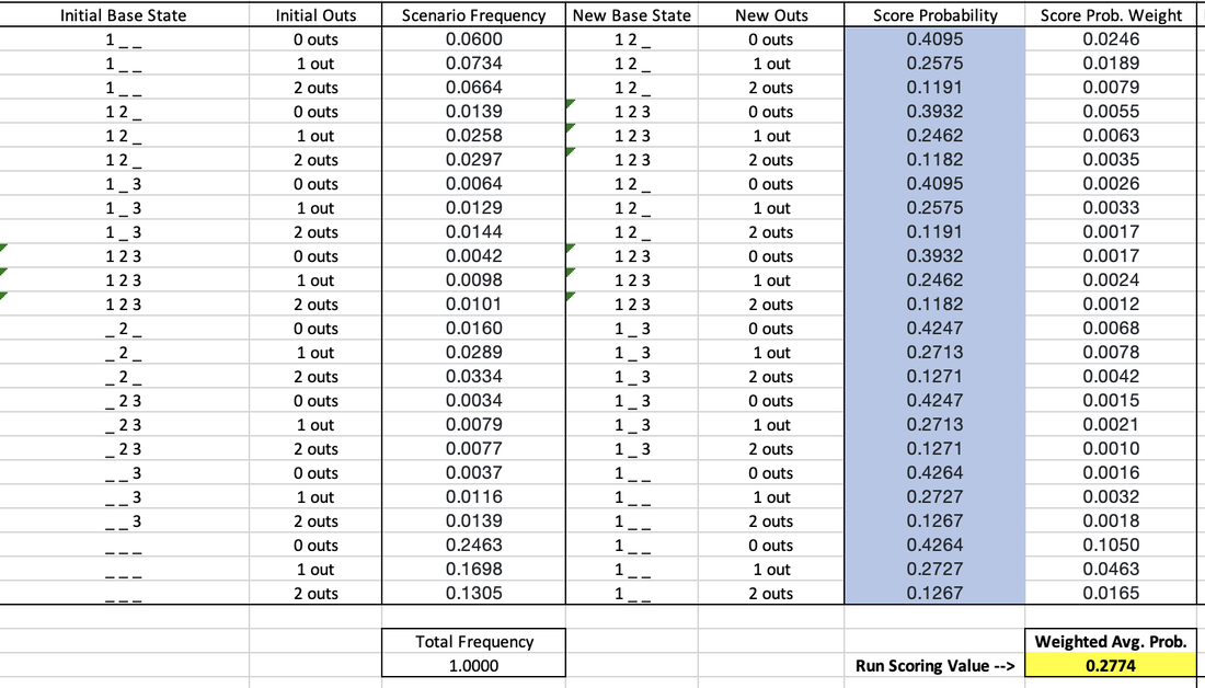 I already mentioned the nobody on, nobody out example above. For another example, about 6% of singles take place with a man on 1st out and 0 outs. When the single is hit, we assume all baserunners will advance as many bases as the batter does (in this case, one). That makes the new situation men on 1st and 2nd with still 0 outs. For the guy on first, this gives him a 40.95% chance of scoring, which is multiplied by the likelihood that scenario occurs (6%) to get the weight of .0246. Adding these up across all possible scenarios, we get the weighted average probability of scoring after hitting a single of 27.74%. The same process was applied to all events. Since I changed the probability of scoring for each event, this also impacted the Future Batters Effecting Value for each event, but the calculation for that piece remained the exact same. The new baseline probability of scoring when you walk up to the plate is 11.24%, and the new Future Batters Effecting Value for outs is -.1080. So I've updated the Run Scoring Value for each event, which impacted the baseline probability of scoring. Thus each event has a new Run Scoring Value Over Baseline. I essentially merged the Run Driving In Value with the Baserunners Effecting Value, and changed the method by which I calculated the Run Driving In Value piece. Lastly, the change in the baseline probability of scoring also impacted the Future Batters Effecting Value for the different events. The third update that I did was also thanks to the r/Sabermetrics sub-Reddit. I was previously weighting the value of an error as the difference between a "non-HR hit" and an "other Out". Realistically, it is unlikely that an error would result in a batter reaching 3rd base solely due to the error. An error will likely put a guy on 1st, and maybe on 2nd if an outfielder drops a flyball or something. To account for this, I calculated a "1B or 2B hit" value that is the weighted average value of a single and double. I now calculate the error as the difference between a "1B or 2B hit" and an "other out". This makes the new value of an error -.6797. You can see the result of these 3 updates in the new run-value weights for each event below: 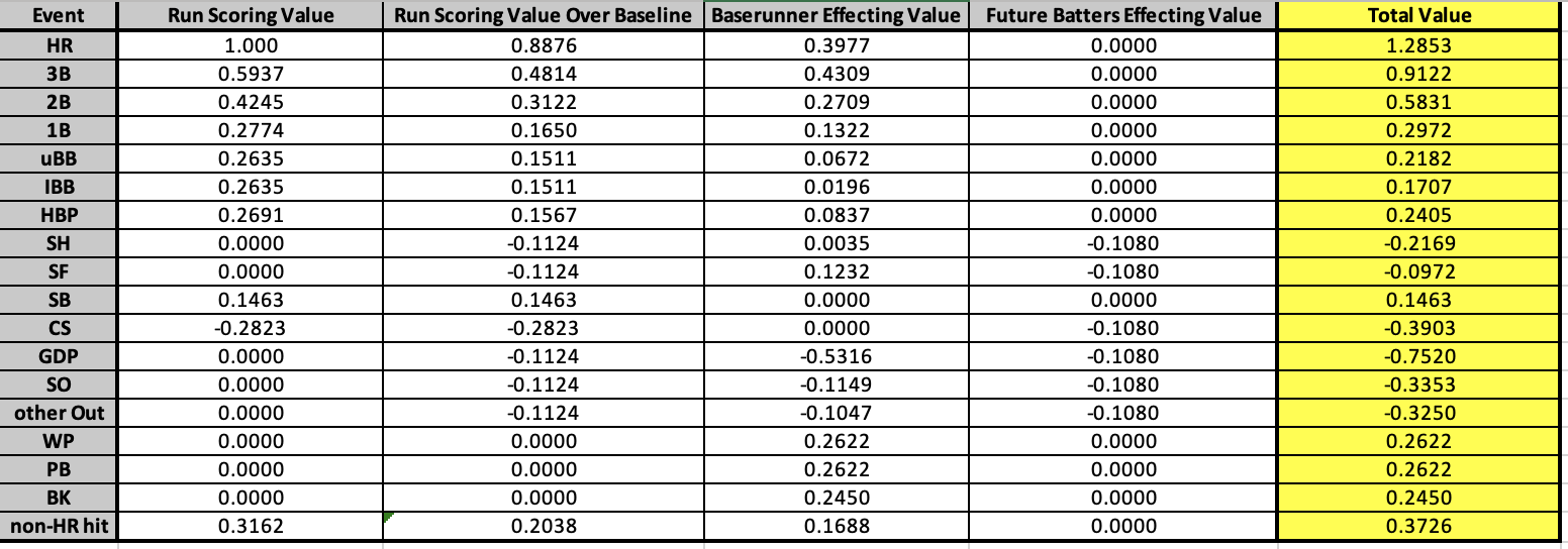 Some events like wild pitches, balks, and passed balls were unaffected by these updates. Most events were changed slightly, but not drastically. The event that had its value change the most was the sac fly, from .6274 to -.0972. This is because I was previously rewarding the batter an entire run for driving the guy on 3rd in. However, the baserunner on 3rd has already done the bulk of the work for that run. Moreover, since there are only 0 outs or 1 out, the guy on 3rd already has a high probability of scoring, even for "being on third base" standards. Bringing him in via sac fly only marginally increases the probability, which gets outnumbered by the detrimental value of the additional out on any remaining baserunners or future batters. The overall effect of these updates is a more accurate measure that intuitively makes more sense. However, there is also an effect on the its ability to describe runs scored and runs allowed per game. Batting Value Average previously had a correlation with runs scored per game of .9341, with an R^2 of .8726. After these updates, it now has a correlation with runs scored per game of .9463 and an R^2 of .8956. So, we improved! When we previously added Baserunning Value Average into the mix, we got an adjusted R^2 of .9071 when running a multiple linear regression to predict runs scored per game. After the updates, we now have an adjusted R^2 of .9238. Again, on the offensive side we see improvement with these updates. Pitching Value Average previously had a correlation with runs allowed per game of -.9217, with an R^2 of .8495. After these updates, it now has a correlation with runs allowed per game of -.9199 and an R^2 of .8462. So, we got a little worse on the pitching side. When we previously added Fielding Value Average into the mix, we got an adjusted R^2 of .8757 when running a multiple linear regression to predict runs allowed per game. After the updates, we now have an adjusted R^2 of .861. Thus overall on the defensive side we lost some performance with these updates. Offensively, we went from describing 90.71% of runs scored per game to 92.38%, a gain of 1.67%. Defensively, we went from describing 87.57% of runs allowed per game to 86.1%, a loss of 1.47%. Thus overall, we increased the descriptive ability of the Player Value metric by 0.2%. This increase is pretty marginal on the measurement side, but again remember that correlation isn't everything; OPS isn't better than wOBA. Having a process that intuitively and mathematically makes more sense is more important, and that is what was really improved through these updates. Below is an updated comparison of my metric's weights with those of other metrics:  Thank you for reading this addendum to Player Value. I look forward to applying this to players in the 2010 season and sharing the results! As always, let me know any thoughts you may have in the comments below. See below for updated versions of the files that I shared in the initial Player Value post:
Statting Lineup Newsletter Signup Form:
If you'd like to receive email updates for each new post that I make, sign up for the Statting Lineup newsletter using the link below: https://weebly.us18.list-manage.com/subscribe?u=ab653f474b2ced9091eb248b1&id=3a60f3b85f In my previous post, I wrote out a long and detailed explanation of what WAR (Wins Above Replacement) is, how it is calculated, and what my stances were on different pieces of that calculation. In short, I believe that WAR is too commonly used and relied upon for how complex and nontransparent the calculation is. I also believe that some of the decisions made in even the transparent parts of the calculation are questionable, such as relying on FIP (Fielding Independent Pitching) for a key portion of pitcher WAR. Because of this, for the past several months I have been working on a new cumulative metric for player value. This post will be dedicated to describing the formulation of this metric, at both a high-level (for you non-mathy baseball fans) and in greater detail (for my fellow math nerds). The overall goal of this metric is to serve as a substitute for WAR. My belief is that this metric is more transparent and more easily calculated than WAR. Furthermore, I believe this metric is more reasonably used to compare players across different periods of the game. While WAR in all its complexities may be better at describing the best players currently, it is flawed in that it changes how it measures players over time. My metric uses the same basic, recordable information to assess players over all of baseball history. **Please note that portions of Player Value have been updated. Refers to this addendum for details** Overview The primary inspiration for the metric was wOBA, or Weighted On Base Average. If you'll recall from my previous post about WAR, I described wOBA in detail there. To summarize, wOBA is a superior offensive rate statistic than its traditional rivals of batting average, on-base percentage, slugging percentage, and even OPS (on base plus slugging). Batting average incorrectly ignores walks and assumes that all hits are equal. Obviously, walks have offensive value and home runs are better than singles. On-base percentage improves by accounting for the value of walks, but still incorrectly assumes that all hits are equal. Slugging percentage acknowledges the superiority of different types of hits, but messes these weights up. A home run isn't 4 times better than a single, and a double isn't 2 times as good as a single. Furthermore, slugging percentage also regresses from on base percentage's improvement by going back to ignoring walks. OPS combines on base and slugging and thus gives value to walks and treats hits differently. This makes OPS the best yet, but it still has the weights of our events wrong. Then there is wOBA, which more accurately uses the actual run-values of the different types of events. The offensive side of my metric also relies on the run-values for determining these weights, but I took a different approach than Tom Tango in calculating them. Recall from my previous post that wOBA relies on the average changes in run expectancy to determine the run value of events. If that sounds confusing to you and you'd like more details, feel free to look into the 'Details' section below, or view the wOBA portion of my previous blog post. Before I summarize how I determined the run-value of each event, you may be wondering why do we rely on runs to determine player value? That is because runs are the fundamental measurement and currency of baseball. The ultimate goal for a team is to win the most games, and within any game the team with the most runs wins. This means teams should try to maximize their runs scored each game, and minimize their runs allowed each game. Truly, the difference between a team's runs scored per game and its runs allowed per game is very indicative of it's ability to win games: 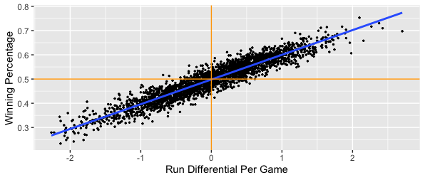 We clearly see that in general, teams that score more runs per game than they allow will have higher winning percentages. Specifically, a team's run differential per game has a correlation of 0.945 with its winning percentage. That is very close to a perfectly positive relationship, which would mean that run differential per game and winning percentage are directly linearly related. If I run a simple linear regression and use run differential per game to predict winning percentage, I get an R^2 value of 0.8931. This mean's that run differential per game accounts for 89.31% of the variability in winning percentage. If you don't know much about linear regression, don't worry; just take this as that run differential per game can explain about 90% of a team's ability to win. Most of the remainder is likely just due to the fact that a team can have individual games where they greatly outscore their opponents (or get outscored by their opponents) that throw the run differential per game off. The key is to have your runs scored per game be consistently greater than your runs allowed per game; if this is always the case, you'll never lose! Another important caveat is understanding player opportunity. At a team level, we care about runs scored and runs allowed. At a player level, we need to understand the strong bias of relying solely on runs scored and runs allowed for measuring value. Players that score more runs or drive more runs in (RBI) will still generally be better, but these values can be skewed. You can be a much better player and still score fewer runs and have less RBI. If your team has worse hitters that can't drive you in as well, you'll probably score less runs than an equivalent player on a better team. Likewise, if your teammates hardly ever get on base for you to drive them in, you'll probably have less RBI than an equivalent player on a better team. The same is true for pitchers; pitchers on a bad defensive team will probably allow more runs and earned runs. Earned runs only account for errors, and there's more to fielding than avoiding errors. To conclude, I could just say that the best batter is the one with the most runs scored per game and RBI per game, and that the best pitcher is the one with the lowest runs allowed per game or earned runs allowed per game, but both of those would be flawed. Obviously measuring by plate appearance or inning could be better, and these metrics would still have some merit, but we can do better. Furthermore, how would you measure defense? Now that I've hammered down why we care about run values (but not runs specifically) so much, let's get into how I derived my run-values, at a high level. The run values for my offensive events were calculated from 4 distinct pieces:
**Per this addendum, Run Driving In Value is no longer used and its respective pieces have merged into Baserunner Effecting Value** I'll take a moment to describe each of these pieces at a high level.
Now that I've explained these 4 pieces, here is a table that shows the run values by piece for each offensive event, as well as the total run value of the event:  **View this addendum for the updated weights of each event** An 'other Out' is an out that is not a strikeout, a sac bunt, a sac fly, or a groundball double play. From a player's standard batting stats, this would be calculated as AB - H - SO - GIDP. An 'uBB' is an unintentional walk, calculated simply as BB - IBB. A 'non-HR hit' is the weighted average of a single, double, and triple. This had to be done because most standard pitching datasets do not include specific hit types against pitchers, only hits and home runs. This is the case for the Lahman package in R, which was the source I used when applying this metric on actual player data. Note that the value of an error is the difference between the value of an other Out and the value of a non-HR hit. This means that the value of an error is -.8326 runs. **Per this addendum, the value of an error is now -.6797 runs** For stolen bases and caught stealings, the Run Scoring Value section is the increase or decrease in the probability of scoring that you receive when either stealing a base or being thrown out. For pitchers, the applicable inverses of these values are used. So for pitchers, any of our hit types or walks are negative values, but any of our out types are positive values. Pitchers also get docked -.2622 runs for each wild pitch and -.245 runs for each balk. For fielding, putouts and assists are treated as 'other Outs', but again the inverse value. Unassisted putouts get the full value of the out, while assisted putouts for first basemen only get 20% of the out value. Assists only get 80% of the out value. These values are purely subjective, with the intuition that a first baseman that just needs to walk a step or two to the bag and then catch a ball thrown at his chest likely has it easier than the fielder that has to run to the ball, field it, and then make a throw to first. I initially was leaning towards a 75%/25% split, but I surveyed the r/Sabermetrics sub-Reddit and found that most of my peers think the split should either be 80/20 or 90/10. With that in mind, I settled on the 80/20 split. Obviously not all assisted putouts require little effort by first basemen, such as when they need to make a scoop play or stretch out far for the catch. Catcher putouts via strikeout only get 33% of the out value. This was also subjective; I figured catchers should get a little more credit since they also play a role in calling pitches and in making balls become strikes via framing. This means that an unassisted putout is worth .3137 runs, an assisted putout for first basemen is worth .3137*.2 = .06274 runs, and an assist is worth .3137*.8 = .25096 runs. I will also note that the # of unassisted putouts by first basemen or the # of catcher putouts that are via strikeouts is not widely available information. I looked at these trends overtime at a team level and generally found that about 90% of all putouts by first basemen are assisted, and that about 93% of all putouts by catchers are from strikeouts. I will note that this assumption is more stable over time for first basemen than it is for catchers, since strikeout rates have been increasing over time. Since for double plays fielders also get credited for the corresponding putouts and assists, double plays for fielding only get the additional value that a double play would bring. A double play means 2 outs, which at face would have a value of 2*.3137 = .6274 runs. However, we see above that a double play is actually worth .7529 runs, so for each fielder involved in a double play we credit them .7529-.6274 = .1255 runs. Catchers get docked -.2622 for each passed ball and -.1469 for each base stolen on them, but get credited .4242 runs for each runner that they throw out. So the fundamental idea of my metric is that we have all of these different traditional recorded baseball events that we've used to evaluate players for many years. We know that more homers are preferable than less, and that more strikeouts by batters is not preferred. What we haven't known is how all of these events compare to each other. What was more impressive, Roger Maris hitting 61 homers or Rickey Henderson stealing 130 bases? Well, 61 homers is worth 61*1.4508 = 88.4988 runs, whereas 130 stolen bases is only worth 130*.1469 = 19.097 runs. What was worse, Jim Rice grounding into 36 double plays or Mark Reynolds striking out 223 times? Well, 36*-.7529 = -27.1044 runs and 223*-.3362 = -74.9726 runs. So things like stealing bases and grounding into double plays can't make or break a season, but can certainly make some players more or less valuable. That's the bones of my metric; we see what players have done, and we are now aware of how relatively valuable those things are, so we can determine which players were the most valuable. The other big piece of my metric is the comparison. WAR of course compares players' values to a mathematically-backed-into 'replacement' level. My metric instead compares to the first quartile, or 25th percentile, value. This is the value that 75% of players are greater than. I believe that this comparison is more straightforward, easier to calculate, and more statistically sound. Comparing values to quartiles or percentiles is a very common practice across all areas of statistics. Comparing values to arbitrary baselines is much less common. Additionally, quartiles are nice because they work like the median in controlling skewed distributions and outliers much better than the mean (what you probably think of as 'average'). Also note that instead of comparing players across a league-wide average (mean) and then adjusting for replacement level (which is what WAR does), I compare players to the league first quartile at their position. So consider the case of rightfielders in 1921. Babe Ruth absolutely dominated his position, leading by a wide margin with 54 homers. The positional mean number of homers would be about 10. That would put only 4 players above average, but 10 players below average. Put another way, Babe would be 44 homers above the mean, and the worst guy (Nemo Leibold, who hit just 1 HR in 480 PA) would be 9 homers below the mean. If we use the median HR value of 6.5 instead, we'd have 7 guys above average and 7 guys below average. Babe would be 47.5 homers above the median and Nemo would be 5.5 homers below the median. The problem with using the mean is that it allows larger values to skew what is considered "average". The mean is much higher at 10 home runs solely because Babe's excellence drove it up. The median is lower because it is just the middle value; it doesn't care how many homers Babe hit. By comparing Babe and Nemo's home run counts to the mean and median, we can see the effect of using both. The mean is more so punishing Nemo, while the median is more so rewarding Babe. Since Babe was the one that performed so greatly, I think it's better to use the measure that rewards him. It also makes more sense because now we have the same # of guys above and below average. This is a common procedure in the statistical world; when a distribution is highly skewed, rely on the median as the measure of average rather than the mean. Since great players have the ability to skew distributions, it's better to use the median. And again, the first quartile works the same way as the median; instead of the middle value, it's the value that's a quarter of the way in. The first quartile is used for largely the same mathematical reason that replacement level is used in WAR. We need a value to compare players to, but we don't want to use an average because being average actually has value. If you have the 15th best catcher in the league, you shouldn't be eagerly looking to get rid of him; he's better than half of the other guys around! If we compare to average, it makes our actual average players (that have a full season of data) look the same as guys that hardly played. There is tremendous value in being able to play at a decent level for a full season. By comparing to a lower level, we reward the average players for playing and recognize their value over a player that only played in a handful of games. WAR makes up a player and quantifies the level that he plays at as 'replacement' and compares players to him. I compare players to their contemporaries, specifically the bottom 25%. What sounds better to you: we should replace our catcher because he's worse than this made up, mathematically defined replacement player, OR we should replace our catcher because he is one of the 7 to 8 worst catchers in the league? The comparison to positional values is done because different positions demand different inherent qualities. A second basemen that hits many homers is unique (Mac from It's Always Sunny in Philadelphia will be the first to tell you), provided that he can still adequately play second base. If we compare to league-wide average, this becomes less impressive as the league wide average HR value gets flooded with corner outfielders and infielders, where power is more expected. Here's a snip of how some of the first quartile offensive event counts varied by position in 2010:  A second basemen that can adequately play the position on defense but hit 20 homers would look great compared to most second basemen, but not so much if we were to throw first basemen, right fielders, and designated hitters into the comparison. That's all there really is to it. Note that there are technically 3 ways that you could view my metric. One is to take the run-value weights and apply them to a player's absolute counts, ignoring the comparison to the positional first quartile. This doesn't help us measure players that may have played well, but only for a limited time such as due to injury, etc. Another way would be to apply the weights without comparison, but measure it on a rate basis. This would give us a value that is more like wOBA, batting average, ERA, or fielding percentage. We'd be able to tell which players are best when they play, but we wouldn't be rewarding players that play more. The final and preferred way is more comparable to WAR, whereby for each offensive and defensive event type, we see how many of that event a player recorded, we compare that value to his position's first quartile value, and then multiply that difference by the actual run value of the event. As a quick sneak peak of my next post where I'll go over the results of applying my metric to the 2010 season, if I rely on the absolute version, I get that the best batter was Miguel Cabrera. If I rely on the rate version, I get that the best batter was Gustavo Chacin, who hit a home run in his only plate appearance. The guy with the highest rate and a reasonable # of PAs for a season was Josh Hamilton. Hamilton was 2nd when using the absolute version; Cabrera only did more "good" offensive things because he had more plate appearances. Lastly, if I compare to positional first quartiles, I again see that Hamilton was the best batter. Cabrera actually comes in 3rd, with Carlos Gonzalez in 2nd because the quality of his batting was more valuable coming from an outfielder than Cabrera's was coming from a first basemen. I will acknowledge that I don't claim 4 decimal precision with these weights. To say that I definitively believe that a HR is worth 1.4508 would be a little absurd. Rather, when applying my metric and thus the weights on actual player data, I round the weights up to 2 decimal places. So when I was measuring Hamilton's and Cabrera's home runs in 2010, I weighted each one as being worth 1.45 runs. I won't go over the absolute version equations, since those are basically just the numerators of the rate equations. But below you can see the equations for each piece of Player Value, as well as the rate versions of the equations:   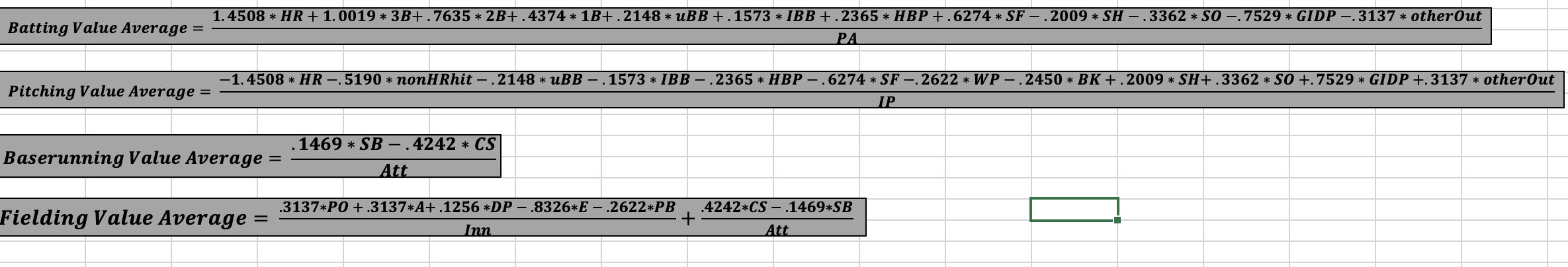 **The weights used in these equations reflect the original methodology. Refer to this addendum for the updated weights to be used in the equations.** That is it for the overview. Feel free to skip the Details section and scroll to the end if you have any comments, or if you want to take a look at some of the files that show my work. If you want to see how the sausage was made, move on to the Details section below. Details As mentioned above, wOBA and the idea of a run expectancy matrix served as the initial inspirations for my metric. Recall that wOBA weights events based on their run value, as measured by the average change in run expectancy as a result of that event in a particular season. You can look at some of the run expectancy matrices that Tom Tango developed for 4 different periods here. My metric doesn't fluctuate each year or even across periods, so I created a simple average of these 4 matrices. You can view this simple average run expectancy matrix from 1950 to 2015 below: 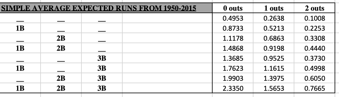 This table means that with nobody on and 0 outs, a team is expected to score .4953 runs that inning. If I were to hit a double and make the situation a man on 2nd with 0 outs, then my team is now expected to score 1.1178 runs that inning. That means I increased my team's expected runs that inning by 1.1178 - .4953 = 0.6625 runs, so my double is worth .6625 runs. However, not all doubles occur in this same situation, so the total change from all doubles in a season are added up and divided by the total number of doubles. This gives us the average change per double, which is the run value we'd use for doubles for a particular season. This process is repeated for each offensive event, each season. wOBA then shifts these values up by the value of an out so that an out becomes worth 0. This puts wOBA in a similar context of the normal metrics like batting average, on-base percentage, slugging, and OPS. Lastly, these values are divided by what is called the 'wOBA scale', which is the value that sets the league average wOBA equal to the league average on-base percentage. This means that wOBA in practice does not use run values for event types such as outs, even though Tango had computed them (here is an example using data from 1999 to 2001). You can compare Tango's values to mine and see that we aren't that far off. Besides the differences in how the run values are calculated, which I'll go into next, some other key differences between my metric and wOBA are:
Now that I've ironed out the key differences from my metric and wOBA besides the change in how run values are calculated, I will now outline how I calculated my run values. As mentioned above in the Overview, the run value for each event was split into 4 pieces. I'll have a subsection for each piece here. Run Scoring Value This is the probability that you will score as a result of your offensive event. It depends on which base you end up on, with the bases closer to home having larger probabilities. The probability of scoring if you hit a home run is 100% and the probability of scoring if you got out is 0%, but how were these other probabilities determined? My main source was the "Expected Runs Per Inning" tool created by Greg Stoll, which you can find here. Greg is a software engineer with an impressive resume whom Tom Tango has also complimented in the past. This isn't just some random data that I found by some random unqualified dude online. The tool allows you to enter a # of outs and a base situation (man on 2nd, bases loaded, etc.) and it will output the total # of times that given base-out state has occurred, as well as how many times different numbers of runs have scored in an inning from those states. The tool's page mentions that it used the same data as Greg's "Win Expectancy Finder" tool, which you can also view here. The "Expected Runs Per Inning" tool suggests that it used data from 1957 to 2015, but I believe that to actually be incorrect. If you put an identical base-out state into the "Win Expectancy Finder" tool, you'll see that the numbers line up. If you were to adjust the date range for the "Win Expectancy Finder" to be from 1957 to 2015, you'd actually get different numbers. The "Win Expectancy Finder" tool by default uses data from 1903 to 2021, so I believe this is the actual range of data used for the "Expected Runs Per Inning" tool. I used the tool for all 24 base-out states to find the total # of times each base-out state has occurred from 1903 to 2021, which you can view below:  Not surprisingly, bases empty with 0 outs occurs the most often, because every half-inning begins that way. While seeing these counts is cool, what matters more is the frequency of each state. That is to say, what % of the time are there men on 1st and 2nd with 1 out compared to bases loaded with 2 outs, etc. We get these values by dividing each value in the table above by the total count of 14.2 million in the bottom right corner. This gives us the frequency of each base-out state from 1903 to 2021, which you can view below:  So we have men on 1st and 2nd with 1 out 2.54% of the time, and we have the based loaded with 2 outs 1.09% of the time. The most common state is again nobody on with 0 outs, and the least common state is men on 2nd and 3rd with 0 outs. Note that these counts and frequencies only come from the 'Total' output of Greg's tool. I repeated this process for the '0 runs' through '3 runs' outputs as well. The below tables show the # of times that 0 runs have scored, 1 run has scored, 2 runs have scored, and 3 runs have scored for each base-out state from 1903 to 2021:   So we can see in the about 3.3 million times that an inning has had nobody on with 0 outs, 0 runs went on to score about 2.4 million times, 1 run went on to score about 495k times, 2 runs went on to score about 228k times, and 3 runs went on to score about 105k times. This same logic can be applied to the other 23 base-out states to find the probability of scoring 0 runs, 1 run, 2 runs, and 3 runs for each base-out state from 1903 to 2021:   So with nobody on and 0 outs, we can expect a team to score 0 runs about 73% of the time, 1 run about 15% of the time, 2 runs about 7% of the time, and 3 runs about 3% of the time. Note that these only add up 98% because the other 2% of probability is for the odds that a team would score 4 or more runs. In determining the probability of scoring from a base, we only care about the probability of scoring 1+ runs, 2+ runs, or 3+ runs. We get these probabilities using the following equations: Prob. Of 1 or more runs = 1 - Prob. Of 0 runs Prob. of 2 or more runs = 1 - Prob. of 1 run - Prob. of 0 runs Prob. of 3 or more runs = 1 - Prob. of 2 runs - Prob. of 1 run - Prob. of 0 runs Using this logic, here are corresponding tables for the probability of scoring 1+ runs, 2+ runs, and 3+ runs for each base-out state from 1903 to 2021:  I have color coded these in such a way that the blue values apply to the probability of scoring from 1st, the orange values apply to the probability of scoring from 2nd, and the gold values apply to the probability of scoring from 3rd. Let's think this through. If the bases are loaded and you're the guy on 3rd, only the probability of scoring 1 or more runs applies to you. If the team were to score just 1 run, it would be you, since you're the leading runner on the base paths. If instead you were the guy on 2nd, then the probability of scoring 2 or more runs would apply to you. If the team scores just 1 run, that wouldn't be you; they'd need to score at least 2 runs for you to score. Lastly, if instead you were the guy on 1st with the bases loaded, only the probability of scoring 3 or more runs would apply to you. The team must score at least 3 runs for you to score. Note that this logic assumes that the leading runner will be the run that scores first. This may not necessarily be the case; a guy on 1st could get picked off and then the batter could hit a solo HR, and the team would still have scored a run resulting from a 'man on 1st' situation. Since this logic can be a little confusing, I have reordered the values below so that we have tables for the probability of scoring from 1st, 2nd, and 3rd for each base-out state from 1903 to 2021:  These 3 tables will be fundamental when discussing the Baserunner Effecting Value later on. The simple averages give us a rough idea of the probabilities by base, # of outs, or base situation, but a weighted average would be more accurate and preferred. I weighted each base-out situation by the frequency that it occurred. The following 6 tables show the # of times each base-out state occurred from 1903-2021 for each base (1st, 2nd, or 3rd), as well as the relative frequency in which each-base out state occurred:   The first set of tables comes directly from our first first table that showed the # of times each base-out state has occurred. The second set of tables comes by dividing each value in the first set by the table's total. There's been a man on 1st base about 4.7 million times, and there was only a man on 1st with 2 outs about 1 million of those times. This means that when there's a guy on first, the situation is just the man on 1st with 2 outs about 21% of the time. Similarly, when there's a man on 3rd base, the situation is bases loaded with 2 outs about 10% of the time. The last step is to multiply each of these frequencies by the probabilities of scoring from earlier. This gives us the weights we need to compute the weighted average probability of scoring, depending on which base you're on:  So the probability of scoring from 1st base is 25.08%. This value applies to singles, unintentional walks, intentional walks, and hit by pitches. The probability of scoring from 2nd base is 37.08%. This value applies to doubles. And the probability of scoring from 3rd base is 51.55%, which applies to triples. Note that the simple average probabilities from earlier suggested that the probability of scoring from 3rd was 60.33%. The simple average assumes that each base-out state is equally likely, so the high probability situations such as based loaded with 0 outs (86.62% chance for guy on 3rd to score) get incorrectly weighted much higher than they should. In reality, this situation only occurs 3.35% of the time that someone is on first. Since different base-out states occur more and less often, a weighted average probability is the right way to go. Above we saw the simple average probabilities of scoring for each base and # of outs. Below you can see the values for the more accurate weighted average probability approach. They are pretty similar to the simple average probabilities.  Note that these line up very well with a similar approach that Tom Tango had taken previously, which you can see here. Towards the bottom of the linked article he shows a table for the "Chance of scoring, from each base/out state" that also gives a guy on 3rd with 2 outs about a 29% shot of scoring, and so on. I will note that well after I had theorized this approach on my own, while still being familiar with wOBA and having purchased and read a portion of Tom Tango's "The Book", I stumbled upon an article of his where he employs a similar approach to mine rather than the approach that he ended up using for wOBA. You can view that article here. Looking at the two Tango linked articles together, we can see that he also had this idea of what he calls a "getting on base" value, as well as a "driving him in" value (from the 1st article) and then additionally a "moving over" value and an "inning killer" value (from the 2nd article). The getting on base connects with my Run Scoring, the moving over is a combo of my Run Driving In and Baserunner Effecting, and the inning killer connects with my Future Batters Effecting. Our breakups are similar, but if you look at the components you can see that the values and thus calculations are different. We seem to agree on a single's scoring chances, but I have a single being more valuable in terms of how it scores and advances runners. We disagree pretty largely on out values too. I mainly just want to acknowledge that I did not "invent" this approach to thinking about runs; other people have thought of it as well. I am embracing it more than Tango did though, and am showing all of my work as to how I developed the weights of each event. Run Driving In Value **This section is largely now obsolete. Refers to this addendum for details on how we now credit batters for driving runners in.** This is the average number of runs that were batted in (RBI) as a result of your offensive event. A leadoff single results in 0 RBI, but a single with men on 2nd and 3rd may result in 2 RBI. It's not the batter's fault if there are no runners on base for him to drive in, so instead we would find the average # of RBI per single and reward every single accordingly. My main source for this piece was Stathead, which is Baseball Reference's paid subscription. I'll link my sources here and mention them by name, but you may not be able to see some of the results if you don't have a subscription. Specifically, I used the "Batting Event Finder" for each event type offered by Stathead. Here's a link to the Batting Event Finder set to regular season triples from 1915 to 2021. Stathead has data for most of these events from 1915 through 2022, but I only used up to 2021 since the current season is incomplete. The calculation for this piece is much more straightforward for each event type; it is simply the # of RBI via the event divided by the # of times the event has occurred. You can view the triple example that I linked to above here:  Stathead knows of 96,604 triples that have occurred from 1915 to 2021, and that 57,921 RBI have scored from those triples. This means the average triple drives in 57921/96604 = .5996 runs. Stathead also provides me with the triple counts by # of outs and by base situation. While this is interesting information, it isn't used in determining the Run Driving In Value. Note that the base and out situations aren't known for every triple, but they are for the vast majority. This is the same case for the other event types. The exact same process is used for the other event types of singles, doubles, home runs, sacrifice bunts, sacrifice flies, strikeouts, walks, hit by pitches, and non-strikeout outs. Most of the work came in Excel from having to run multiple of these Stathead queries and then add them together. Rarer events like triples can be captured in a single query, but trying to capture all singles in history with a single query leads to timing out issues. Instead, I had to essentially get the singles from each decade and then sum them up to get the totals. Since Stathead doesn't have unintentional walks as a query option, I had to just subtract the intentional walks and the # of RBI via IBB from the respective walk (BB) values to get the average # of RBI per uBB. Likewise, Stathead only has a 'non-strikeout out' option that only has data from 1933 to 2021. Since sac flies and sac bunts are included in non-SO outs, I had to run separate queries from 1933 to 2021 for them and subtract their values to get a true 'other Out' value. I subtracted groundball double plays from the denominator of 'other Outs', but didn't take out any RBI via GIDP from the numerator since by definition a ground ball double play doesn't result in an RBI. Another note is that the sac fly RBI value actually came out less than 1, but I set the value equal to 1 since by definition a sac fly results in at least 1 run scoring, and the batter is credited with an RBI. As noted earlier, RBI resulting from a player hitting a HR and driving themselves in are removed. The value of 'driving yourself in' is already reflected in the higher probability of scoring that a HR has (100%) compared to the other bases. With the bases loaded, a bases clearing triple and a grand slam do the same thing in driving all 3 of the runs in. The HR is clearly better, because you've removed the nearly 50% in uncertainty of whether a guy on 3rd would score, but to credit the HR with an additional RBI would value it too much. Put another way, a home run should have about the same value as a triple followed by a steal of home; however, without removing these extra RBI, the HR gets credit for the RBI and the run scored, while the triple and steal of home only get credit for the run scored. Baserunner Effecting Value This is the increase or decrease in the probabilities of scoring that your event caused to existing baserunners. As mentioned previously, the probability that a runner on base will score depends on the current base-out situation. Generally advancing a runner will increase his probability of scoring, but increasing the # of outs will decrease his probability of scoring. The main sources for this piece were again Greg Stoll's "Expected Runs in an Inning" tool, as well as Stathead's "Team Batting Split Finder", which you can find here, and its "Team Pitching Split Finder", which you can find here. Stathead has a little more years of data for these, but I again used from 1915 to 2021 to align with the year ranges I used for the Run Driving In values. Note that I applied a Team Filter to only use data from the National League and the American League, and also combined each season's major league totals. I set the split type to Bases Occupied. These split finders told me how often each event type occurred in each base-out state. We already know how often each base-out state occurs, but to assume that each event type is equally likely for every base-out state would be wrong. For example, there have been 89,318 sac flies that Stathead has the base-out data for from 1915 to 2021. Of these, none have occurred with nobody on and 0 outs. This makes sense, because a sac fly generally requires a guy on 3rd base. Likewise, no sac flies have occurred with a man on 3rd and 2 outs. This also makes sense, because a sac fly with 2 outs is impossible; the outfielder that caught the ball would just make the 3rd out and the inning would be over. However, 4,934 sac flies have occurred with a man on 3rd base with 0 outs. This means that the first two base-out situations that I mentioned both comprise 0% of all sac flies, but the last situation comprises 4934/89318 = 5.52% of all sac flies. I use this same logic for each event type and base-out state to get the frequency of each event type, by base-out state. For example, you can see the # of singles by base-out state from 1915 to 2021, as well as the frequency of singles by base-out state below:  So singles are pretty uniform by # of outs, as about 35% occur with 0 outs and about 31% occur with 2 outs. However, singles are very dependent on the base situation, as about 55% occur with nobody on and only about 2% of singles occur with the bases loaded. At a more granular level, we see that 1.39% of singles take place with men and 1st and 2nd with 0 outs. I combine these frequency tables for each event with the probabilities of scoring by base-out state for each base type (1st, 2nd, or 3rd) that I developed earlier under the Run Scoring Value section using Greg Stoll's tool. The next step requires as much fundamental baseball logic as it does math. For each applicable base-out state, I assess the beginning probability of scoring for each baserunner. Then after the offensive event, I see what the new base-out state would be, and calculate the total change in scoring probability for all the baserunners. Lastly, I weight each situation's change in probability by how frequently the initial situation occurs. This gives me the weighted average increase or decrease in the baserunners' scoring probability, which is the Baserunner Effecting Value. To help see how this works, let's take a look at the calculation for the unintentional walk's Baserunner Effecting Value:  A guy on 1st with 0 outs has a 42.64% chance of scoring. You got walked and moved him to 2nd, so the new situation is men on 1st and 2nd with still 0 outs. He now has a 63.65% chance of scoring. This means that your walk increased his chances of scoring by .6365 - .4264 = 21.01%. If we naiively assumed that each base-out situation was equally likely, we could repeat this logic for each situation and then average the changes in probabilities and conclude that an unintentional walk on average increases the baserunners' probabilities of scoring by 13.49%. However, we know that some situations occur more often than others. A walk occurs with a man on 1st with 0 outs 4.18% of the time, but a walk occurs with the bases loaded and 2 outs just 0.71% of the time. So even though that bases loaded walk scenario is much more valuable (42.53% total increase in probability), it happens much less frequently. It only accounts for .003 of the value in our unintentional walk, while the less valuable but more common man on 1st with 0 outs scenario accounts for .0088 of the value in our unintentional walk. Overall, we see that an unintentional walk increases the baserunners' probability of scoring by 5.7%. Note that only 21 of the base-out states were listed above. The other 3 states are when the bases are empty. When the bases are empty, your walk won't increase or decrease the probability of scoring for any baserunners, since there are no baserunners to begin with. Also note that when a bases loaded walk occurs, you don't get credit for advancing the runner on 3rd to home. This is because you already get credit for this via the Run Driving In value. A bases loaded walk gives you an RBI. I believe that when Tango theorized his "driving him in" value, he did the opposite; he did credit events for advancing runners to home by the corresponding increase in scoring probability, but he didn't determine how many RBI an event got on average. I like my approach better because it's hard to know if a single would score a guy from 2nd or not; by relying on RBI, we can measure that proper proportion. **Note that the above is now incorrect. Refers to this addendum for details. We now DO credit batters for the corresponding increase in scoring probability that they provide the baserunners.** Another interesting note is that some walks can actually decrease the probability that a baserunner scores. For instance, with men on 2nd and 3rd and 1 out, the runner on 3rd has a 67.96% chance of scoring. However, with the bases loaded and 1 out, the runner on 3rd has a 67.15% chance of scoring. Your walk actually hurt his scoring chances by .6796 - .6715 = 0.81%, despite not impacting his advancement or not changing the # of outs. This is likely because of 2 things; for one, the play at home is now a force out, making it easier for any play at home to get the runner out since a tag won't be required; for another, a groundball double play is now possible, which would result in 3 outs and end the inning. Despite some walk situations being negative, they don't hinder the scoring probabilities that much, and they occur in less common base-out states, so overall getting walked is certainly a positive impact. A final interesting tidbit is the difference between the values of an unintentional walk and an intentional walk. These events have the same Run Scoring values because both of them get you to first base. However, the unintentional walk has a higher Run Driving In value. Bases loaded walks aren't ideal but do occur, but intentionally walking a run in has happened just 5 times, so the chances of getting an RBI via an IBB are slim to none. However, intentional walks also have noticeably lower Baserunner Effecting values than unintentional walks. This is because intentional walks are concentrated in the situations where a walk actually hurts the chances that a baserunner scores, such as men on 2nd and 3rd with 1 out. This was the case for just 0.97% of all unintentional walks, but happens 22.49% of the time for intentional walks. This type of logic is repeated for each event type, but some of them are a bit tricky, so I'll try to explain the special cases here. In general, I assumed that each baserunner would advance as many bases as the batter does. Any additional advancement by the baserunner is a credit to his baserunning ability, not an added value to the batter. This means that all singles with a man on 1st are assumed to result in a 1st and 2nd situation. If the baserunner were to advance to 3rd (or get thrown out attempting to do so), the increase/decrease would be pinned on him. Recall that I don't give the batter value for advancing baserunners to home, since they already get credit for doing this in the Run Driving In value. This means that triples and home runs both have a Baserunner Effecting Value of 0. If you hit a homer, everyone on base scores, so you get RBI for each. If you hit a triple, we expect everyone on base to score, including a man on 1st, so again you'd get RBI for each. Similar to this vein, only situations where the event can have an impact on scoring probabilities is considered. A sac fly can only occur in 10 situations (whenever there's a man on 3rd with less than 2 outs), a sac bunt can only occur in 14 situations (men on base with less than 2 outs), and a groundball double play can only occur in 8 situations (man on 1st with less than 2 outs). Across all event types, no situations are considered when nobody is on base; these 3 situations all have probability changes of 0. For sac flies, I only used situations when a man was on 3rd because only about 2.3% of sac flies occur when the leading runner is only on 2nd or 1st. Note that flying out and advancing a runner isn't a sac fly; to be a sac fly, a runner on 2nd or 1st must advance all the way home on a flyout. Doing this is an impressive feat that I believe should be credited to the baserunner, not the batter. Perhaps I could have given the batter credit for advancing the runner at least 1 base, but these situations happen so rarely that it won't have a significant impact on the total value of a sac fly, so I digress. I also assume that only the lead runner in sac flies advances; if there's men on 2nd and 3rd with 1 out and a sac fly occurs, I assume the new situation will be a man on 2nd with 2 outs. I'm not sure how common it is for the tail runner to also advance, so I didn't want to make a large unguided assumption if I didn't have to. My thought process was that on a flyball to left or center it's probably unlikely that the guy on 2nd would try to advance to 3rd, etc. For sac bunts, I do assume that both baserunners will advance. This is largely because the ball is in play (on the ground) and most of the time it's a force out, so the runners must advance. The sac bunt is a designed play to advance the baserunners, so they'll try to advance. The sac fly is more spontaneous. For groundball double plays, I only consider the situations where runners are forced to advance. If you grounded into a double play with men on 2nd and 3rd, the extra out is likely the baserunner's fault, not yours. The tricky part with the double plays is that the fielders have a decision in which players to try and get out. I couldn't find any data on the frequency of different double play types, so I had to make the somewhat unfortunate and lofty assumption that each scenario was equally likely. If there's men on 1st and 2nd, do you try to get the guys out and 3rd and 2nd, at 3rd and 1st, or at 2nd and 1st? I assume that each one has 33% chance of occurring. With the bases loaded it gets even more complicated, with 6 options for the fielders to take. Another twist is the 1st and 3rd situation. The guy on 1st must advance, but the guy on 3rd has a choice. How often would a runner on 3rd go home on a double play up the middle? I couldn't find any data to answer this, so again I assumed each was equally likely; 50% chance that he scores, 50% that he stays on 3rd. If he tries to score and gets out, that's his fault, not the batter's. Lastly, for double plays I did credit the batter for advancing runners home. This is because groundball double play's don't get credit for RBI, but I feel that there is at least some value in scoring a run, even if you did get 2 outs. The main argument against this is that the fielders chose to get the 2 outs rather than prevent the run from scoring. While this is largely true, there are surely some instances when a double play up the middle may have been possible, but getting a guy out at home wasn't. Furthermore, the value of the advanced base is still dwarfed by the creation of an extra out, so this addition only makes the groundball double play *less* negative for some situations. A double play isn't ever good, even if it scored a run. Stolen bases and caught stealings work largely as you would expect, with the exception of the 1st and 3rd situation, and double steals. I assume no double steals, so a 1st and 2nd with a steal always results in a 1st and 3rd situation. That is to say that I assume only the leading runner steals, and that the tail runner never steals simultaneously. The 1st and 3rd situation is unique in that both runners have an open base that they can steal. One would result in a 2nd and 3rd situation, but the other would result in a scored run and a man on 1st. I have the data to see how often a stolen base occurs with men on 1st and 3rd, but I don't have the exact data to see how often the man on 1st is the one stealing compared to the man on 3rd. Instead, I have to see at a higher level how frequently each type of base is stolen. I also obtained this info using Stathead, specifically the "Team Batting Season Finder", which you can find here. I set the Stats to Display to Baserunning, only used the American and National leagues, set the option to find combined seasons for franchise matching criteria, and set the data range to again be from 1915 to 2021. This gave me the total # of steals (and caught steals) for 2nd, 3rd, and home. I summed these up and found that 87.15% of steals are of 2nd, 11.34% of steals are of 3rd, and just 1.51% of steals are of home. Armed with this knowledge, I assumed that these proportions maintained for each base-out state. That is to say that I assumed that for a steal that occurred with men on 1st and 3rd, about 87% of them were of 2nd (resulting in 2nd and 3rd) and about 1.5% of them were of home (resulting in a run scored and a man on 1st). The increases or decreases in your probability of scoring from a stolen base or a caught stealing contribute to the Run Scoring value. The increases or decreases in the other baserunners' probabilities of scoring contribute to the Baserunner Effecting value. You advancing bases doesn't impact other baserunners' chances much, so stolen bases have a small Baserunner Effecting value. However, you increasing the # of outs certainly does hinder the other baserunners' chances of scoring, so caught stealings have a more noticeable Baserunner Effecting value. Note that you get credit to your Run Scoring value for advancing home. Like Tom Tango and wOBA have concluded in the past, generally the potential gains from a stolen base are far outnumbered by the crushing losses of a caught stealing, so a baserunner must steal bases at an impressive clip to be truly effective. These findings are one of the main reasons why stolen base attempts have decreased over the years. With a total SB value of .1469 and a total CS value of -.4242, a CS is worth about 3 times as much as a SB, so runners have to successfully steal about 75% of their bases to be effective (more specifically, the breakeven rate is about 74.27%). Future Batters Effecting Value The idea for this final piece is that getting out doesn't just hurt the chances that the runners on base will score, but it also hurts the scoring chances for the remaining batters that inning. We know that the probability of scoring depends on the base-out state, so we can use those probabilities and the frequencies of the different states from earlier to find the weighted average probability of scoring from each base, by the # of outs. We then see the average decrease in scoring probability for an additional out, and multiply that value by how many additional batters we expect to bat in the inning. Recall from earlier the graphic that showed the # of times each base-out state occurred from 1903-2021 for each base (1st, 2nd, or 3rd). We had used these values earlier to find the frequency of each base-out state. That is to say, what % of the time (when there is a man on 1st base) are there men on 1st and 3rd with 1 out? We now use these values to find the frequency of each base state, by the # outs, for each base type:  This means that when there is a man on 1st base with 0 outs, 72.37% of the time there is only a man on first, and 4.29% of the time the bases are loaded. Similarly, when there is a man on 3rd base with 2 outs, 30.14% of the time there is just a man on 3rd, and 21.14% of the time the bases are loaded. Note that this is also based on data from 1903 to 2021. I multiply these frequencies by each base type's probability of scoring by base-out state from earlier to find the weighted average probabilities of scoring by # of outs and by base type:  If you're on 3rd base with 0 outs, you have an 85.23% chance to score, but if you're on 1st base with 2 outs, you only have a 12.42% chance to score. The top table applies to singles, walks, and hit by pitches. The middle table applies to doubles, and the bottom table applies to triples. Regardless of the # of outs, a home run has a 100% probability of scoring, and an out has a 0% probability of scoring. For each of the event types, I then find the decrease in probability from 0 outs to 1 out, and from 1 out to 2 outs. The next step is to weight each event type by how likely it is to occur. To find this, I used Stathead's "Team Batting Season Finder', which you can find here. I combine each franchise's seasons from 1915 to 2021, while only using AL and NL seasons, and then sum all franchises up to get the total # of times each event occurred. I then divide by the total # of plate appearances to get the probability that each event will occur. The table below shows the # of times the event occurred, the probability of the event occurred, the probability of scoring with 0, 1, and 2 outs, and the decreases in probability from 0 outs to 1 out and from 1 out to 2 out, for each event type:  **Note that the above graphic uses the previous methodology's probability of scoring for each event. The calculation here works the same way now, but instead uses the updated scoring probabilities for each event. Refers to this addendum for details** Not surprisingly, getting a 'normal' out and striking out are two of the more common event types. We also see that the 2nd out is more detrimental for guys on 3rd base, but the 1st out hurts a little more for guys on 2nd or 1st base. I weight each event type based on its frequency (Prob. Of Event) and multiply that value by the probability decreases for the 1st and 2nd outs. The sum of these products gives me the weighted average probability decrease from 0 outs to 1 out of -4.92%, and the weighted average probability decrease from 1 out to 2 outs of -4.68%. I do a similar thing to find the weighted average probabilities of scoring with 0, 1, and 2 outs. Multiply each event type probability of occurring with its corresponding probability of scoring for each # of outs, and then sum each event's values. The weighted average probability of scoring with 0 outs is 16.03%, the weighted average probability of scoring with 1 out is 11.11%, and the weighted average probability of scoring with 2 outs is 6.43%. Now that we know the probability of scoring for each # of outs, we then must find the frequency with which each # of outs occurs to find the baseline probability of scoring. To get the out frequencies, I again used the "Team Batting Split Finder", but this time set the split type to Number of Outs in Inning. You can view that here. Like before, I used data from 1915 to 2021, only used the AL and NL, and combined each season's totals using a Team Filter. The results are that there have been about 13.6 million plate appearances from 1915 to 2021, with about 4.7 million occurring with 0 outs, about 4.5 million occurring with 1 out, and about 4.4 million occurring with 2 outs. Using the exact value, we get that the probability of having 0 outs is 34.58%, the probability of having 1 out is 33.34%, and the probability of having 2 outs is 32.08%. I multiply the probability of a given # of outs occurring by the probability of scoring given that # of outs and then sum up for each of the 3 outs to get the overall baseline probability of scoring of 11.31%. This is the probability that a batter has of scoring when he walks up to the plate. A batter has a chance of scoring when he goes up to bat because he has a certain chance of getting on base. By adding up each of the ways to get on base and their probabilities of occurring, we see that a batter in general has a probability of not getting out (getting on base) of 32.44%, and thus a probability of getting out of 67.56%. Since a batter has a chance to score when he walks up to the plate, we need to adjust our Run Scoring values from reality vs expectation. A single gives you a 25.08% chance of scoring, but you already had an 11.31% chance of scoring, so the real value of the single is the additional .2508 - .1131 = 13.77% of probability. Similarly, an out gives you a 0% chance of scoring, so the value of all outs is the loss of -11.31% of probability. This logic is how we get the Run Scoring Value Over Baseline. However, note that we are looking to find the Future Batters Effecting Value. In making outs, we don't care about the impact of the 3rd out. When the 3rd out is made, the remaining batters just get to bat next inning. However, when we make the 1st or 2nd outs, we force the batters after us to hit with more outs and thus with a lower probability of scoring. Since we only care about the first 2 outs, we need to find the probability of making the 1st or the 2nd out. We multiply the probability of making any out (67.56%) with the probability of having 0 outs or 1 outs (34.58% and 33.34%) to obtain the probability of making the 1st out of 23.36% and the probability of making the 2nd out of 22.53%. If you get out when there are 0 outs, then you made the 1st out, and likewise if you get out when there is 1 out, then you made the 2nd out. We add these values together to get the probability of making the 1st out or 2nd out of 45.89%. Since we only care about making the 1st and 2nd outs, we need to find their relative probabilities. That just means dividing the probability of making the 1st out by the probability of making the 1st out or the 2nd out, and the same for making the 2nd out. The relative probability of making the 1st out is 50.91%, and the relative probability of making the 2nd out is 49.09%. If you made the 1st or 2nd out, there's a 51% chance that you made the 1st out and a 49% chance that you made the 2nd out. Now we need to determine how many future batters our out will impact. The # of batters that we expect to bat after us for the remainder of the inning depends on which # out that we made. For the 2nd out, this is pretty easy. The probability of having just 1 more batter is the probability that the batter will get out (67.56%) and thus make the 3rd out. The probability of having 2 more batters is the probability that the first batter will not get out (32.44%) and the second batter will get out (67.56%); the combination probability of both of these occurring is .3244*.6756 = 21.92%. The probability of having 3 more batters is the probability that the first two batters will not get out (.3244*.3244 = 10.52%) and the third batter will get out (67.56%); the combination probability of all three of these occurring is .3244*.3244*.6756 = 7.11%. The process continues in this way. Below you can see the probability of having a given # of remaining batters with 2 outs:  You can see that by the time we get to 10 batters, the probability is quite small at 0.0027%. I did this for up to 20 batters, which has a probability that isn't even viewable from a 6 decimal standpoint. Like with any expected value, we multiply each probability of a value occurring by the corresponding value to get our overall expected value. This means .6756*1 + .2192*2 + .0711*3 + ... We end up with 1.4801 expected remaining batters with 2 outs. For the 1st out, things get a little more complicated. The probability of having 1 more batter is 0%, because that would just give us 2 outs. The probability of having 2 more batters is the probability that both of the next two batters get out, which is .6756*.6756 = 45.64%. The probability of having 3 more batters is the probability that only 1 of the next 2 batters gets out and the 3rd batter also gets out. Since we can either have the 1st guy get out and the 2nd guy get on base, OR the 1st guy get on base and the 2nd guy get out, the probability that only 1 of the next 2 batters gets out is .3244*.6756 + .6756*.3244 = 43.93%. Then the probability that the 3rd guy gets out is just 67.56%, so the probability of having 3 more batters is 2*.3244*.6756*.6756 = 29.61%. The process continues in this way. This is calculated more easily using combinatorics. If N is the # of batters batting after me, then the equation becomes: (N-1) nCr (N-2) * .6756 * (.3244 ^ (N - 2)) * .6756. If N = 3, we get the probability of having 3 more batters with 1 out. If N = 2, we get the probability of having 2 more batters with 1 out. Below is the table that applies this equation and shows the probability of having a given # of remaining batters with 1 out:  I again extended these out to 20 batters and found that we can expect 2.9602 remaining batters with 1 out. Finding the expected number of remaining batters with 0 outs is not needed and gets even more complicated. However, the expected # of remaining batters in an inning when we have 0 outs is 4.4403. Note that the probabilities of having just 1 more or 2 more batters are both 0%, since they would just leave us with 1 out or 2 outs. The equation for the probabilities of having N more batters (where N > 2) is: ((N-1) nCr 2) * (.6756 ^ 2) * (.3244 ^ (N-3)) * .6756 If we're the last batter, we need 2 of the batters before us to get out, the rest to not get out, and then we need to get out. If N = 3, we get the probability of having 3 more batters with 0 outs of 30.84%. If N = 4, we get the probability of having 4 more batters with 0 outs of 30.01%. Once we have the expected # of remaining batters for the 1st out and the 2nd out, we multiply them by the probability decrease of the 1st and 2nd outs, respectively. This gives us the total probability decrease of the 1st out of 2.9602*-.0492 = -14.56%. When we make the 1st out, we hurt each batter going to the plate's probability of scoring by about 5%, and we expect about 3 more batters to go the plate in the inning, so overall we hurt our team's probability of scoring by about 15%. Likewise, the total probability decrease of the 2nd out is 1.4801*-.0468 = -6.93%. When we make the 2nd out, we hurt each batter's probability of scoring by about 4.5%, and we expect about 1.5 more batters to come to the plate in the inning, so overall we hurt our team's probability of scoring by about 7%. Then recall that we have about a 51% chance of making the 1st out, and about a 49% chance of making the 2nd out. Multiplying these by the total decreases above gives us our weighted average total probability decrease of .5091*-.1456 + .4909*-.0693 = -10.82%. This is the Future Batters Effecting Value. This value only applies to outs (strikeouts, groundball double plays, caught stealings, and other outs). The rest of the events have a Future Batters Effecting Value of 0. That is it for the nitty gritty of how the run value weights for each event were calculated. You of course may be wondering if these weights are actually better than those used by OPS or wOBA. Similarly, for pitchers you may be wondering if these weights are a better metric than Batting Average Against or FIP. In short, yes, but let's take a look. To compare these metrics, I used the Lahman package in R, which you read about here. Anyone with R can download the package for free. The package has a "Teams" dataset that shows a variety of statistics for each team in history. The package's PDF that I linked to provides code to filter this dataset down to just include AL and NL seasons, as well as only include seasons in the modern era (1901+). The dataset has values for each team's # of games played, runs scored, and runs allowed. From these values we can calculate each team's runs scored per game and runs allowed per game. The goal is for our offensive metrics to correlate well with runs scored per game, and for the defensive/pitching metrics to correlate well with runs allowed per game. The package also has a "Batting" dataset for each player season in history. I can whittle the dataset down to only include players that played in the AL or NL and from 1901 and later. I then summed up each player's stats for a given team (and season), and merged this dataset with the teams data. From there I can compute the different offensive metrics for each team, and then compare them to runs scored per game. Let's see how good batting average is at describing runs scored per game:  Batting average has a correlation with runs scored per game of 0.788. This means that batting average is pretty strongly positively correlated with runs scored per game, so teams with higher batting averages will generally score more runs per game. If we fit a simple linear regression using batting average to predict runs scored per game, we get an R^2 value of 0.6209. This means that batting average explains 62.09% of the variability in a team's runs scored per game. So batting average is pretty good at explaining runs scored per game, but we can do better. We know that batting average won't be the best since it ignores the value of walks and treats all hits the same. Let's see how good on-base percentage is at describing runs scored per game:  On-base percentage has a correlation with runs scored per game of 0.8749, so it's even more related to runs scored per game than batting average. This makes sense, since on-base percentage acknowledges the value of walks. If we run a simple linear regression and predict runs scored per game using on-base percentage, we get an R^2 of 0.7655, so on-base percentage explains runs scored per game better than batting average does. However, we can still do better, since on-base percentage treats all hits the same. Let's see how slugging percentage does at describing runs scored per game:  Slugging percentage has a correlation with runs scored per game of 0.8424, so it's better than batting average but worse than on-base percentage. This is because while slugging does value the types of hits differently, the weights aren't accurate and it doesn't treat walks as having any value. The regression for slugging percentage produces an R^2 of 0.7096, so again slugging percentage is better at describing runs scored per game than batting average, but is worse than on-base percentage. How does On-base Plus Slugging (OPS) do at describing runs scored per game?  OPS has a correlation with runs scored per game of 0.9217, so it's the metric that has the strongest relationship with scoring runs thus far. This makes sense because OPS weights the hit types differently, is closer to weighting them correctly, and treats walks as having value. The regression for OPS has an R^2 of 0.8495, which is also the best thus far. OPS does a good job of describing runs scored per game, but we can do better yet. How does weighted on-base average (wOBA) fare at explaining runs scored per game?  Interestingly enough, wOBA actually only has a correlation with runs scored per game of 0.8982. While this is better than any of the 'triple slash line' metrics, it's worse than OPS. I used the exact wOBA weights listed by FanGraphs for each season here. The regression produces an R^2 of 0.8067, which is also worse than OPS. Hey Aaron, that's weird, I thought wOBA was better than OPS? Truth be told this isn't a new discovery. A retired economics professor pointed this out here in 2013. Tom Tango and this professor (as well as others) had a discussion in the comments of one of his posts in 2013 as well. The crux of the matter is that while a good offensive statistic should correlate well with runs scored per game, the one that correlates with runs scored per game the most isn't necessarily the best. I could easily just run a multiple linear regression to try to predict runs scored and arbitrarily use those weights. In fact, I did; using per game values for singles, doubles, triples, home runs, unintentional walks, intentional walks, and hit by pitches, I ran a multiple linear regression to predict runs scored and got an R^2 of 0.9077 and an adjusted R^2 of 0.9075 (when using multiple predictors, adjusted R^2 is the preferred metric). This regression produced the following weights for these events:  Those unfamiliar with R outputs probably don't care much for this image, but essentially it is telling us that a single is worth .55, a double is worth .63, a triple is worth 1.81, a homer is worth 1.31, an unintentional walk is worth .37, an intentional walk is worth .05, and a hit by pitch is worth .91. Those more familiar with R outputs will notice that the model says that intentional walks aren't significant, so I could remove those and run it again, but optimizing this isn't the point. The point is that this model is better at predicting runs scored per game than any of the metrics thus far, and *spoiler* better than mine too. Does that make it the best? No. I also converted these weights into a rate form and then compared that to runs scored per game. The correlation was 0.9423, again the highest. Hell, I even tacked on the other event types of strikeouts, sac bunts, sac flies, groundball double plays, and other outs and got an adjusted R^2 of .9435, and then tacked on stolen bases and caught stealings and got an R^2 of .9501. If we treat R^2 as the key to finding the best metric, I could easily rely on this MLR model and be better than basically any of the metrics currently in use. By the same token, I could just rely on a player's runs scored and RBI and also be able to correlate with runs scored per game well... Again, good metrics should have high correlations, but the highest correlation alone doesn't mean it's a better metric. Why is that the case? wOBA is better than OPS because it employs researched, mathematical rationale in deriving its weights. Seeing the OPS weights, and seeing our MLR weights above, tells us nothing about the events. We get no understanding as to why these events are worth what they are. Heck, the MLR thinks a triple is more valuable than a HR, and that a hit by pitch is more valuable than a single or a double. I doubt anyone honestly believes either of those statements to be true. It is much more important to understand why events are worth what they are and to understand how runs are actually created. Because wOBA does this and OPS does not, and because wOBA is still very correlated with runs scored per game, it is the better metric. Another note to add is that measuring teams' runs scored per game isn't going to translate perfectly into determining player value. Furthermore, as I mentioned in my last post, OPS is also flawed because it is biased towards slugging percentage (the inferior metric compared to OPS' other component, on-base percentage) and because it is mathematically unsound. OPS adds OBP and SLG, but OBP has a denominator of *basically* PA while SLG has a denominator of AB. So is my metric better? Well obviously I think so, or else I wouldn't have bothered sharing, but in short, yes. My metric goes through the process of mathematically determining the event weights using baseball rationale, and as a cherry on top is even more correlated with runs scored per game than wOBA or OPS are. How does my new metric do at describing runs scored per game?  My metric, which I'm calling 'Batting Value Average' for now (open to suggestions), has a correlation with runs scored per game of 0.9341, the highest of any metric thus far. Likewise, the regression has an R^2 of 0.8726, also the highest thus far. My metric can explain 86.95% of the variability in teams' runs scored per game. **Note that the updated metric has a correlation of .9463 and an R^2 of .8956. Refer to this addendum for details** Let's revisit how my metric's event weights compare to the other most common offensive metrics:  **Note that the updated metric has different weight comparisons. Referr to this addendum for details** You''ll notice that mine and wOBA's values for stolen bases and caught stealings are quite similar. You can also look here and see that my values are also quite close to Tango's unshifted, unscaled wOBA weights. We both have an out at about -.3, a HR at about 1.4, a triple at about 1, a double at about .76, and a balk at about .24 (if you scroll up to the top and see my non-offensive values). Where we differ is that I have intentional walks being worth more, HBP and uBB being worth less, strikeouts being worth less (to the batter, i.e. more harmful), and passed balls and wild pitches also being more detrimental. Tango considers some things that I don't, like reaching on errors, bunts, pickoffs, and defensive indifferences, while I consider some things that Tango doesn't, like sac flies and groundball double plays. But recall that the linked weights are only from 1999 to 2002, and that in reality wOBA has weights for each year that it shifts up so that an out is worth 0, and then scales to match the league average on-base percentage. An important distinction is that the other metrics just don't consider the weight of an out, whereas wOBA does but again just shifts all values up so than an out is worth 0. Another important distinction is that the wOBA weights listed here are weighted averages. I took the wOBA weights for each year and weighted them based on the # of plate appearances that year. I'll include the workbook that I did this in at the end of the post. I will admit that using these weighted average wOBA weights here, the correlation with runs scored per game is actually higher than my metric at 0.9415, with the regression's R^2 being 0.8864. However, I've found that this is solely because I chose to include IBB and SH, and wOBA does not. If I remove IBB and SH from my metric, I get an even higher correlation with runs scored of 0.9445, and the regression produces an R^2 of 0.8921. For now I stand by my decision to include SH and IBB, and since wOBA doesn't actually function like this weighted average approach, my metric is still superior. The main rationale in using different weights each year for wOBA is that different years have different run scoring environments. While I agree that the state of baseball certainly changes over time, I'm not entirely set on there being such drastic differences in run scoring environments to merit the stance that values of events literally need to be adjusted every year. Again, I believe that there is a true value of each event, and I am simply estimating that unknown true value to the best of my ability given the data available while applying necessary baseball logic. Take a look at teams' runs scored per game over the years:  There really hasn't been that much variation. There are certainly some peaks and troughs, but more or less the teams in the MLB are going to average about 4.5 runs scored per game. Other events like home runs have certainly become more common over time, but we can clearly see here that team's aren't really getting any better or worse at scoring runs. Rather, they have just adjusted how they score those runs over time. I don't think more or less of an event makes it less or more valuable. Singles aren't some commodity with finite demand. A walk-off single will win a team the game, regardless if it's the 23rd run scored that game or the 3rd, and regardless if it's the 12th single of the game or the 1st. It is for these reasons that I am against having specific event values for each season. One final note on the offensive side is that batting isn't everything that leads to scoring runs. Baserunning also plays an important part. The baserunning side of my metric isn't as comprehensive as I would hope it to be, mainly due to the lack of data, but I'll get into that later. I don't just want my batting metric to be better, but my baserunning metric as well. Let's compare my baserunning metric to stolen base percentage and the application of the wOBA weights. All 3 of these are pretty crummy at predicting runs scored per game on their own, but what really matters is how they can predict runs scored in conjunction with the batting metrics. If I run a multiple linear regression using OPS and stolen base percentage, I get an adjusted R^2 of .8928. If I run a regression using wOBA and the SB and CS wOBA weights, I get an adjusted R^2 of .8592. If I use the weighted average version's of wOBA, I get an adjusted R^2 of 0.8966. Lastly, if I run a regression using my batting metric and my baserunning metric, I get an adjusted R^2 of .9071. So by tacking on my baserunning, we see that it performs better than the other simple baserunning metrics that only consider stealing bases. **Note that the updated metric has an adjusted R^2 of .9238. Refer to this addendum for details** So I've shown that my offensive metric is the best describer of runs scored per game. Now I'll show that my defensive metric is the best describer of runs allowed per game. The Lahman package also has a 'Pitching' dataset that I can also sum up for all pitchers on a team for a given season, and then merge with the teams data. We want to see how different metrics that do NOT rely on actual runs do at describing runs allowed per game. Thus we won't use Earned Run Average (ERA), since it relies on earned runs, which are directly related to runs allowed; any run that was scored by a runner that reached base by an error is considered an earned run. ERA is simply the # of earned runs that a team allowed per 9 innings. This is done for the same reason that we don't just simply rely on a player's runs scored per game or their runs scored + RBI per game to measure their offensive value. Players that play with other bad players get the short end of the stick; as batters they don't have as many runners to drive in, and as a baserunners they don't have as many competent hitters to drive them in. By the same token, pitchers that play with bad fielders can also get the short end of the stick. Pitchers with poor defenses behind them will allow more runs. Only using earned runs eliminates some of this effect, but not all. Let's first look at how Fielding Independent Pitching (FIP) does at describing runs allowed per game:  FIP has a correlation with runs allowed per game of 0.7962. FIP works like an ERA estimator, so the higher a player's or team's FIP, the more runs they will generally allow per game. In fitting a simple linear regression to FIP, we get an R^2 of 0.634. This is decent, but we can surely do better. If I were to instead estimate earned runs per game using FIP, I'd get a correlation of 0.9162 and an R^2 of 0.8394. Let's see how opponent's batting average against a team's pitchers does at describing its runs allowed per game:  Batting average against has a correlation with runs allowed per game of 0.8471, which is better than FIP. The regression for batting average against has an R^2 of 0.7176, also better than FIP. If I were to instead estimate earned runs per game using batting average against, I'd get a correlation of .7432 and an R^2 of .5523. Let's see how on-base percentage against does at describing runs allowed per game:  Opponents' on-base percentage against a team's pitchers has a correlation with the team's runs allowed per game of .8971. When running a linear regression to predict runs allowed per game using on-base percentage against, the R^2 is .8048. Both of these are the highest yet, so we're moving in the right direction. If we used on-base percentage against to measure earned runs per game, we get a correlation of .8317 and an R^2 of .6918. So you may have noticed that batting average against and on-base percentage against are better at describing runs allowed, but FIP is better at describing earned runs. Note that in our fundamental win model, we care about runs scored per game vs runs allowed per game, not earned runs per game. Furthermore, a team wins a particular baseball game by having more runs scored than runs allowed. The 'earned' runs aren't used for determining who wins. Earned runs are just a construct of splitting blame on the pitcher vs the fielder. FIP does a good job of describing the portion that the pitcher is responsible for, but to the detriment of being a worse describer of how runs are allowed overall. Just because FIP can identify the things that a pitcher is solely to blame for doesn't mean that it does a better job of measuring pitcher performance overall (recall FIP ignores things like doubles that a pitcher allows; a pitcher isn't solely to blame for the double, but certainly is at least partially, if not for the most part, responsible for giving up the double). Lastly, let's see how my pitching metric does at describing runs allowed per game:  My metric, which I'm calling 'Pitching Value Average' for now (open to suggestions), has a correlation with runs allowed per game of -0.9217. On an absolute value basis, my metric has the best relationship with runs allowed per game thus far. Pitchers and teams with a higher value will tend to allow fewer runs per game. The regression for my metric has an R^2 of 0.8495, which is also the best so far. If instead I measure earned runs per game using my pitching metric, I get a correlation of -.9491 and an R^2 of .9007. So my pitching metric can explain 85.19% of the variation in a team's runs allowed per game, and 90.07% of the variation in a team's earned runs per game. These are both the best of any of the metrics discussed, so it doesn't really matter if we focus on runs allowed or earned runs. **Note that the updated metric has a correlation of -.9199 and an R^2 of .8462. Refer to this addendum for details** I will note that for pitchers, removing IBB does seem to improve the predictions of runs allowed per game, but removing SF as well makes it a little worse relative to just removing IBB. Nonetheless, I am going to still include both IBB and SF for now. My intuition is that even though on the pitching side intentional walks are entirely manager decisions and batters doing sac bunts may be luck of the draw, presumably good pitchers will be less likely to have IBB and more likely to have SH. If you're confident that your ace can get the batter out, you probably won't intentionally walk him. If you have little confidence in your batter to get a hit due to the sheer dominance of the pitcher, you're probably more likely to signal for a sac bunt. Just like how baserunning adds on to batting to describe runs scored, so too does fielding add on to pitching to describe runs allowed. None of the fielding metrics in isolation are particularly good at describing runs allowed, but we can add them to the pitching metrics to see how they improve the models overall. Specifically, we are running multiple linear regressions to predict runs allowed per game using fielding percentage and the other pitching metrics, and then comparing that to a regression that uses my fielding metric and pitching metric. The multiple linear regression of fielding percentage and FIP had an adjusted R^2 of .8137. The MLR of fielding percentage and batting average against had an adjusted R^2 of .6976. The MLR of fielding percentage and on-base percentage against had an adjusted R^2 of .7962. And as you may have guessed, the MLR of my fielding metric and my pitching metric had the highest adjusted R^2 of .8757. **Note that the updated metric has an adjusted R^2 of .861. Refer to this addendum for details** So focusing on adjusted R^2 values alone, we can describe 89.31% of a team's ability to win (winning percentage) using the difference between their runs scored per gamed and their runs allowed per game. From there, we can describe 90.71% of a team's runs scored per game using my batting and baserunning metrics, and we can describe 87.57% of a team's runs allowed per game using my pitching and fielding metrics. I'd say that's a pretty good understanding of what makes teams good, and thus a pretty good way to measure player performance. **Note that the updated metric can describe 92.37% of a team's runs scored per game, and can describe 86.1% of a team's runs allowed per game. Refer to this addendum for details** Like basically all statistics, my measure is not without its flaws, so let's hash out some ways that my metric could improve:
That is it for the list of things that I can think of right now that could immediately improve my metric. Most of this data is already available, it's just a matter of getting it in formats that make it easy for me to calculate my metric for many players at a time. Going player-by-player and then season-by-season would obviously take forever to accomplish. I hope you have enjoyed reading about my new metric. Again, the goal here is to compare players across MLB history. The advanced measurements available on Baseball Savant (Statcast) and sophisticated methods/available data used by FanGraphs and Baseball Reference to compute WAR are likely superior metrics to use to determine the value of present day players. While this post was certainly long, so too was my WAR post, and much of that consisted of linking to many other sources! Yes, my metric is still a bit complicated, but far less so than WAR (in my opinion), and with the work I've shown above and will include below, you are much better equipped to calculate and understand it on your own. One final review of the basics: we take the readily available and recorded baseball events and measure them per opportunity, then we compare to the first quartile for each position, and then we multiply by the run value of each event type. So instead of Wins Above Replacement, I guess you could call it Run Value Above Positional First Quartile or something. **Again, the Player Value metric has had some updates since this initial post. Refer to this addendum for details** Below you can find the files that I used to create and analyze my metric. The "player_value_weights" workbook will be the most useful, and details the calculation of the run-value weights for each event type. The "player_value_equations" workbooks shows the equations for my metrics, including the rate versions (similar to wOBA) and the versions that compare to the positional first quartiles (similar to WAR). The "babe_ruth_1920_example" workbook shows my work for why the median (and by extension, the first quartile) is a better method rather than relying on the mean. The "2010quartiles" workbooks shows the first quartile values for each position from the 2010 example. The "yearly_woba_weights" workbook shows the run-value adjusted wOBA weights for each season. This is basically a download of the Guts! page on FanGraphs, which I linked to earlier. The "weightedavg_woba" workbook shows my calculation of the weights for the weighted average version of wOBA. The "metricscompare" R file shows the code for how I compared the different batting and pitching metrics. This is how I got my different plots against runs scored per game and runs allowed per game. The "1bassistposandcstrikeoutpos" R file shows the code for how I set my assumptions that 90% of putouts by first basemen are assisted and that 93% of putouts by catchers are via strikeouts.
I think that these files (along with this lengthy post) should be all you need to understand my metric at a pretty deep level.
As mentioned, my next post will apply this metric to all players from the 2010 season as an example. Thank you all again for reading and as always let me know what you think in the comments! Statting Lineup Newsletter Signup Form: If you'd like to receive email updates for each new post that I make, sign up for the Statting Lineup newsletter using the link below: https://weebly.us18.list-manage.com/subscribe?u=ab653f474b2ced9091eb248b1&id=3a60f3b85f I know, it's been awhile since I have imparted my wisdom (or opinions) onto you guys. But bear with me, as the culmination of several weeks of hard, laborious work has finally begun to come to fruition. Over the last month or so, I've been working on a system that I've named my "Hall-Of-Fame Metric". In short, it is designed to take into account the awards and statistical parts of a player's career to determine if they belong in Cooperstown. However, the system is designed to only compare players of similar positions. We can compare Hank Aaron and Willie Mays fairly accurately, but not Johnny Bench and Derek Jeter. So, without further adieu, here is how the Hall-Of-Fame Metric is calculated:
Awards 10 points for each Triple Crown 8 points for each MVP 5 points for each Cy Young 4 points for each Hank Aaron 4 points for each Rolaids Relief Man or Reliever of the Year 3 points for each Silver Slugger 3 points for each Gold Glove (2 points for pitchers) 3 points for each World Series MVP 2 points for each League Championship Series MVP 2 points for each Batting Title 2 points for each year leading the league in Home Runs, RBI, Stolen Bases, Wins, ERA, Strikeouts, or Saves 1 point for each All-Star game 1 point for each All-Star game MVP 1 point for winning the Rookie of the Year Stats .67 points for every 10 singles .78 points for every 10 doubles .89 points for every 10 triples 1 point for every 10 home runs, every 10 runs scored, and every 10 RBI .5 points for every 10 walks (for batters) .11 points for every 10 stolen bases .5 points for career batting average x 1000 (ex: .295 would be 295, for 147.5 points) .5 points for career on-base percentage x 1000 .25 points for career slugging percentage x 1000 2 points for each win -2 points for each loss .5 points for 10-career ERA, x 100 (ex: ERA of 3 would yield 10-3=7, 7x100 = 700, for 350 points) 1 point for 5-career WHIP, x 100 (ex: WHIP of 1 would yield 5-1=4, 4x100 = 400, for 400 points) 1 point every 10 strikeouts (for pitchers) -1 point for every 10 walks (for pitchers) 1 point for every shutout 1 point for every save -1 point for every blown save 25 points for every perfect game or no hitter Total = Stats + 10 x Awards It is also important to note that differences in era can have an affect on the outcomes, especially with the awards. Players that played before 1933 had no All-Star game and thus had no access to the points associated with that honor. Those that played prior to 1957 likewise had no Gold Glove award. Anyone that played ahead of 1980 had no Silver Slugger award and lastly, players that played before 1999 had no Hank Aaron award. Similar scenarios can be seen in pitchers without the existence of the Cy Young award until 1956 or any sort of Reliever award prior to 1976. For the purpose of my metric, I created 5 eras of baseball, each divided by the start of a major award: 1) Beginning of time to 1932, highlighted in green (no All-Star game) 2) 1933 to 1956, highlighted in blue (no Gold Glove, mainly no Cy Young) 3) 1957 to 1979, highlighted in gold (no Silver Slugger, mainly no Relief award) 4) 1980 to 1998, highlighted in silver (no Hank Aaron) 5) 1999 to present day, highlighted Pointing out these eras allow us to first take note of a player's total score, but then take into consideration his era. A total of 2,000 from 1930 should be ranked ahead of a total of 2,015 from 2004 because the older player likely would have more points had he had the opportunity to win all the awards that the newer player benefited from. Though older players missed out on these award points, they did benefit in some ways with players leading the league in certain categories more often, giving them more points, which in turn lead to more triple crown winners and even more points. Consider the 11 players that won the Triple Crown in the 52 year span from 1915 to 1967 versus the 1 player that won the Triple Crown in the 52 year span from 1967 to today. Older players also benefitted with higher career batting averages (the "newest" played in the top 10 is Ted Williams, who retired in 1960), more triples ("newest" in top 20 is Stan Musial, who retired in 1963), and less strikeouts, although they did usually have less home runs. On the pitching side, Triple Crowns are still less common than before albeit more common today than the batting version of the award. Earlier pitchers saw much more games started and thus more wins and shutouts, but had no access to the save. Hopefully you are eager to discover which players are the greatest at their respective positions, including finding out notable Hall of Fame snubs or those already in Cooperstown that may not belong. I will try my best to post the results of a position each week. For now, I'll release some spoilers for each position: Barry Bonds*: 2828.7 Vince Coleman: 782.165 Ivan Rodriguez: 1782.672 Walker Cooper: 757.724 Albert Pujols: 1925.935 Bill Skowron: 793.8 Rogers Hornsby: 1181.847 Bobby Richardson: 609.489 Alex Rodriguez*: 2254.602 Dave Bancroft: 753.883 Mike Schmidt: 2126.162 Freddie Lindstrom: 753.815 Roger Clemens*: 2491.9 Ted Lyons: 870.9 Mariano Rivera: 1944.2 Kent Tekulve: 882.3 You know what the asterisk means. Thanks again for reading, be on the lookout for my position lists in the coming weeks, and Roll Tide! Aaron Springer It is my opinion that the current regular season and postseason format of Major League Baseball is broken and in need of fixing. Recently, the Chicago Cubs were defeated in the National League Wild Card Game by the Colorado Rockies, eliminating them from the playoffs. The Cubs, at 95-68, had the second-best record in the National League but a single game against Colorado ended their World Series hopes. Furthermore, it was another single game that prevented them from being the top seed in the first place. The MLB boasts the regular season with the most games out of any of the major sports but does little to reward the teams that finish the best. In the NBA, which plays about half the games the MLB does, a team with the 2nd best record in its conference is seeded second and has a 7-game series to try to advance. The Cubs weren’t alone in this predicament either; the Yankees finished with the 3rd best record in the American League – and 3rd best in the MLB overall – and likewise had to battle in a single game to keep their hopes alive. Imagine if the Warriors and Rockets had played a single game at the start of the NBA postseason in order for one of them to move on. Hopefully you are beginning to see the issue at hand. I’ll start by going over the regular season format of the MLB. As it currently exists, the MLB is divided into 2 conferences: the American League and the National League. There are 30 teams in the MLB overall and therefore 15 teams in each conference. From there, each conference is divided into 3 divisions: the East, Central, and West, respectively for both. With 15 teams in each conference, this means there are 5 teams in each division. Each team in the MLB plays a total of 162 regular season games. These consist of 19 games against each of a team’s division opponents (total 76 division games), 6 to 7 games against each team’s conference opponents (total of 66 non-division conference games) and 20 games to be played against various (not all) teams in the other conference. Upon the end of the season, each division winner is not only guaranteed a spot in the playoffs, but also given a top-3 seed in the playoffs. It is for this reason that the 91-71 Cleveland Indians, who won their division, are seeded higher this year than the 100-62 New York Yankees, who finished second in their division. The top 2 teams in each league that did not win their division play in the “Wild Card Game”, a one game showdown to determine who will play the top ranked division winner. From there, the winning wild card team plays the top division winner while the other two division winners play each other in what are called the “Division Series”. The DS both consist of best-of-five series. The winners then compete in a best-of-seven series called the “Championship Series”. Lastly, the two winners of the championship series, and thus the two winners of each league, play in the “World Series”, another best of 7 competition. For the regular season, uniformity is the main key. In order for records to hold true for teams in the same league, they should all play each other the same amount of times, not “6 or 7”. Additionally, each team should be able to play a series against every team in the season. Since there are only 20 interleague games, and MLB games are played in series of 2-4 games in a row, the current system does not allow for every team to play each other. For example, this year the Reds didn’t play the American League teams of the Athletics, Astros, or any of the AL East teams. Thus, teams that play worse interleague opponents have an advantage over those that play superior teams in the opposing league. Lastly, the division winner should take divisional wins into consideration. Giving teams a spot in the postseason for winning their division comes with the assumption that that team is the best in their division. However, that is not always the case. This year, the Brewers and the Cubs met in a one game showdown to determine the division winner since both teams finished with the same record. The Brewers won. However, Milwaukee finished with a divisional record of 39-37 before the game whereas the Cubs finished at 41-35. Even more specifically, the Cubs were 11-8 against the Brewers this season before that game. Such a “tie-breaker” game shouldn’t be in place. The team with the best divisional record in their division should be claimed the winner in the event of a tie overall record. Now I’ll talk about what should be changed in the postseason. Obviously, I find it extremely ridiculous that teams with roughly 10 more wins than other teams are seeded lower and furthermore, forced to play in a single “sudden death” type game to advance while the worst record team sits at home, safe for the next round. I agree that division winners deserve to be in the playoffs, but the seeding of the playoffs should be based on the overall record of every team, regardless of whether they won their division or not. From there, the bottom two teams can still compete to play the 1st seed, but this should be at least a 5-game series. Playing 162 games in a season is effectively futile if all of that season’s hard work can be destroyed in a single game. Then, the division series should be placed at 7 games as well to make up for the postseason-regular season game ratio that is currently not in effect. If the NBA makes its teams play 82 games in the regular season and uses 7 game postseason matchups throughout, that puts them at a ratio of .0854 (7 / 82). Using that same ratio on the MLB, it couldn’t hurt to have series of 13 games (.0854 x 162 = 13.8293). However, since baseball games are traditionally longer and weather is more of a factor in the MLB postseason than the NBA, a series of 7 should suffice. I’ve listed what is currently in place and what is wrong with the MLB schedule format, so now I’ll state what should be implemented:
I’ve thought long and hard about this format and think it can truly better the MLB. It rewards teams for doing well in the long regular season by guaranteeing more postseason games but still encourages regular season competition by limiting the amount of postseason teams. It doesn’t punish teams for being in the same division as the best team that year. It ensures each team plays each other so that teams don’t get an advantage by playing certain teams less or not at all. And lastly, it prevents major seeding implications coming down to a single game by taking divisional record and head to head record into consideration. I hope you enjoyed reading about this proposed change and I challenge you to think of other ways in which our nation’s pastime may improve. Aaron Springer Sources: https://en.wikipedia.org/wiki/Major_League_Baseball_schedule https://en.wikipedia.org/wiki/Major_League_Baseball https://www.baseball-reference.com/leagues/MLB/misc.shtml https://www.baseball-reference.com/play-index/head2head.cgi?teams=MIL&from=2018&to=2018 https://www.baseball-reference.com/play-index/head2head.cgi?teams=CHC&from=2018&to=2018 https://www.mlb.com/standings https://www.baseball-reference.com/teams/CIN/2018-schedule-scores.shtml
|
Statting Lineup Newsletter Signup Form:
|
||||||||||||||||||||||||||||||||||||||||||||||||

