|
In my previous post, I wrote out a long and detailed explanation of what WAR (Wins Above Replacement) is, how it is calculated, and what my stances were on different pieces of that calculation. In short, I believe that WAR is too commonly used and relied upon for how complex and nontransparent the calculation is. I also believe that some of the decisions made in even the transparent parts of the calculation are questionable, such as relying on FIP (Fielding Independent Pitching) for a key portion of pitcher WAR. Because of this, for the past several months I have been working on a new cumulative metric for player value. This post will be dedicated to describing the formulation of this metric, at both a high-level (for you non-mathy baseball fans) and in greater detail (for my fellow math nerds). The overall goal of this metric is to serve as a substitute for WAR. My belief is that this metric is more transparent and more easily calculated than WAR. Furthermore, I believe this metric is more reasonably used to compare players across different periods of the game. While WAR in all its complexities may be better at describing the best players currently, it is flawed in that it changes how it measures players over time. My metric uses the same basic, recordable information to assess players over all of baseball history. **Please note that portions of Player Value have been updated. Refers to this addendum for details** Overview The primary inspiration for the metric was wOBA, or Weighted On Base Average. If you'll recall from my previous post about WAR, I described wOBA in detail there. To summarize, wOBA is a superior offensive rate statistic than its traditional rivals of batting average, on-base percentage, slugging percentage, and even OPS (on base plus slugging). Batting average incorrectly ignores walks and assumes that all hits are equal. Obviously, walks have offensive value and home runs are better than singles. On-base percentage improves by accounting for the value of walks, but still incorrectly assumes that all hits are equal. Slugging percentage acknowledges the superiority of different types of hits, but messes these weights up. A home run isn't 4 times better than a single, and a double isn't 2 times as good as a single. Furthermore, slugging percentage also regresses from on base percentage's improvement by going back to ignoring walks. OPS combines on base and slugging and thus gives value to walks and treats hits differently. This makes OPS the best yet, but it still has the weights of our events wrong. Then there is wOBA, which more accurately uses the actual run-values of the different types of events. The offensive side of my metric also relies on the run-values for determining these weights, but I took a different approach than Tom Tango in calculating them. Recall from my previous post that wOBA relies on the average changes in run expectancy to determine the run value of events. If that sounds confusing to you and you'd like more details, feel free to look into the 'Details' section below, or view the wOBA portion of my previous blog post. Before I summarize how I determined the run-value of each event, you may be wondering why do we rely on runs to determine player value? That is because runs are the fundamental measurement and currency of baseball. The ultimate goal for a team is to win the most games, and within any game the team with the most runs wins. This means teams should try to maximize their runs scored each game, and minimize their runs allowed each game. Truly, the difference between a team's runs scored per game and its runs allowed per game is very indicative of it's ability to win games: 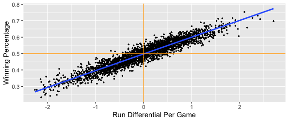 We clearly see that in general, teams that score more runs per game than they allow will have higher winning percentages. Specifically, a team's run differential per game has a correlation of 0.945 with its winning percentage. That is very close to a perfectly positive relationship, which would mean that run differential per game and winning percentage are directly linearly related. If I run a simple linear regression and use run differential per game to predict winning percentage, I get an R^2 value of 0.8931. This mean's that run differential per game accounts for 89.31% of the variability in winning percentage. If you don't know much about linear regression, don't worry; just take this as that run differential per game can explain about 90% of a team's ability to win. Most of the remainder is likely just due to the fact that a team can have individual games where they greatly outscore their opponents (or get outscored by their opponents) that throw the run differential per game off. The key is to have your runs scored per game be consistently greater than your runs allowed per game; if this is always the case, you'll never lose! Another important caveat is understanding player opportunity. At a team level, we care about runs scored and runs allowed. At a player level, we need to understand the strong bias of relying solely on runs scored and runs allowed for measuring value. Players that score more runs or drive more runs in (RBI) will still generally be better, but these values can be skewed. You can be a much better player and still score fewer runs and have less RBI. If your team has worse hitters that can't drive you in as well, you'll probably score less runs than an equivalent player on a better team. Likewise, if your teammates hardly ever get on base for you to drive them in, you'll probably have less RBI than an equivalent player on a better team. The same is true for pitchers; pitchers on a bad defensive team will probably allow more runs and earned runs. Earned runs only account for errors, and there's more to fielding than avoiding errors. To conclude, I could just say that the best batter is the one with the most runs scored per game and RBI per game, and that the best pitcher is the one with the lowest runs allowed per game or earned runs allowed per game, but both of those would be flawed. Obviously measuring by plate appearance or inning could be better, and these metrics would still have some merit, but we can do better. Furthermore, how would you measure defense? Now that I've hammered down why we care about run values (but not runs specifically) so much, let's get into how I derived my run-values, at a high level. The run values for my offensive events were calculated from 4 distinct pieces:
**Per this addendum, Run Driving In Value is no longer used and its respective pieces have merged into Baserunner Effecting Value** I'll take a moment to describe each of these pieces at a high level.
Now that I've explained these 4 pieces, here is a table that shows the run values by piece for each offensive event, as well as the total run value of the event:  **View this addendum for the updated weights of each event** An 'other Out' is an out that is not a strikeout, a sac bunt, a sac fly, or a groundball double play. From a player's standard batting stats, this would be calculated as AB - H - SO - GIDP. An 'uBB' is an unintentional walk, calculated simply as BB - IBB. A 'non-HR hit' is the weighted average of a single, double, and triple. This had to be done because most standard pitching datasets do not include specific hit types against pitchers, only hits and home runs. This is the case for the Lahman package in R, which was the source I used when applying this metric on actual player data. Note that the value of an error is the difference between the value of an other Out and the value of a non-HR hit. This means that the value of an error is -.8326 runs. **Per this addendum, the value of an error is now -.6797 runs** For stolen bases and caught stealings, the Run Scoring Value section is the increase or decrease in the probability of scoring that you receive when either stealing a base or being thrown out. For pitchers, the applicable inverses of these values are used. So for pitchers, any of our hit types or walks are negative values, but any of our out types are positive values. Pitchers also get docked -.2622 runs for each wild pitch and -.245 runs for each balk. For fielding, putouts and assists are treated as 'other Outs', but again the inverse value. Unassisted putouts get the full value of the out, while assisted putouts for first basemen only get 20% of the out value. Assists only get 80% of the out value. These values are purely subjective, with the intuition that a first baseman that just needs to walk a step or two to the bag and then catch a ball thrown at his chest likely has it easier than the fielder that has to run to the ball, field it, and then make a throw to first. I initially was leaning towards a 75%/25% split, but I surveyed the r/Sabermetrics sub-Reddit and found that most of my peers think the split should either be 80/20 or 90/10. With that in mind, I settled on the 80/20 split. Obviously not all assisted putouts require little effort by first basemen, such as when they need to make a scoop play or stretch out far for the catch. Catcher putouts via strikeout only get 33% of the out value. This was also subjective; I figured catchers should get a little more credit since they also play a role in calling pitches and in making balls become strikes via framing. This means that an unassisted putout is worth .3137 runs, an assisted putout for first basemen is worth .3137*.2 = .06274 runs, and an assist is worth .3137*.8 = .25096 runs. I will also note that the # of unassisted putouts by first basemen or the # of catcher putouts that are via strikeouts is not widely available information. I looked at these trends overtime at a team level and generally found that about 90% of all putouts by first basemen are assisted, and that about 93% of all putouts by catchers are from strikeouts. I will note that this assumption is more stable over time for first basemen than it is for catchers, since strikeout rates have been increasing over time. Since for double plays fielders also get credited for the corresponding putouts and assists, double plays for fielding only get the additional value that a double play would bring. A double play means 2 outs, which at face would have a value of 2*.3137 = .6274 runs. However, we see above that a double play is actually worth .7529 runs, so for each fielder involved in a double play we credit them .7529-.6274 = .1255 runs. Catchers get docked -.2622 for each passed ball and -.1469 for each base stolen on them, but get credited .4242 runs for each runner that they throw out. So the fundamental idea of my metric is that we have all of these different traditional recorded baseball events that we've used to evaluate players for many years. We know that more homers are preferable than less, and that more strikeouts by batters is not preferred. What we haven't known is how all of these events compare to each other. What was more impressive, Roger Maris hitting 61 homers or Rickey Henderson stealing 130 bases? Well, 61 homers is worth 61*1.4508 = 88.4988 runs, whereas 130 stolen bases is only worth 130*.1469 = 19.097 runs. What was worse, Jim Rice grounding into 36 double plays or Mark Reynolds striking out 223 times? Well, 36*-.7529 = -27.1044 runs and 223*-.3362 = -74.9726 runs. So things like stealing bases and grounding into double plays can't make or break a season, but can certainly make some players more or less valuable. That's the bones of my metric; we see what players have done, and we are now aware of how relatively valuable those things are, so we can determine which players were the most valuable. The other big piece of my metric is the comparison. WAR of course compares players' values to a mathematically-backed-into 'replacement' level. My metric instead compares to the first quartile, or 25th percentile, value. This is the value that 75% of players are greater than. I believe that this comparison is more straightforward, easier to calculate, and more statistically sound. Comparing values to quartiles or percentiles is a very common practice across all areas of statistics. Comparing values to arbitrary baselines is much less common. Additionally, quartiles are nice because they work like the median in controlling skewed distributions and outliers much better than the mean (what you probably think of as 'average'). Also note that instead of comparing players across a league-wide average (mean) and then adjusting for replacement level (which is what WAR does), I compare players to the league first quartile at their position. So consider the case of rightfielders in 1921. Babe Ruth absolutely dominated his position, leading by a wide margin with 54 homers. The positional mean number of homers would be about 10. That would put only 4 players above average, but 10 players below average. Put another way, Babe would be 44 homers above the mean, and the worst guy (Nemo Leibold, who hit just 1 HR in 480 PA) would be 9 homers below the mean. If we use the median HR value of 6.5 instead, we'd have 7 guys above average and 7 guys below average. Babe would be 47.5 homers above the median and Nemo would be 5.5 homers below the median. The problem with using the mean is that it allows larger values to skew what is considered "average". The mean is much higher at 10 home runs solely because Babe's excellence drove it up. The median is lower because it is just the middle value; it doesn't care how many homers Babe hit. By comparing Babe and Nemo's home run counts to the mean and median, we can see the effect of using both. The mean is more so punishing Nemo, while the median is more so rewarding Babe. Since Babe was the one that performed so greatly, I think it's better to use the measure that rewards him. It also makes more sense because now we have the same # of guys above and below average. This is a common procedure in the statistical world; when a distribution is highly skewed, rely on the median as the measure of average rather than the mean. Since great players have the ability to skew distributions, it's better to use the median. And again, the first quartile works the same way as the median; instead of the middle value, it's the value that's a quarter of the way in. The first quartile is used for largely the same mathematical reason that replacement level is used in WAR. We need a value to compare players to, but we don't want to use an average because being average actually has value. If you have the 15th best catcher in the league, you shouldn't be eagerly looking to get rid of him; he's better than half of the other guys around! If we compare to average, it makes our actual average players (that have a full season of data) look the same as guys that hardly played. There is tremendous value in being able to play at a decent level for a full season. By comparing to a lower level, we reward the average players for playing and recognize their value over a player that only played in a handful of games. WAR makes up a player and quantifies the level that he plays at as 'replacement' and compares players to him. I compare players to their contemporaries, specifically the bottom 25%. What sounds better to you: we should replace our catcher because he's worse than this made up, mathematically defined replacement player, OR we should replace our catcher because he is one of the 7 to 8 worst catchers in the league? The comparison to positional values is done because different positions demand different inherent qualities. A second basemen that hits many homers is unique (Mac from It's Always Sunny in Philadelphia will be the first to tell you), provided that he can still adequately play second base. If we compare to league-wide average, this becomes less impressive as the league wide average HR value gets flooded with corner outfielders and infielders, where power is more expected. Here's a snip of how some of the first quartile offensive event counts varied by position in 2010:  A second basemen that can adequately play the position on defense but hit 20 homers would look great compared to most second basemen, but not so much if we were to throw first basemen, right fielders, and designated hitters into the comparison. That's all there really is to it. Note that there are technically 3 ways that you could view my metric. One is to take the run-value weights and apply them to a player's absolute counts, ignoring the comparison to the positional first quartile. This doesn't help us measure players that may have played well, but only for a limited time such as due to injury, etc. Another way would be to apply the weights without comparison, but measure it on a rate basis. This would give us a value that is more like wOBA, batting average, ERA, or fielding percentage. We'd be able to tell which players are best when they play, but we wouldn't be rewarding players that play more. The final and preferred way is more comparable to WAR, whereby for each offensive and defensive event type, we see how many of that event a player recorded, we compare that value to his position's first quartile value, and then multiply that difference by the actual run value of the event. As a quick sneak peak of my next post where I'll go over the results of applying my metric to the 2010 season, if I rely on the absolute version, I get that the best batter was Miguel Cabrera. If I rely on the rate version, I get that the best batter was Gustavo Chacin, who hit a home run in his only plate appearance. The guy with the highest rate and a reasonable # of PAs for a season was Josh Hamilton. Hamilton was 2nd when using the absolute version; Cabrera only did more "good" offensive things because he had more plate appearances. Lastly, if I compare to positional first quartiles, I again see that Hamilton was the best batter. Cabrera actually comes in 3rd, with Carlos Gonzalez in 2nd because the quality of his batting was more valuable coming from an outfielder than Cabrera's was coming from a first basemen. I will acknowledge that I don't claim 4 decimal precision with these weights. To say that I definitively believe that a HR is worth 1.4508 would be a little absurd. Rather, when applying my metric and thus the weights on actual player data, I round the weights up to 2 decimal places. So when I was measuring Hamilton's and Cabrera's home runs in 2010, I weighted each one as being worth 1.45 runs. I won't go over the absolute version equations, since those are basically just the numerators of the rate equations. But below you can see the equations for each piece of Player Value, as well as the rate versions of the equations:   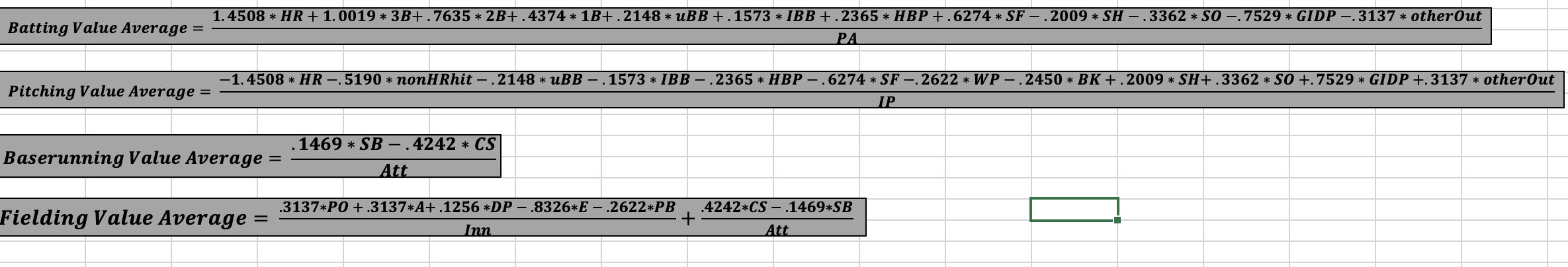 **The weights used in these equations reflect the original methodology. Refer to this addendum for the updated weights to be used in the equations.** That is it for the overview. Feel free to skip the Details section and scroll to the end if you have any comments, or if you want to take a look at some of the files that show my work. If you want to see how the sausage was made, move on to the Details section below. Details As mentioned above, wOBA and the idea of a run expectancy matrix served as the initial inspirations for my metric. Recall that wOBA weights events based on their run value, as measured by the average change in run expectancy as a result of that event in a particular season. You can look at some of the run expectancy matrices that Tom Tango developed for 4 different periods here. My metric doesn't fluctuate each year or even across periods, so I created a simple average of these 4 matrices. You can view this simple average run expectancy matrix from 1950 to 2015 below: 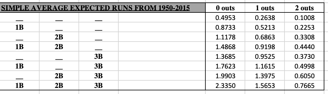 This table means that with nobody on and 0 outs, a team is expected to score .4953 runs that inning. If I were to hit a double and make the situation a man on 2nd with 0 outs, then my team is now expected to score 1.1178 runs that inning. That means I increased my team's expected runs that inning by 1.1178 - .4953 = 0.6625 runs, so my double is worth .6625 runs. However, not all doubles occur in this same situation, so the total change from all doubles in a season are added up and divided by the total number of doubles. This gives us the average change per double, which is the run value we'd use for doubles for a particular season. This process is repeated for each offensive event, each season. wOBA then shifts these values up by the value of an out so that an out becomes worth 0. This puts wOBA in a similar context of the normal metrics like batting average, on-base percentage, slugging, and OPS. Lastly, these values are divided by what is called the 'wOBA scale', which is the value that sets the league average wOBA equal to the league average on-base percentage. This means that wOBA in practice does not use run values for event types such as outs, even though Tango had computed them (here is an example using data from 1999 to 2001). You can compare Tango's values to mine and see that we aren't that far off. Besides the differences in how the run values are calculated, which I'll go into next, some other key differences between my metric and wOBA are:
Now that I've ironed out the key differences from my metric and wOBA besides the change in how run values are calculated, I will now outline how I calculated my run values. As mentioned above in the Overview, the run value for each event was split into 4 pieces. I'll have a subsection for each piece here. Run Scoring Value This is the probability that you will score as a result of your offensive event. It depends on which base you end up on, with the bases closer to home having larger probabilities. The probability of scoring if you hit a home run is 100% and the probability of scoring if you got out is 0%, but how were these other probabilities determined? My main source was the "Expected Runs Per Inning" tool created by Greg Stoll, which you can find here. Greg is a software engineer with an impressive resume whom Tom Tango has also complimented in the past. This isn't just some random data that I found by some random unqualified dude online. The tool allows you to enter a # of outs and a base situation (man on 2nd, bases loaded, etc.) and it will output the total # of times that given base-out state has occurred, as well as how many times different numbers of runs have scored in an inning from those states. The tool's page mentions that it used the same data as Greg's "Win Expectancy Finder" tool, which you can also view here. The "Expected Runs Per Inning" tool suggests that it used data from 1957 to 2015, but I believe that to actually be incorrect. If you put an identical base-out state into the "Win Expectancy Finder" tool, you'll see that the numbers line up. If you were to adjust the date range for the "Win Expectancy Finder" to be from 1957 to 2015, you'd actually get different numbers. The "Win Expectancy Finder" tool by default uses data from 1903 to 2021, so I believe this is the actual range of data used for the "Expected Runs Per Inning" tool. I used the tool for all 24 base-out states to find the total # of times each base-out state has occurred from 1903 to 2021, which you can view below:  Not surprisingly, bases empty with 0 outs occurs the most often, because every half-inning begins that way. While seeing these counts is cool, what matters more is the frequency of each state. That is to say, what % of the time are there men on 1st and 2nd with 1 out compared to bases loaded with 2 outs, etc. We get these values by dividing each value in the table above by the total count of 14.2 million in the bottom right corner. This gives us the frequency of each base-out state from 1903 to 2021, which you can view below: 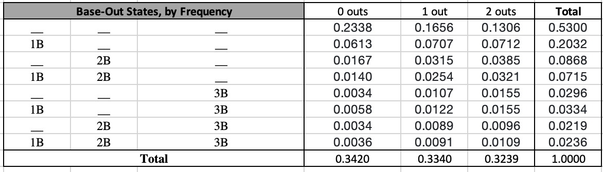 So we have men on 1st and 2nd with 1 out 2.54% of the time, and we have the based loaded with 2 outs 1.09% of the time. The most common state is again nobody on with 0 outs, and the least common state is men on 2nd and 3rd with 0 outs. Note that these counts and frequencies only come from the 'Total' output of Greg's tool. I repeated this process for the '0 runs' through '3 runs' outputs as well. The below tables show the # of times that 0 runs have scored, 1 run has scored, 2 runs have scored, and 3 runs have scored for each base-out state from 1903 to 2021:   So we can see in the about 3.3 million times that an inning has had nobody on with 0 outs, 0 runs went on to score about 2.4 million times, 1 run went on to score about 495k times, 2 runs went on to score about 228k times, and 3 runs went on to score about 105k times. This same logic can be applied to the other 23 base-out states to find the probability of scoring 0 runs, 1 run, 2 runs, and 3 runs for each base-out state from 1903 to 2021:   So with nobody on and 0 outs, we can expect a team to score 0 runs about 73% of the time, 1 run about 15% of the time, 2 runs about 7% of the time, and 3 runs about 3% of the time. Note that these only add up 98% because the other 2% of probability is for the odds that a team would score 4 or more runs. In determining the probability of scoring from a base, we only care about the probability of scoring 1+ runs, 2+ runs, or 3+ runs. We get these probabilities using the following equations: Prob. Of 1 or more runs = 1 - Prob. Of 0 runs Prob. of 2 or more runs = 1 - Prob. of 1 run - Prob. of 0 runs Prob. of 3 or more runs = 1 - Prob. of 2 runs - Prob. of 1 run - Prob. of 0 runs Using this logic, here are corresponding tables for the probability of scoring 1+ runs, 2+ runs, and 3+ runs for each base-out state from 1903 to 2021:  I have color coded these in such a way that the blue values apply to the probability of scoring from 1st, the orange values apply to the probability of scoring from 2nd, and the gold values apply to the probability of scoring from 3rd. Let's think this through. If the bases are loaded and you're the guy on 3rd, only the probability of scoring 1 or more runs applies to you. If the team were to score just 1 run, it would be you, since you're the leading runner on the base paths. If instead you were the guy on 2nd, then the probability of scoring 2 or more runs would apply to you. If the team scores just 1 run, that wouldn't be you; they'd need to score at least 2 runs for you to score. Lastly, if instead you were the guy on 1st with the bases loaded, only the probability of scoring 3 or more runs would apply to you. The team must score at least 3 runs for you to score. Note that this logic assumes that the leading runner will be the run that scores first. This may not necessarily be the case; a guy on 1st could get picked off and then the batter could hit a solo HR, and the team would still have scored a run resulting from a 'man on 1st' situation. Since this logic can be a little confusing, I have reordered the values below so that we have tables for the probability of scoring from 1st, 2nd, and 3rd for each base-out state from 1903 to 2021:  These 3 tables will be fundamental when discussing the Baserunner Effecting Value later on. The simple averages give us a rough idea of the probabilities by base, # of outs, or base situation, but a weighted average would be more accurate and preferred. I weighted each base-out situation by the frequency that it occurred. The following 6 tables show the # of times each base-out state occurred from 1903-2021 for each base (1st, 2nd, or 3rd), as well as the relative frequency in which each-base out state occurred:   The first set of tables comes directly from our first first table that showed the # of times each base-out state has occurred. The second set of tables comes by dividing each value in the first set by the table's total. There's been a man on 1st base about 4.7 million times, and there was only a man on 1st with 2 outs about 1 million of those times. This means that when there's a guy on first, the situation is just the man on 1st with 2 outs about 21% of the time. Similarly, when there's a man on 3rd base, the situation is bases loaded with 2 outs about 10% of the time. The last step is to multiply each of these frequencies by the probabilities of scoring from earlier. This gives us the weights we need to compute the weighted average probability of scoring, depending on which base you're on:  So the probability of scoring from 1st base is 25.08%. This value applies to singles, unintentional walks, intentional walks, and hit by pitches. The probability of scoring from 2nd base is 37.08%. This value applies to doubles. And the probability of scoring from 3rd base is 51.55%, which applies to triples. Note that the simple average probabilities from earlier suggested that the probability of scoring from 3rd was 60.33%. The simple average assumes that each base-out state is equally likely, so the high probability situations such as based loaded with 0 outs (86.62% chance for guy on 3rd to score) get incorrectly weighted much higher than they should. In reality, this situation only occurs 3.35% of the time that someone is on first. Since different base-out states occur more and less often, a weighted average probability is the right way to go. Above we saw the simple average probabilities of scoring for each base and # of outs. Below you can see the values for the more accurate weighted average probability approach. They are pretty similar to the simple average probabilities.  Note that these line up very well with a similar approach that Tom Tango had taken previously, which you can see here. Towards the bottom of the linked article he shows a table for the "Chance of scoring, from each base/out state" that also gives a guy on 3rd with 2 outs about a 29% shot of scoring, and so on. I will note that well after I had theorized this approach on my own, while still being familiar with wOBA and having purchased and read a portion of Tom Tango's "The Book", I stumbled upon an article of his where he employs a similar approach to mine rather than the approach that he ended up using for wOBA. You can view that article here. Looking at the two Tango linked articles together, we can see that he also had this idea of what he calls a "getting on base" value, as well as a "driving him in" value (from the 1st article) and then additionally a "moving over" value and an "inning killer" value (from the 2nd article). The getting on base connects with my Run Scoring, the moving over is a combo of my Run Driving In and Baserunner Effecting, and the inning killer connects with my Future Batters Effecting. Our breakups are similar, but if you look at the components you can see that the values and thus calculations are different. We seem to agree on a single's scoring chances, but I have a single being more valuable in terms of how it scores and advances runners. We disagree pretty largely on out values too. I mainly just want to acknowledge that I did not "invent" this approach to thinking about runs; other people have thought of it as well. I am embracing it more than Tango did though, and am showing all of my work as to how I developed the weights of each event. Run Driving In Value **This section is largely now obsolete. Refers to this addendum for details on how we now credit batters for driving runners in.** This is the average number of runs that were batted in (RBI) as a result of your offensive event. A leadoff single results in 0 RBI, but a single with men on 2nd and 3rd may result in 2 RBI. It's not the batter's fault if there are no runners on base for him to drive in, so instead we would find the average # of RBI per single and reward every single accordingly. My main source for this piece was Stathead, which is Baseball Reference's paid subscription. I'll link my sources here and mention them by name, but you may not be able to see some of the results if you don't have a subscription. Specifically, I used the "Batting Event Finder" for each event type offered by Stathead. Here's a link to the Batting Event Finder set to regular season triples from 1915 to 2021. Stathead has data for most of these events from 1915 through 2022, but I only used up to 2021 since the current season is incomplete. The calculation for this piece is much more straightforward for each event type; it is simply the # of RBI via the event divided by the # of times the event has occurred. You can view the triple example that I linked to above here:  Stathead knows of 96,604 triples that have occurred from 1915 to 2021, and that 57,921 RBI have scored from those triples. This means the average triple drives in 57921/96604 = .5996 runs. Stathead also provides me with the triple counts by # of outs and by base situation. While this is interesting information, it isn't used in determining the Run Driving In Value. Note that the base and out situations aren't known for every triple, but they are for the vast majority. This is the same case for the other event types. The exact same process is used for the other event types of singles, doubles, home runs, sacrifice bunts, sacrifice flies, strikeouts, walks, hit by pitches, and non-strikeout outs. Most of the work came in Excel from having to run multiple of these Stathead queries and then add them together. Rarer events like triples can be captured in a single query, but trying to capture all singles in history with a single query leads to timing out issues. Instead, I had to essentially get the singles from each decade and then sum them up to get the totals. Since Stathead doesn't have unintentional walks as a query option, I had to just subtract the intentional walks and the # of RBI via IBB from the respective walk (BB) values to get the average # of RBI per uBB. Likewise, Stathead only has a 'non-strikeout out' option that only has data from 1933 to 2021. Since sac flies and sac bunts are included in non-SO outs, I had to run separate queries from 1933 to 2021 for them and subtract their values to get a true 'other Out' value. I subtracted groundball double plays from the denominator of 'other Outs', but didn't take out any RBI via GIDP from the numerator since by definition a ground ball double play doesn't result in an RBI. Another note is that the sac fly RBI value actually came out less than 1, but I set the value equal to 1 since by definition a sac fly results in at least 1 run scoring, and the batter is credited with an RBI. As noted earlier, RBI resulting from a player hitting a HR and driving themselves in are removed. The value of 'driving yourself in' is already reflected in the higher probability of scoring that a HR has (100%) compared to the other bases. With the bases loaded, a bases clearing triple and a grand slam do the same thing in driving all 3 of the runs in. The HR is clearly better, because you've removed the nearly 50% in uncertainty of whether a guy on 3rd would score, but to credit the HR with an additional RBI would value it too much. Put another way, a home run should have about the same value as a triple followed by a steal of home; however, without removing these extra RBI, the HR gets credit for the RBI and the run scored, while the triple and steal of home only get credit for the run scored. Baserunner Effecting Value This is the increase or decrease in the probabilities of scoring that your event caused to existing baserunners. As mentioned previously, the probability that a runner on base will score depends on the current base-out situation. Generally advancing a runner will increase his probability of scoring, but increasing the # of outs will decrease his probability of scoring. The main sources for this piece were again Greg Stoll's "Expected Runs in an Inning" tool, as well as Stathead's "Team Batting Split Finder", which you can find here, and its "Team Pitching Split Finder", which you can find here. Stathead has a little more years of data for these, but I again used from 1915 to 2021 to align with the year ranges I used for the Run Driving In values. Note that I applied a Team Filter to only use data from the National League and the American League, and also combined each season's major league totals. I set the split type to Bases Occupied. These split finders told me how often each event type occurred in each base-out state. We already know how often each base-out state occurs, but to assume that each event type is equally likely for every base-out state would be wrong. For example, there have been 89,318 sac flies that Stathead has the base-out data for from 1915 to 2021. Of these, none have occurred with nobody on and 0 outs. This makes sense, because a sac fly generally requires a guy on 3rd base. Likewise, no sac flies have occurred with a man on 3rd and 2 outs. This also makes sense, because a sac fly with 2 outs is impossible; the outfielder that caught the ball would just make the 3rd out and the inning would be over. However, 4,934 sac flies have occurred with a man on 3rd base with 0 outs. This means that the first two base-out situations that I mentioned both comprise 0% of all sac flies, but the last situation comprises 4934/89318 = 5.52% of all sac flies. I use this same logic for each event type and base-out state to get the frequency of each event type, by base-out state. For example, you can see the # of singles by base-out state from 1915 to 2021, as well as the frequency of singles by base-out state below:  So singles are pretty uniform by # of outs, as about 35% occur with 0 outs and about 31% occur with 2 outs. However, singles are very dependent on the base situation, as about 55% occur with nobody on and only about 2% of singles occur with the bases loaded. At a more granular level, we see that 1.39% of singles take place with men and 1st and 2nd with 0 outs. I combine these frequency tables for each event with the probabilities of scoring by base-out state for each base type (1st, 2nd, or 3rd) that I developed earlier under the Run Scoring Value section using Greg Stoll's tool. The next step requires as much fundamental baseball logic as it does math. For each applicable base-out state, I assess the beginning probability of scoring for each baserunner. Then after the offensive event, I see what the new base-out state would be, and calculate the total change in scoring probability for all the baserunners. Lastly, I weight each situation's change in probability by how frequently the initial situation occurs. This gives me the weighted average increase or decrease in the baserunners' scoring probability, which is the Baserunner Effecting Value. To help see how this works, let's take a look at the calculation for the unintentional walk's Baserunner Effecting Value:  A guy on 1st with 0 outs has a 42.64% chance of scoring. You got walked and moved him to 2nd, so the new situation is men on 1st and 2nd with still 0 outs. He now has a 63.65% chance of scoring. This means that your walk increased his chances of scoring by .6365 - .4264 = 21.01%. If we naiively assumed that each base-out situation was equally likely, we could repeat this logic for each situation and then average the changes in probabilities and conclude that an unintentional walk on average increases the baserunners' probabilities of scoring by 13.49%. However, we know that some situations occur more often than others. A walk occurs with a man on 1st with 0 outs 4.18% of the time, but a walk occurs with the bases loaded and 2 outs just 0.71% of the time. So even though that bases loaded walk scenario is much more valuable (42.53% total increase in probability), it happens much less frequently. It only accounts for .003 of the value in our unintentional walk, while the less valuable but more common man on 1st with 0 outs scenario accounts for .0088 of the value in our unintentional walk. Overall, we see that an unintentional walk increases the baserunners' probability of scoring by 5.7%. Note that only 21 of the base-out states were listed above. The other 3 states are when the bases are empty. When the bases are empty, your walk won't increase or decrease the probability of scoring for any baserunners, since there are no baserunners to begin with. Also note that when a bases loaded walk occurs, you don't get credit for advancing the runner on 3rd to home. This is because you already get credit for this via the Run Driving In value. A bases loaded walk gives you an RBI. I believe that when Tango theorized his "driving him in" value, he did the opposite; he did credit events for advancing runners to home by the corresponding increase in scoring probability, but he didn't determine how many RBI an event got on average. I like my approach better because it's hard to know if a single would score a guy from 2nd or not; by relying on RBI, we can measure that proper proportion. **Note that the above is now incorrect. Refers to this addendum for details. We now DO credit batters for the corresponding increase in scoring probability that they provide the baserunners.** Another interesting note is that some walks can actually decrease the probability that a baserunner scores. For instance, with men on 2nd and 3rd and 1 out, the runner on 3rd has a 67.96% chance of scoring. However, with the bases loaded and 1 out, the runner on 3rd has a 67.15% chance of scoring. Your walk actually hurt his scoring chances by .6796 - .6715 = 0.81%, despite not impacting his advancement or not changing the # of outs. This is likely because of 2 things; for one, the play at home is now a force out, making it easier for any play at home to get the runner out since a tag won't be required; for another, a groundball double play is now possible, which would result in 3 outs and end the inning. Despite some walk situations being negative, they don't hinder the scoring probabilities that much, and they occur in less common base-out states, so overall getting walked is certainly a positive impact. A final interesting tidbit is the difference between the values of an unintentional walk and an intentional walk. These events have the same Run Scoring values because both of them get you to first base. However, the unintentional walk has a higher Run Driving In value. Bases loaded walks aren't ideal but do occur, but intentionally walking a run in has happened just 5 times, so the chances of getting an RBI via an IBB are slim to none. However, intentional walks also have noticeably lower Baserunner Effecting values than unintentional walks. This is because intentional walks are concentrated in the situations where a walk actually hurts the chances that a baserunner scores, such as men on 2nd and 3rd with 1 out. This was the case for just 0.97% of all unintentional walks, but happens 22.49% of the time for intentional walks. This type of logic is repeated for each event type, but some of them are a bit tricky, so I'll try to explain the special cases here. In general, I assumed that each baserunner would advance as many bases as the batter does. Any additional advancement by the baserunner is a credit to his baserunning ability, not an added value to the batter. This means that all singles with a man on 1st are assumed to result in a 1st and 2nd situation. If the baserunner were to advance to 3rd (or get thrown out attempting to do so), the increase/decrease would be pinned on him. Recall that I don't give the batter value for advancing baserunners to home, since they already get credit for doing this in the Run Driving In value. This means that triples and home runs both have a Baserunner Effecting Value of 0. If you hit a homer, everyone on base scores, so you get RBI for each. If you hit a triple, we expect everyone on base to score, including a man on 1st, so again you'd get RBI for each. Similar to this vein, only situations where the event can have an impact on scoring probabilities is considered. A sac fly can only occur in 10 situations (whenever there's a man on 3rd with less than 2 outs), a sac bunt can only occur in 14 situations (men on base with less than 2 outs), and a groundball double play can only occur in 8 situations (man on 1st with less than 2 outs). Across all event types, no situations are considered when nobody is on base; these 3 situations all have probability changes of 0. For sac flies, I only used situations when a man was on 3rd because only about 2.3% of sac flies occur when the leading runner is only on 2nd or 1st. Note that flying out and advancing a runner isn't a sac fly; to be a sac fly, a runner on 2nd or 1st must advance all the way home on a flyout. Doing this is an impressive feat that I believe should be credited to the baserunner, not the batter. Perhaps I could have given the batter credit for advancing the runner at least 1 base, but these situations happen so rarely that it won't have a significant impact on the total value of a sac fly, so I digress. I also assume that only the lead runner in sac flies advances; if there's men on 2nd and 3rd with 1 out and a sac fly occurs, I assume the new situation will be a man on 2nd with 2 outs. I'm not sure how common it is for the tail runner to also advance, so I didn't want to make a large unguided assumption if I didn't have to. My thought process was that on a flyball to left or center it's probably unlikely that the guy on 2nd would try to advance to 3rd, etc. For sac bunts, I do assume that both baserunners will advance. This is largely because the ball is in play (on the ground) and most of the time it's a force out, so the runners must advance. The sac bunt is a designed play to advance the baserunners, so they'll try to advance. The sac fly is more spontaneous. For groundball double plays, I only consider the situations where runners are forced to advance. If you grounded into a double play with men on 2nd and 3rd, the extra out is likely the baserunner's fault, not yours. The tricky part with the double plays is that the fielders have a decision in which players to try and get out. I couldn't find any data on the frequency of different double play types, so I had to make the somewhat unfortunate and lofty assumption that each scenario was equally likely. If there's men on 1st and 2nd, do you try to get the guys out and 3rd and 2nd, at 3rd and 1st, or at 2nd and 1st? I assume that each one has 33% chance of occurring. With the bases loaded it gets even more complicated, with 6 options for the fielders to take. Another twist is the 1st and 3rd situation. The guy on 1st must advance, but the guy on 3rd has a choice. How often would a runner on 3rd go home on a double play up the middle? I couldn't find any data to answer this, so again I assumed each was equally likely; 50% chance that he scores, 50% that he stays on 3rd. If he tries to score and gets out, that's his fault, not the batter's. Lastly, for double plays I did credit the batter for advancing runners home. This is because groundball double play's don't get credit for RBI, but I feel that there is at least some value in scoring a run, even if you did get 2 outs. The main argument against this is that the fielders chose to get the 2 outs rather than prevent the run from scoring. While this is largely true, there are surely some instances when a double play up the middle may have been possible, but getting a guy out at home wasn't. Furthermore, the value of the advanced base is still dwarfed by the creation of an extra out, so this addition only makes the groundball double play *less* negative for some situations. A double play isn't ever good, even if it scored a run. Stolen bases and caught stealings work largely as you would expect, with the exception of the 1st and 3rd situation, and double steals. I assume no double steals, so a 1st and 2nd with a steal always results in a 1st and 3rd situation. That is to say that I assume only the leading runner steals, and that the tail runner never steals simultaneously. The 1st and 3rd situation is unique in that both runners have an open base that they can steal. One would result in a 2nd and 3rd situation, but the other would result in a scored run and a man on 1st. I have the data to see how often a stolen base occurs with men on 1st and 3rd, but I don't have the exact data to see how often the man on 1st is the one stealing compared to the man on 3rd. Instead, I have to see at a higher level how frequently each type of base is stolen. I also obtained this info using Stathead, specifically the "Team Batting Season Finder", which you can find here. I set the Stats to Display to Baserunning, only used the American and National leagues, set the option to find combined seasons for franchise matching criteria, and set the data range to again be from 1915 to 2021. This gave me the total # of steals (and caught steals) for 2nd, 3rd, and home. I summed these up and found that 87.15% of steals are of 2nd, 11.34% of steals are of 3rd, and just 1.51% of steals are of home. Armed with this knowledge, I assumed that these proportions maintained for each base-out state. That is to say that I assumed that for a steal that occurred with men on 1st and 3rd, about 87% of them were of 2nd (resulting in 2nd and 3rd) and about 1.5% of them were of home (resulting in a run scored and a man on 1st). The increases or decreases in your probability of scoring from a stolen base or a caught stealing contribute to the Run Scoring value. The increases or decreases in the other baserunners' probabilities of scoring contribute to the Baserunner Effecting value. You advancing bases doesn't impact other baserunners' chances much, so stolen bases have a small Baserunner Effecting value. However, you increasing the # of outs certainly does hinder the other baserunners' chances of scoring, so caught stealings have a more noticeable Baserunner Effecting value. Note that you get credit to your Run Scoring value for advancing home. Like Tom Tango and wOBA have concluded in the past, generally the potential gains from a stolen base are far outnumbered by the crushing losses of a caught stealing, so a baserunner must steal bases at an impressive clip to be truly effective. These findings are one of the main reasons why stolen base attempts have decreased over the years. With a total SB value of .1469 and a total CS value of -.4242, a CS is worth about 3 times as much as a SB, so runners have to successfully steal about 75% of their bases to be effective (more specifically, the breakeven rate is about 74.27%). Future Batters Effecting Value The idea for this final piece is that getting out doesn't just hurt the chances that the runners on base will score, but it also hurts the scoring chances for the remaining batters that inning. We know that the probability of scoring depends on the base-out state, so we can use those probabilities and the frequencies of the different states from earlier to find the weighted average probability of scoring from each base, by the # of outs. We then see the average decrease in scoring probability for an additional out, and multiply that value by how many additional batters we expect to bat in the inning. Recall from earlier the graphic that showed the # of times each base-out state occurred from 1903-2021 for each base (1st, 2nd, or 3rd). We had used these values earlier to find the frequency of each base-out state. That is to say, what % of the time (when there is a man on 1st base) are there men on 1st and 3rd with 1 out? We now use these values to find the frequency of each base state, by the # outs, for each base type:  This means that when there is a man on 1st base with 0 outs, 72.37% of the time there is only a man on first, and 4.29% of the time the bases are loaded. Similarly, when there is a man on 3rd base with 2 outs, 30.14% of the time there is just a man on 3rd, and 21.14% of the time the bases are loaded. Note that this is also based on data from 1903 to 2021. I multiply these frequencies by each base type's probability of scoring by base-out state from earlier to find the weighted average probabilities of scoring by # of outs and by base type:  If you're on 3rd base with 0 outs, you have an 85.23% chance to score, but if you're on 1st base with 2 outs, you only have a 12.42% chance to score. The top table applies to singles, walks, and hit by pitches. The middle table applies to doubles, and the bottom table applies to triples. Regardless of the # of outs, a home run has a 100% probability of scoring, and an out has a 0% probability of scoring. For each of the event types, I then find the decrease in probability from 0 outs to 1 out, and from 1 out to 2 outs. The next step is to weight each event type by how likely it is to occur. To find this, I used Stathead's "Team Batting Season Finder', which you can find here. I combine each franchise's seasons from 1915 to 2021, while only using AL and NL seasons, and then sum all franchises up to get the total # of times each event occurred. I then divide by the total # of plate appearances to get the probability that each event will occur. The table below shows the # of times the event occurred, the probability of the event occurred, the probability of scoring with 0, 1, and 2 outs, and the decreases in probability from 0 outs to 1 out and from 1 out to 2 out, for each event type:  **Note that the above graphic uses the previous methodology's probability of scoring for each event. The calculation here works the same way now, but instead uses the updated scoring probabilities for each event. Refers to this addendum for details** Not surprisingly, getting a 'normal' out and striking out are two of the more common event types. We also see that the 2nd out is more detrimental for guys on 3rd base, but the 1st out hurts a little more for guys on 2nd or 1st base. I weight each event type based on its frequency (Prob. Of Event) and multiply that value by the probability decreases for the 1st and 2nd outs. The sum of these products gives me the weighted average probability decrease from 0 outs to 1 out of -4.92%, and the weighted average probability decrease from 1 out to 2 outs of -4.68%. I do a similar thing to find the weighted average probabilities of scoring with 0, 1, and 2 outs. Multiply each event type probability of occurring with its corresponding probability of scoring for each # of outs, and then sum each event's values. The weighted average probability of scoring with 0 outs is 16.03%, the weighted average probability of scoring with 1 out is 11.11%, and the weighted average probability of scoring with 2 outs is 6.43%. Now that we know the probability of scoring for each # of outs, we then must find the frequency with which each # of outs occurs to find the baseline probability of scoring. To get the out frequencies, I again used the "Team Batting Split Finder", but this time set the split type to Number of Outs in Inning. You can view that here. Like before, I used data from 1915 to 2021, only used the AL and NL, and combined each season's totals using a Team Filter. The results are that there have been about 13.6 million plate appearances from 1915 to 2021, with about 4.7 million occurring with 0 outs, about 4.5 million occurring with 1 out, and about 4.4 million occurring with 2 outs. Using the exact value, we get that the probability of having 0 outs is 34.58%, the probability of having 1 out is 33.34%, and the probability of having 2 outs is 32.08%. I multiply the probability of a given # of outs occurring by the probability of scoring given that # of outs and then sum up for each of the 3 outs to get the overall baseline probability of scoring of 11.31%. This is the probability that a batter has of scoring when he walks up to the plate. A batter has a chance of scoring when he goes up to bat because he has a certain chance of getting on base. By adding up each of the ways to get on base and their probabilities of occurring, we see that a batter in general has a probability of not getting out (getting on base) of 32.44%, and thus a probability of getting out of 67.56%. Since a batter has a chance to score when he walks up to the plate, we need to adjust our Run Scoring values from reality vs expectation. A single gives you a 25.08% chance of scoring, but you already had an 11.31% chance of scoring, so the real value of the single is the additional .2508 - .1131 = 13.77% of probability. Similarly, an out gives you a 0% chance of scoring, so the value of all outs is the loss of -11.31% of probability. This logic is how we get the Run Scoring Value Over Baseline. However, note that we are looking to find the Future Batters Effecting Value. In making outs, we don't care about the impact of the 3rd out. When the 3rd out is made, the remaining batters just get to bat next inning. However, when we make the 1st or 2nd outs, we force the batters after us to hit with more outs and thus with a lower probability of scoring. Since we only care about the first 2 outs, we need to find the probability of making the 1st or the 2nd out. We multiply the probability of making any out (67.56%) with the probability of having 0 outs or 1 outs (34.58% and 33.34%) to obtain the probability of making the 1st out of 23.36% and the probability of making the 2nd out of 22.53%. If you get out when there are 0 outs, then you made the 1st out, and likewise if you get out when there is 1 out, then you made the 2nd out. We add these values together to get the probability of making the 1st out or 2nd out of 45.89%. Since we only care about making the 1st and 2nd outs, we need to find their relative probabilities. That just means dividing the probability of making the 1st out by the probability of making the 1st out or the 2nd out, and the same for making the 2nd out. The relative probability of making the 1st out is 50.91%, and the relative probability of making the 2nd out is 49.09%. If you made the 1st or 2nd out, there's a 51% chance that you made the 1st out and a 49% chance that you made the 2nd out. Now we need to determine how many future batters our out will impact. The # of batters that we expect to bat after us for the remainder of the inning depends on which # out that we made. For the 2nd out, this is pretty easy. The probability of having just 1 more batter is the probability that the batter will get out (67.56%) and thus make the 3rd out. The probability of having 2 more batters is the probability that the first batter will not get out (32.44%) and the second batter will get out (67.56%); the combination probability of both of these occurring is .3244*.6756 = 21.92%. The probability of having 3 more batters is the probability that the first two batters will not get out (.3244*.3244 = 10.52%) and the third batter will get out (67.56%); the combination probability of all three of these occurring is .3244*.3244*.6756 = 7.11%. The process continues in this way. Below you can see the probability of having a given # of remaining batters with 2 outs:  You can see that by the time we get to 10 batters, the probability is quite small at 0.0027%. I did this for up to 20 batters, which has a probability that isn't even viewable from a 6 decimal standpoint. Like with any expected value, we multiply each probability of a value occurring by the corresponding value to get our overall expected value. This means .6756*1 + .2192*2 + .0711*3 + ... We end up with 1.4801 expected remaining batters with 2 outs. For the 1st out, things get a little more complicated. The probability of having 1 more batter is 0%, because that would just give us 2 outs. The probability of having 2 more batters is the probability that both of the next two batters get out, which is .6756*.6756 = 45.64%. The probability of having 3 more batters is the probability that only 1 of the next 2 batters gets out and the 3rd batter also gets out. Since we can either have the 1st guy get out and the 2nd guy get on base, OR the 1st guy get on base and the 2nd guy get out, the probability that only 1 of the next 2 batters gets out is .3244*.6756 + .6756*.3244 = 43.93%. Then the probability that the 3rd guy gets out is just 67.56%, so the probability of having 3 more batters is 2*.3244*.6756*.6756 = 29.61%. The process continues in this way. This is calculated more easily using combinatorics. If N is the # of batters batting after me, then the equation becomes: (N-1) nCr (N-2) * .6756 * (.3244 ^ (N - 2)) * .6756. If N = 3, we get the probability of having 3 more batters with 1 out. If N = 2, we get the probability of having 2 more batters with 1 out. Below is the table that applies this equation and shows the probability of having a given # of remaining batters with 1 out:  I again extended these out to 20 batters and found that we can expect 2.9602 remaining batters with 1 out. Finding the expected number of remaining batters with 0 outs is not needed and gets even more complicated. However, the expected # of remaining batters in an inning when we have 0 outs is 4.4403. Note that the probabilities of having just 1 more or 2 more batters are both 0%, since they would just leave us with 1 out or 2 outs. The equation for the probabilities of having N more batters (where N > 2) is: ((N-1) nCr 2) * (.6756 ^ 2) * (.3244 ^ (N-3)) * .6756 If we're the last batter, we need 2 of the batters before us to get out, the rest to not get out, and then we need to get out. If N = 3, we get the probability of having 3 more batters with 0 outs of 30.84%. If N = 4, we get the probability of having 4 more batters with 0 outs of 30.01%. Once we have the expected # of remaining batters for the 1st out and the 2nd out, we multiply them by the probability decrease of the 1st and 2nd outs, respectively. This gives us the total probability decrease of the 1st out of 2.9602*-.0492 = -14.56%. When we make the 1st out, we hurt each batter going to the plate's probability of scoring by about 5%, and we expect about 3 more batters to go the plate in the inning, so overall we hurt our team's probability of scoring by about 15%. Likewise, the total probability decrease of the 2nd out is 1.4801*-.0468 = -6.93%. When we make the 2nd out, we hurt each batter's probability of scoring by about 4.5%, and we expect about 1.5 more batters to come to the plate in the inning, so overall we hurt our team's probability of scoring by about 7%. Then recall that we have about a 51% chance of making the 1st out, and about a 49% chance of making the 2nd out. Multiplying these by the total decreases above gives us our weighted average total probability decrease of .5091*-.1456 + .4909*-.0693 = -10.82%. This is the Future Batters Effecting Value. This value only applies to outs (strikeouts, groundball double plays, caught stealings, and other outs). The rest of the events have a Future Batters Effecting Value of 0. That is it for the nitty gritty of how the run value weights for each event were calculated. You of course may be wondering if these weights are actually better than those used by OPS or wOBA. Similarly, for pitchers you may be wondering if these weights are a better metric than Batting Average Against or FIP. In short, yes, but let's take a look. To compare these metrics, I used the Lahman package in R, which you read about here. Anyone with R can download the package for free. The package has a "Teams" dataset that shows a variety of statistics for each team in history. The package's PDF that I linked to provides code to filter this dataset down to just include AL and NL seasons, as well as only include seasons in the modern era (1901+). The dataset has values for each team's # of games played, runs scored, and runs allowed. From these values we can calculate each team's runs scored per game and runs allowed per game. The goal is for our offensive metrics to correlate well with runs scored per game, and for the defensive/pitching metrics to correlate well with runs allowed per game. The package also has a "Batting" dataset for each player season in history. I can whittle the dataset down to only include players that played in the AL or NL and from 1901 and later. I then summed up each player's stats for a given team (and season), and merged this dataset with the teams data. From there I can compute the different offensive metrics for each team, and then compare them to runs scored per game. Let's see how good batting average is at describing runs scored per game:  Batting average has a correlation with runs scored per game of 0.788. This means that batting average is pretty strongly positively correlated with runs scored per game, so teams with higher batting averages will generally score more runs per game. If we fit a simple linear regression using batting average to predict runs scored per game, we get an R^2 value of 0.6209. This means that batting average explains 62.09% of the variability in a team's runs scored per game. So batting average is pretty good at explaining runs scored per game, but we can do better. We know that batting average won't be the best since it ignores the value of walks and treats all hits the same. Let's see how good on-base percentage is at describing runs scored per game:  On-base percentage has a correlation with runs scored per game of 0.8749, so it's even more related to runs scored per game than batting average. This makes sense, since on-base percentage acknowledges the value of walks. If we run a simple linear regression and predict runs scored per game using on-base percentage, we get an R^2 of 0.7655, so on-base percentage explains runs scored per game better than batting average does. However, we can still do better, since on-base percentage treats all hits the same. Let's see how slugging percentage does at describing runs scored per game:  Slugging percentage has a correlation with runs scored per game of 0.8424, so it's better than batting average but worse than on-base percentage. This is because while slugging does value the types of hits differently, the weights aren't accurate and it doesn't treat walks as having any value. The regression for slugging percentage produces an R^2 of 0.7096, so again slugging percentage is better at describing runs scored per game than batting average, but is worse than on-base percentage. How does On-base Plus Slugging (OPS) do at describing runs scored per game?  OPS has a correlation with runs scored per game of 0.9217, so it's the metric that has the strongest relationship with scoring runs thus far. This makes sense because OPS weights the hit types differently, is closer to weighting them correctly, and treats walks as having value. The regression for OPS has an R^2 of 0.8495, which is also the best thus far. OPS does a good job of describing runs scored per game, but we can do better yet. How does weighted on-base average (wOBA) fare at explaining runs scored per game?  Interestingly enough, wOBA actually only has a correlation with runs scored per game of 0.8982. While this is better than any of the 'triple slash line' metrics, it's worse than OPS. I used the exact wOBA weights listed by FanGraphs for each season here. The regression produces an R^2 of 0.8067, which is also worse than OPS. Hey Aaron, that's weird, I thought wOBA was better than OPS? Truth be told this isn't a new discovery. A retired economics professor pointed this out here in 2013. Tom Tango and this professor (as well as others) had a discussion in the comments of one of his posts in 2013 as well. The crux of the matter is that while a good offensive statistic should correlate well with runs scored per game, the one that correlates with runs scored per game the most isn't necessarily the best. I could easily just run a multiple linear regression to try to predict runs scored and arbitrarily use those weights. In fact, I did; using per game values for singles, doubles, triples, home runs, unintentional walks, intentional walks, and hit by pitches, I ran a multiple linear regression to predict runs scored and got an R^2 of 0.9077 and an adjusted R^2 of 0.9075 (when using multiple predictors, adjusted R^2 is the preferred metric). This regression produced the following weights for these events:  Those unfamiliar with R outputs probably don't care much for this image, but essentially it is telling us that a single is worth .55, a double is worth .63, a triple is worth 1.81, a homer is worth 1.31, an unintentional walk is worth .37, an intentional walk is worth .05, and a hit by pitch is worth .91. Those more familiar with R outputs will notice that the model says that intentional walks aren't significant, so I could remove those and run it again, but optimizing this isn't the point. The point is that this model is better at predicting runs scored per game than any of the metrics thus far, and *spoiler* better than mine too. Does that make it the best? No. I also converted these weights into a rate form and then compared that to runs scored per game. The correlation was 0.9423, again the highest. Hell, I even tacked on the other event types of strikeouts, sac bunts, sac flies, groundball double plays, and other outs and got an adjusted R^2 of .9435, and then tacked on stolen bases and caught stealings and got an R^2 of .9501. If we treat R^2 as the key to finding the best metric, I could easily rely on this MLR model and be better than basically any of the metrics currently in use. By the same token, I could just rely on a player's runs scored and RBI and also be able to correlate with runs scored per game well... Again, good metrics should have high correlations, but the highest correlation alone doesn't mean it's a better metric. Why is that the case? wOBA is better than OPS because it employs researched, mathematical rationale in deriving its weights. Seeing the OPS weights, and seeing our MLR weights above, tells us nothing about the events. We get no understanding as to why these events are worth what they are. Heck, the MLR thinks a triple is more valuable than a HR, and that a hit by pitch is more valuable than a single or a double. I doubt anyone honestly believes either of those statements to be true. It is much more important to understand why events are worth what they are and to understand how runs are actually created. Because wOBA does this and OPS does not, and because wOBA is still very correlated with runs scored per game, it is the better metric. Another note to add is that measuring teams' runs scored per game isn't going to translate perfectly into determining player value. Furthermore, as I mentioned in my last post, OPS is also flawed because it is biased towards slugging percentage (the inferior metric compared to OPS' other component, on-base percentage) and because it is mathematically unsound. OPS adds OBP and SLG, but OBP has a denominator of *basically* PA while SLG has a denominator of AB. So is my metric better? Well obviously I think so, or else I wouldn't have bothered sharing, but in short, yes. My metric goes through the process of mathematically determining the event weights using baseball rationale, and as a cherry on top is even more correlated with runs scored per game than wOBA or OPS are. How does my new metric do at describing runs scored per game?  My metric, which I'm calling 'Batting Value Average' for now (open to suggestions), has a correlation with runs scored per game of 0.9341, the highest of any metric thus far. Likewise, the regression has an R^2 of 0.8726, also the highest thus far. My metric can explain 86.95% of the variability in teams' runs scored per game. **Note that the updated metric has a correlation of .9463 and an R^2 of .8956. Refer to this addendum for details** Let's revisit how my metric's event weights compare to the other most common offensive metrics:  **Note that the updated metric has different weight comparisons. Referr to this addendum for details** You''ll notice that mine and wOBA's values for stolen bases and caught stealings are quite similar. You can also look here and see that my values are also quite close to Tango's unshifted, unscaled wOBA weights. We both have an out at about -.3, a HR at about 1.4, a triple at about 1, a double at about .76, and a balk at about .24 (if you scroll up to the top and see my non-offensive values). Where we differ is that I have intentional walks being worth more, HBP and uBB being worth less, strikeouts being worth less (to the batter, i.e. more harmful), and passed balls and wild pitches also being more detrimental. Tango considers some things that I don't, like reaching on errors, bunts, pickoffs, and defensive indifferences, while I consider some things that Tango doesn't, like sac flies and groundball double plays. But recall that the linked weights are only from 1999 to 2002, and that in reality wOBA has weights for each year that it shifts up so that an out is worth 0, and then scales to match the league average on-base percentage. An important distinction is that the other metrics just don't consider the weight of an out, whereas wOBA does but again just shifts all values up so than an out is worth 0. Another important distinction is that the wOBA weights listed here are weighted averages. I took the wOBA weights for each year and weighted them based on the # of plate appearances that year. I'll include the workbook that I did this in at the end of the post. I will admit that using these weighted average wOBA weights here, the correlation with runs scored per game is actually higher than my metric at 0.9415, with the regression's R^2 being 0.8864. However, I've found that this is solely because I chose to include IBB and SH, and wOBA does not. If I remove IBB and SH from my metric, I get an even higher correlation with runs scored of 0.9445, and the regression produces an R^2 of 0.8921. For now I stand by my decision to include SH and IBB, and since wOBA doesn't actually function like this weighted average approach, my metric is still superior. The main rationale in using different weights each year for wOBA is that different years have different run scoring environments. While I agree that the state of baseball certainly changes over time, I'm not entirely set on there being such drastic differences in run scoring environments to merit the stance that values of events literally need to be adjusted every year. Again, I believe that there is a true value of each event, and I am simply estimating that unknown true value to the best of my ability given the data available while applying necessary baseball logic. Take a look at teams' runs scored per game over the years:  There really hasn't been that much variation. There are certainly some peaks and troughs, but more or less the teams in the MLB are going to average about 4.5 runs scored per game. Other events like home runs have certainly become more common over time, but we can clearly see here that team's aren't really getting any better or worse at scoring runs. Rather, they have just adjusted how they score those runs over time. I don't think more or less of an event makes it less or more valuable. Singles aren't some commodity with finite demand. A walk-off single will win a team the game, regardless if it's the 23rd run scored that game or the 3rd, and regardless if it's the 12th single of the game or the 1st. It is for these reasons that I am against having specific event values for each season. One final note on the offensive side is that batting isn't everything that leads to scoring runs. Baserunning also plays an important part. The baserunning side of my metric isn't as comprehensive as I would hope it to be, mainly due to the lack of data, but I'll get into that later. I don't just want my batting metric to be better, but my baserunning metric as well. Let's compare my baserunning metric to stolen base percentage and the application of the wOBA weights. All 3 of these are pretty crummy at predicting runs scored per game on their own, but what really matters is how they can predict runs scored in conjunction with the batting metrics. If I run a multiple linear regression using OPS and stolen base percentage, I get an adjusted R^2 of .8928. If I run a regression using wOBA and the SB and CS wOBA weights, I get an adjusted R^2 of .8592. If I use the weighted average version's of wOBA, I get an adjusted R^2 of 0.8966. Lastly, if I run a regression using my batting metric and my baserunning metric, I get an adjusted R^2 of .9071. So by tacking on my baserunning, we see that it performs better than the other simple baserunning metrics that only consider stealing bases. **Note that the updated metric has an adjusted R^2 of .9238. Refer to this addendum for details** So I've shown that my offensive metric is the best describer of runs scored per game. Now I'll show that my defensive metric is the best describer of runs allowed per game. The Lahman package also has a 'Pitching' dataset that I can also sum up for all pitchers on a team for a given season, and then merge with the teams data. We want to see how different metrics that do NOT rely on actual runs do at describing runs allowed per game. Thus we won't use Earned Run Average (ERA), since it relies on earned runs, which are directly related to runs allowed; any run that was scored by a runner that reached base by an error is considered an earned run. ERA is simply the # of earned runs that a team allowed per 9 innings. This is done for the same reason that we don't just simply rely on a player's runs scored per game or their runs scored + RBI per game to measure their offensive value. Players that play with other bad players get the short end of the stick; as batters they don't have as many runners to drive in, and as a baserunners they don't have as many competent hitters to drive them in. By the same token, pitchers that play with bad fielders can also get the short end of the stick. Pitchers with poor defenses behind them will allow more runs. Only using earned runs eliminates some of this effect, but not all. Let's first look at how Fielding Independent Pitching (FIP) does at describing runs allowed per game:  FIP has a correlation with runs allowed per game of 0.7962. FIP works like an ERA estimator, so the higher a player's or team's FIP, the more runs they will generally allow per game. In fitting a simple linear regression to FIP, we get an R^2 of 0.634. This is decent, but we can surely do better. If I were to instead estimate earned runs per game using FIP, I'd get a correlation of 0.9162 and an R^2 of 0.8394. Let's see how opponent's batting average against a team's pitchers does at describing its runs allowed per game:  Batting average against has a correlation with runs allowed per game of 0.8471, which is better than FIP. The regression for batting average against has an R^2 of 0.7176, also better than FIP. If I were to instead estimate earned runs per game using batting average against, I'd get a correlation of .7432 and an R^2 of .5523. Let's see how on-base percentage against does at describing runs allowed per game:  Opponents' on-base percentage against a team's pitchers has a correlation with the team's runs allowed per game of .8971. When running a linear regression to predict runs allowed per game using on-base percentage against, the R^2 is .8048. Both of these are the highest yet, so we're moving in the right direction. If we used on-base percentage against to measure earned runs per game, we get a correlation of .8317 and an R^2 of .6918. So you may have noticed that batting average against and on-base percentage against are better at describing runs allowed, but FIP is better at describing earned runs. Note that in our fundamental win model, we care about runs scored per game vs runs allowed per game, not earned runs per game. Furthermore, a team wins a particular baseball game by having more runs scored than runs allowed. The 'earned' runs aren't used for determining who wins. Earned runs are just a construct of splitting blame on the pitcher vs the fielder. FIP does a good job of describing the portion that the pitcher is responsible for, but to the detriment of being a worse describer of how runs are allowed overall. Just because FIP can identify the things that a pitcher is solely to blame for doesn't mean that it does a better job of measuring pitcher performance overall (recall FIP ignores things like doubles that a pitcher allows; a pitcher isn't solely to blame for the double, but certainly is at least partially, if not for the most part, responsible for giving up the double). Lastly, let's see how my pitching metric does at describing runs allowed per game:  My metric, which I'm calling 'Pitching Value Average' for now (open to suggestions), has a correlation with runs allowed per game of -0.9217. On an absolute value basis, my metric has the best relationship with runs allowed per game thus far. Pitchers and teams with a higher value will tend to allow fewer runs per game. The regression for my metric has an R^2 of 0.8495, which is also the best so far. If instead I measure earned runs per game using my pitching metric, I get a correlation of -.9491 and an R^2 of .9007. So my pitching metric can explain 85.19% of the variation in a team's runs allowed per game, and 90.07% of the variation in a team's earned runs per game. These are both the best of any of the metrics discussed, so it doesn't really matter if we focus on runs allowed or earned runs. **Note that the updated metric has a correlation of -.9199 and an R^2 of .8462. Refer to this addendum for details** I will note that for pitchers, removing IBB does seem to improve the predictions of runs allowed per game, but removing SF as well makes it a little worse relative to just removing IBB. Nonetheless, I am going to still include both IBB and SF for now. My intuition is that even though on the pitching side intentional walks are entirely manager decisions and batters doing sac bunts may be luck of the draw, presumably good pitchers will be less likely to have IBB and more likely to have SH. If you're confident that your ace can get the batter out, you probably won't intentionally walk him. If you have little confidence in your batter to get a hit due to the sheer dominance of the pitcher, you're probably more likely to signal for a sac bunt. Just like how baserunning adds on to batting to describe runs scored, so too does fielding add on to pitching to describe runs allowed. None of the fielding metrics in isolation are particularly good at describing runs allowed, but we can add them to the pitching metrics to see how they improve the models overall. Specifically, we are running multiple linear regressions to predict runs allowed per game using fielding percentage and the other pitching metrics, and then comparing that to a regression that uses my fielding metric and pitching metric. The multiple linear regression of fielding percentage and FIP had an adjusted R^2 of .8137. The MLR of fielding percentage and batting average against had an adjusted R^2 of .6976. The MLR of fielding percentage and on-base percentage against had an adjusted R^2 of .7962. And as you may have guessed, the MLR of my fielding metric and my pitching metric had the highest adjusted R^2 of .8757. **Note that the updated metric has an adjusted R^2 of .861. Refer to this addendum for details** So focusing on adjusted R^2 values alone, we can describe 89.31% of a team's ability to win (winning percentage) using the difference between their runs scored per gamed and their runs allowed per game. From there, we can describe 90.71% of a team's runs scored per game using my batting and baserunning metrics, and we can describe 87.57% of a team's runs allowed per game using my pitching and fielding metrics. I'd say that's a pretty good understanding of what makes teams good, and thus a pretty good way to measure player performance. **Note that the updated metric can describe 92.37% of a team's runs scored per game, and can describe 86.1% of a team's runs allowed per game. Refer to this addendum for details** Like basically all statistics, my measure is not without its flaws, so let's hash out some ways that my metric could improve:
That is it for the list of things that I can think of right now that could immediately improve my metric. Most of this data is already available, it's just a matter of getting it in formats that make it easy for me to calculate my metric for many players at a time. Going player-by-player and then season-by-season would obviously take forever to accomplish. I hope you have enjoyed reading about my new metric. Again, the goal here is to compare players across MLB history. The advanced measurements available on Baseball Savant (Statcast) and sophisticated methods/available data used by FanGraphs and Baseball Reference to compute WAR are likely superior metrics to use to determine the value of present day players. While this post was certainly long, so too was my WAR post, and much of that consisted of linking to many other sources! Yes, my metric is still a bit complicated, but far less so than WAR (in my opinion), and with the work I've shown above and will include below, you are much better equipped to calculate and understand it on your own. One final review of the basics: we take the readily available and recorded baseball events and measure them per opportunity, then we compare to the first quartile for each position, and then we multiply by the run value of each event type. So instead of Wins Above Replacement, I guess you could call it Run Value Above Positional First Quartile or something. **Again, the Player Value metric has had some updates since this initial post. Refer to this addendum for details** Below you can find the files that I used to create and analyze my metric. The "player_value_weights" workbook will be the most useful, and details the calculation of the run-value weights for each event type. The "player_value_equations" workbooks shows the equations for my metrics, including the rate versions (similar to wOBA) and the versions that compare to the positional first quartiles (similar to WAR). The "babe_ruth_1920_example" workbook shows my work for why the median (and by extension, the first quartile) is a better method rather than relying on the mean. The "2010quartiles" workbooks shows the first quartile values for each position from the 2010 example. The "yearly_woba_weights" workbook shows the run-value adjusted wOBA weights for each season. This is basically a download of the Guts! page on FanGraphs, which I linked to earlier. The "weightedavg_woba" workbook shows my calculation of the weights for the weighted average version of wOBA. The "metricscompare" R file shows the code for how I compared the different batting and pitching metrics. This is how I got my different plots against runs scored per game and runs allowed per game. The "1bassistposandcstrikeoutpos" R file shows the code for how I set my assumptions that 90% of putouts by first basemen are assisted and that 93% of putouts by catchers are via strikeouts.
I think that these files (along with this lengthy post) should be all you need to understand my metric at a pretty deep level.
As mentioned, my next post will apply this metric to all players from the 2010 season as an example. Thank you all again for reading and as always let me know what you think in the comments! Statting Lineup Newsletter Signup Form: If you'd like to receive email updates for each new post that I make, sign up for the Statting Lineup newsletter using the link below: https://weebly.us18.list-manage.com/subscribe?u=ab653f474b2ced9091eb248b1&id=3a60f3b85f
1 Comment
Ah, WAR. The metric that has taken the baseball world by storm, whether it be for deciding who in a given season is the best player and most deserving of the MVP award, or even deciding who cumulatively are the best players of all-time and deserve to be in the Hall of Fame in Cooperstown. Many people love to use WAR these days, be it the baseball math nerds or even the more traditional baseball fans that are starting to learn the new ways. To me, the problem is that neither of these parties truly understand WAR. The traditionalists may write off WAR altogether, but when they do use it are wise enough to not use it as an end-all be-all of player performance. The analytics gurus use WAR with reckless abandon, crafting as many different splits and scenarios as they can imagine all based around WAR. However, despite the strong analytical acumen of this party, most members take WAR as is, treating it like any ordinary recorded statistic. WAR is not batting average, an easily calculated, in-the-moment, recordable statistic; rather, WAR is a complex framework for measuring overall player value. Many people that are very likely capable of actually understanding WAR choose not to do so. Even pages online that are meant to help describe WAR fail to adequately provide all of the details in one convenient place. It is my opinion that if anyone is to rely so heavily on WAR for their opinions on which players are the best, they ought to know how it is actually calculated. Thus is the purpose for this blog post: what is WAR, how is it calculated, and what are some of the benefits and drawbacks of using it as the primary basis for determining a player's total contributions? WAR: How It's NOT Calculated The first step of WAR is knowing what it stands for! WAR is an acronym for Wins Above Replacement. The general idea is that it stands to measure how many more wins a player is worth compared to a replacement level player. From an initial intuitive standpoint, we may think that WAR is calculated in an entirely different way from how it actually is. For instance, suppose we have a starting catcher who, when in the lineup, results in his team having a winning percentage of .600. Now suppose that whenever the backup catcher plays instead, the team has a winning percentage of just .400. That's a .200 increase in winning percentage when the starter plays, which across a 162 game season is worth about 32 games. So, maybe we think the starting catcher is worth 32 wins above the replacement/backup catcher. An alternative way to think this through is that if the team were to go .600 with the starting catcher for all 162 games, they'd win about 97 games, and if they went .400 with the backup for all 162 games, they'd only win about 65 games, which again is a difference of about 32 games. Of course, this example is certainly extreme, but based solely on the name of WAR - Wins Above Replacement - this may be how we think WAR is calculated. My favorite baseball podcast, which I often listen to on my drive to and from work, is called Effectively Wild and is sponsored by FanGraphs. The podcast is free to listen to on the Apple Podcasts app (and surely other podcast apps, for you non-Apple users). On episode 1841, they discussed ESPN baseball reporter Jeff Passan's tweet about the increase in the Minnesota Twins' record when star outfielder Byron Buxton is playing. About an hour and 3 minutes into the episode, they do a segment discussing the tweet and the inaccuracies of such an approach to assessing player value. Based on Passan's tweet, Buxton increases the Twins' win pace from 75 games to 101 games, making his supposed valued about 26 games! In the episode segment, they sought to find the player whose team's winning percentage increased the most when they played, for a 3 year stretch (the amount of time referenced in Passan's tweet). The results are... not promising. By this thought process, Mike Squires, a first basemen for the Chicago White Sox in the '70s and '80s, is the most valuable. From 1982 to 1984, the White Sox had a .669 winning percentage with Squires in the lineup at any point during the game, and a .145 winning percentage without Squires. As the workbook shows, you're hard pressed to find any truly memorable player at the top of list. The closest is Curt Flood, who while a great player and an important figure in baseball history, certainly wouldn't be anyone's pick for the greatest ever. On the reverse side, some of the seemingly worst players ever - players whose teams had higher winning percentages with them not appearing in the game - included some notable Hall of Famers, such as Enos Slaughter and Johnny Mize. Clearly this approach isn't accurate, but why is that? For one, many of the 'best' players were defensive replacements, who appeared later in games when their team was already ahead, making it much more likely that they would win. Alternatively, many of the 'worst' players were pinch hitters, who also appeared later in games but generally when their team was losing, making it more likely that they would lose. To avoid these substitution issues, the same analysis was done again, but this time only looking at the winning percentage of the team when the player started the game. These results are on the 3rd tab of the workbook, and the results are slightly better, but still not significant. We see some more names we know at the top, such as Shoeless Joe Jackson, Nap Lajoie, and Barry Bonds, but also many more recent or active players, such as Javier Baez, Andrew Benintendi, Manny Machado, and Trea Turner. But there are also notable names amongst the players at the bottom, such as Tony Gwynn, Craig Biggio, Reggie Jackson, and Xander Bogaerts. I doubt anyone thinks that Andrew Benintendi is one of the greatest MLB players ever, or that Tony Gwynn is one of the worst. The reason these results are so off is simply because whether a team wins or losses a game has many more factors to it than just a singular player's presence. For instance, whether or not other starters are also sitting out, making the overall starting lineup worse and less likely to win. Or, whether the normal starters just happen to play worse when one guy happens to be out. Most importantly, who the other team is! If the backups always play against the bad teams, but the starters have to play against the good teams, the team will likely have a higher winning percentage with the backups. The list goes on. In conclusion, Wins Above Replacement sounds like it would be how much more a player's team wins when he is playing versus when he's replaced, but it isn't, and that approach isn't a good indicator of actual player skill. We could try to isolate all of these other factors and use this approach, but I haven't seen such a thing been done and it would likely result in far too small of sample sizes for each player in question. WAR: The Basics Major League Baseball has an online glossary where it defines most of the statistics used in the game. Included in this glossary is WAR, which MLB makes sound like a fairly straightforward calculation. Again, WAR stands for Wins Above Replacement and seeks to measure the number of wins a player is worth above a replacement level player. Unlike nearly all other statistics, WAR is not a simple plug-and-chug formula based on recorded baseball events, such as getting a hit or striking out. Rather, WAR is more of an ever-evolving framework for determining player value. The general framework for WAR is based on determining the # of runs a player is worth in different areas of the game, and then translating those runs into wins (something I disagree with, which I'll touch more on later). See the general framework equation for position players below:  Pitchers are similar, but we may measure pitching WAR in a different way and then combine that with the pitcher's position-player WAR to get their total WAR. This looks easy, but in reality none of these are simple, recorded events. Not even Batting Runs or Baserunning Runs are variants of RBI or runs scored, but entirely different calculated measures altogether. To define the 'statistic' of WAR is really to define a long stream of statistics that are encompassed in WAR, which is what I'll be doing today. Again, WAR is really more of a framework than a statistic; the people who calculate WAR may change how they calculate these different Run components whenever they want, and do. Generally these changes are due to having more data to include, but the lack of this new data for older players makes the use of WAR when comparing players of different eras and for Hall of Fame consideration particularly troublesome. Because of this, WAR is a much better metric to use to compare current players than it is to compare all players in history. We just don't have the data for Babe Ruth that we have for Mike Trout, and using one version of WAR for Ruth and a different version of WAR for Trout and then comparing their WAR values isn't ideal and really shouldn't be done. Because of the differences over time in calculating WAR, as well as the inherent flexibility/subjectivity in its calculation, there are actually 3 distinct versions of WAR that are determined by 3 different baseball entities. If you see fWAR, that does NOT mean fielding WAR, but rather WAR as calculated by FanGraphs. Likewise, bWAR or rWAR don't mean batting or running WAR, but rather WAR as calculated by Baseball Reference. Lastly, WARP is calculated by Baseball Prospectus, whose version stands for Wins Above Replacement Player. Baseball Prospectus usually makes you pay to see the methods behind their madness, and people generally care more about WAR than WARP, so I'll only focus on the first two in this post. So, not only will I have to dig into each of the specific calculations for the 'Runs' metrics listed in the above equation, but I'll have to describe how FanGraphs and Baseball Reference both calculate each piece! What fun! Let's take a look. Batting Runs Batting Runs is meant to measure the offensive value (in terms of runs) of a player whilst batting, i.e. at the plate. The first step to calculating Batting Runs, which Baseball Reference refers to as Rbat, is calculating Weighted Runs Above Average (wRAA). Both websites use the same basic framework. You can read up on Baseball Reference's version here, and on FanGraph's here. Let's take a look at the equation:  This stat is kind of like if you were given a player's batting average and the number of at bats he had and wanted to determine how many hits he produced, or similarly if you were given a player's on-base percentage and the number of plate appearances he had and wanted to determine how many times he got on base. Essentially, we use a rate stat and combine it with the # of opportunities we have to determine the # of successes we end up with. The first difference here is that the final result isn't a recordable thing where we actually know how many a player achieved (as with hits), but rather a total that we must calculate and use on its own (weighted runs isn't a metric/event recorded during a game). The second difference is that we don't just care about the total final result, but rather how many more a player gets above average (i.e. instead of # of hits, we want # of hits above average, or in this case # of weighted runs above average). The third difference is that we don't use batting average to determine the # of weighted runs, but rather something called Weighted On Base Average (wOBA). So, what is wOBA? Essentially, wOBA is a rate stat that seeks to explain offensive value better than the traditional triple-slash-line metrics (batting average, on-base percentage, and slugging percentage) do, as well as better than OPS (on-base plus slugging) does. Let's enter a tangent on these, as really understanding wOBA is important on its own. If you need a refresher on these different rate stats, feel free to read an earlier article of mine that discusses them, or look them up in Google or in the MLB glossary linked above. Batting average is the most traditional offensive rate stat, and tells us the % of times a player got a hit, when he had the chance to (we use at-bats as the denominator, so we exclude sac bunts, sac flies, walks, catcher interferences, and hit by pitches). As we can see below, batting average certainly explains some of the ability of a team to score runs (generally, a higher team batting average means a team scores more runs per game), but it could be better.  The downside of batting average is that it does NOT consider walks or hit by pitches, and also considers all hits to be of equal value. Walks mean the runner is on base and has a chance to score, so clearly there is value there. Also, clearly home runs, which for sure score the batter and any other runners on base, are more valuable than singles that only give the batter a chance to score. The next step up is on-base percentage (OBP), which does slightly better in that it does consider walks and hit by pitches. The book and movie Moneyball became famous in describing the 2002 Oakland Athletics' strategy to prioritize players with higher on-base percentages rather than batting averages, leading to great regular season success. Let's see how a team's on-base percentage does at describing its runs per game:  Better than batting average for sure, but there's still room for improvement. For one, on-base percentage still considers all hits to be of equal value, which is of course wrong. Then we have slugging percentage, which finally weighs the different types of hits differently. Singles are worth 1, doubles are worth 2, triples are worth 3, and home runs are worth 4. How does a team's slugging percentage do at explaining its runs scored per game?  While this is still better than batting average, it's actually a bit worse than on-base percentage. This is because slugging percentage ignores the improvement from on-base percentage in considering walks and hit by pitches, and also because the hitting weights that slugging percentage uses aren't actually all that correct. While a single certainly isn't worth as much as a home run, the long ball isn't quite 4 times more valuable than a typical base-knock. Then steps in OPS (literally, On base Plus Slugging), which combines on-base percentage and slugging percentage to form a rate stat that actually weighs the types of hits differently and still considers walks and hit by pitches as valuable. As we can see, a team's OPS is the best describer of its runs scored per game yet:  OPS is a pretty solid indicator, but almost out of coincidence. There's no real work out there supporting why the OPS weights should be what they are, but rather it's just a quick and easy-to-calculate stat that does pretty well. Since it adds OBP to slugging, the weights are essentially 1 for a walk or HBP, 2 for a single, 3 for a double, 4 for a triple, and 5 for a home run. However, OPS is mathematically sinful in that it adds two pieces with different denominators; the denominator of OBP is plate appearances, but the denominator for slugging percentage is at-bats. Furthermore, since slugging percentage is nearly always a higher figure than OBP is (a good OBP is .400, a good slugging is .600), OPS is slightly skewed towards favoring slugging percentage. Thus, players that lead the league in slugging are more likely to lead the league in OPS than players that lead the league in OBP. This shouldn't be the case, since we showed previously that OBP is actually better than slugging. Truthfully, a quicker and more accurate approach would be to use something along the lines of slugging plus 1.5 to 2 times OBP; that makes the inherent weights closer to what wOBA supports. OPS is a better indicator than the other 3, but we can still do better, and try to actually explain our weights by using mathematical and baseball logic. Enter wOBA. The first step to understanding wOBA is understanding RE24, which is the Run Expectancy based on the 24 base-out states in baseball. There are 3 out situations where play continues in baseball: 0 outs, 1 out, or 2 outs. Likewise, there are 8 distinct combinations of runners on the bases, from nobody on to the bases loaded. Combining these, we have a total of 24 distinct base-out states that exist in baseball, such as a man on first with 1 out or a man on third with 2 outs. Not surprising, we can expect that the number of runs a team will score on average depends on the base-out state that the team is in. It's more likely that you'll score more runs with 0 outs and the bases loaded than with 2 outs and nobody on. Below is an example run expectancy matrix from FanGraphs, showing how many runs we expect a team to score based on the base-out state:  Note that this isn't the golden, catch-all run expectancy matrix for all of baseball history, and nobody appears to use the matrices in that way. Rather, the matrices vary based on the data being used to develop them, and it's common to develop different matrices for different years or periods of time. For example, Tom Tango has a different run expectancy matrix located here, using data from 1999 to 2001. Tango has an even more comprehensive run expectancy matrix located here, which has 4 different matrices for 2010-2015, 1993-2009, 1969-1992, and 1950-1969. The post also shows the frequency of each base-out state across these periods, as well as the probability that a run will score for each of the base-out states. The next step is using these run expectancies to calculate the weights for our different events in wOBA. FanGraphs makes this sound more complicated than it really is and refers to it as Linear Weights. Tom Tango also explains linear weights here. In reality, you simply start with the current base-out state and see which state you ended up in, as a result of the offensive event. The weight is simply the change in the resulting run expectancy, plus any runs that actually scored. For example, using the above run expectancy matrix, if the bases are empty with 0 outs, my team expects to score .461 runs. If I then hit a single and change the state to a man on first with 0 outs, the expectation goes up to .831 runs, meaning my single increased my team's expectancy by .831 - .461 = .37 runs, so the weight for my single would be .37 runs. If instead I hit a home run, the ending state would be the exact same, but I actually scored a run, so the weight for my homer would be 1 run. If I hit a double with 2 outs and men on first and third, and both runners score, my starting expectancy was .471 runs, and my end state expectancy (man on 2nd, 2 outs) is .305 runs + the 2 runs that actually scored or 2.305 runs. Then the value of my double would be 2.305 - .471, or 1.834 runs. The process is the same for any event type and any base-out state. Find the difference in run expectancies for the start and end states and add any runs that scored. As you may imagine, the resulting weights for the same event type can vary heavily; a single with 0 outs and the bases empty won't increase the expectancy as much as a single with 2 outs and the bases loaded with 2 runs scoring. The core philosophy behind the weighted runs approach is that the traditional stats of RBI and run scored are too contingent on the skill of a player's teammates, and thus fail to accurately reflect the player's own skill. You could bat 1.000 and hit only triples for an entire season and *technically* never record any RBI if nobody was ever on base when you were up to bat, and also never score a run if nobody else ever drove you in or you never stole home or advanced on a wild pitch, passed ball, or a balk. Since you driving people in is dependent on there being people on base, and you scoring is mainly dependent on other competent batters driving you in, RBI and runs scored are slightly flawed metrics in measuring an individual player's general run producing value. So, instead we seek to figure out the average run value of the different offensive events and assess value that way. Because of this, we don't add up a player's total increase in their team's run expectancy for all their offensive hits. Rather, we look at the total increase for a given event type for all players, and then divide by the number of times that event occurred to get the average increase in run expectancy for that event type (be it singles, doubles, etc.). Put another way, I don't determine that one of Joey Votto's singles was worth x runs and that another was worth y runs and then add those all up, but rather determine that any single on average is worth z runs and multiply by the # of singles that Votto recorded. If we didn't do this, we'd be repeating the flaws of RBI and runs scored since the value of our events would be dependent on how many runners are on base. This average increase in run expectancy is *almost* the weight for the event type in the wOBA formula. This post by Tom Tango, the creator of wOBA, shows the weights for each event type by base-out state, as well as their overall average values, using data from 1999 to 2002. The final step to get the wOBA formula weights is a little bit of shifting and scaling. First, since the other rate stats like batting average, OBP, slugging percentage, and OPS all treat outs as having 0 weight, all of the weights are shifted up by the value of an out. As the Tango post above shows, an out is actually worth about -.3 runs; thus, all other event types are shifted up by .3, meaning our HR value of 1.409 becomes 1.709. Second, to put wOBA on a scale that is familiar with baseball fans (i.e. easier to determine what a 'good' wOBA is), all of the wOBA weights are multiplied by what is called the wOBA Scale so that the total scale of wOBA is the same as the league's average on-base percentage. The wOBA Scale is simply the unscaled (but shifted) wOBA divided by the league average OBP. So, if say my wOBA Scale was 1.15, I would multiply that by 1.709 to get my final wOBA weight for HRs as 1.965. Once we have all of the now scaled wOBA weights, we can use them in our actual wOBA equation, which works similar to the other offensive rate stats. The below equation is from The Book, Tom Tango's book where he discusses wOBA and other statistical baseball topics:  The NIBB stands for non-intentional bases on balls (all walks besides intentional walks), and the RBOE stands for reached based on error, a figure that most wOBA equations today don't include. In The Book, Tango used a different dataset, so his initial unscaled weights were slightly different, thus the difference in the HR weight here. Nonetheless, the process is the same: determine the unscaled weights by using the run expectancy matrix and linear weights, shift the weights up based on the run value of an out, and then multiply by the wOBA Scale to get wOBA on the same scale as on-base percentage. How does a team's wOBA do in describing its runs scored per game? Let's take a look:  While it may be difficult to visually see, wOBA is the best describer of run scoring yet, even better than OPS. And better yet, wOBA actually has some thought and data behind why it weights each event type a certain way. However, to me, wOBA is not without its flaws either. Unlike our other rate stats, whose weights (albeit inaccurate) are definitively locked in until the end of time (i.e. a single is always worth 1 in slugging percentage), the wOBA weights are actually recalculated and applied every season. FanGraphs has a list of the wOBA weights and the wOBA Scale for each season, here. It's my opinion that a single does have a true intrinsic run value throughout the course of baseball history, and that players who hit more singles in a given year shouldn't be docked because supposedly singles were less valuable that season. I believe that the value of a single doesn't come from its relative frequency/demand (it's not a stock or commodity), but rather solely in how close it puts the batter to scoring and how many runs it drives in on average. To this end, I have my entire own rate statistic and measurement of player value that I look forward to introducing soon. Now that we know all about wOBA, returning to the wRAA equation is fairly straightforward. First, we calculate the league average wOBA for that season, and subtract it from wOBA. Since we're calculating weighted runs above average, we only care about the 'above average' part of wOBA. Second, you'll notice that wRAA actually divides by the wOBA Scale, returning us back to our more true weights. wRAA is a standalone statistic and doesn't care about being on the same scale as the league average on-base percentage, like wOBA does. Doing so brings us to what Tango referred to as the 'Run value per PA above average'. By multiplying by a player's actual plate appearances, we get his wRAA as shown in the equation above. Now that we have wRAA, the two sites apply some different adjustments to get their versions of Batting Runs. FanGraphs adjusts by league and park. I somewhat agree with park adjustments, but am more against league adjustments. For the park adjustment, FanGraphs uses what are called Park Factors. The idea is that some parks are higher or lower run scoring environments, so each player's wRAA should be scaled by his home team's Park Factor to adjust his offensive skill. My earlier 'Defining Statistics' article also discussed park factors. Baseball Savant has a list of Park Factors by team and event here, and FanGraphs describes them in more detail here. Baseball Reference also adjusts for park, and details that here. I won't go into the specifics, but essentially teams who have ballparks that experience more runs scored than average will have Park Factors greater than 1, and teams whose parks experience less runs being scored will have Park Factors less than 1. Thus, players that play for a team with a higher Park Factor will have their wRAA decreased (so we don't favor Rockies or Reds players too much), and players that play for a team with a lower Park Factor will have their wRAA increased (so we don't penalize Mariners or Athletics players too much). The adjustment is done by taking the MLB league average runs per plate appearance, and subtracting from that the park-adjusted league average runs per plate appearance, weighted by the player's number of plate appearances. A lot there, so look at the equation later on. A similar thing is done for the league adjustment, but instead of using the MLB league average runs per plate appearance, we use the MLB league average Weighted Runs Created (wRC) per plate appearance. Well, what is wRC? Take a look:  wRC is another Tango creation and is described by FanGraphs (along with the more popular wRC+) here. You may notice that the first part of this equation is similar to wRAA; wRAA is just wRC with the league runs per plate appearance set to 0. So, wRC is basically just wRAA but scaled for the league's run scoring environment that season. Ok, so let's move on back to adjusting wRAA to get Batting Runs. With the league adjustment, we take the overall MLB league runs per plate appearance and subtract from it the specific AL or NL league wRC per plate appearance, and then multiply by a player's number of plate appearances. Take a look at the equation below to get a better feel. Finally, to get Batting Runs for FanGraphs, we take the baseline wRAA and add the park and league adjustments as discussed to get the following equation:  Realistically, I fail to directly see the rationale behind using the AL or NL wRC per plate appearance as an adjustment. It would make more since to me to simply calculate another 'League Factor' as the AL R/PA divided by the NL R/PA (or vice versa) and then multiply that factor by the MLB R/PA as the value to subtract and adjust by, but I digress. I also disagree with the prospect of having to adjust for specific league as well. As this shows, in the 117 World Series played in history, the AL has won 66 times and the NL has won 51 times, meaning the AL wins the World Series about 56.4% of the time. That's not a big enough change from .500 for me, especially since much of the AL victories are attributable to one specific team, the New York Yankees. Likewise, as this shows, in the 91 All-Star games that have been played in history, the AL has won 46 and the NL has won 43, with 2 ties. While I still have more research to do on my end before I can fully support or be against park or league adjustments, for now I feel that the league adjustment is unnecessary, and while I acknowledge that some parks are easier to score in than others, I fear adjusting real, recordable events like home runs by some factor into hypothetical amounts. The more recent innovations where we can actually determine if a given ball would be a homer in different parks based on its launch angle, distance, exit velocity, etc. is a much better approach to adjusting for park, in my mind. Since we don't have this data for our older players, I may be in favor of not using park factors at all when comparing players across time. We've finished Batting Runs for FanGraphs, but still have to tidy up Baseball Reference's adjustments. As I said previously, Baseball Reference also adjusts for park and league. It adjusts by park as below, where the Ball Park Factor (BPF) is on a scale of 100 being average, unlike with FanGraphs and Baseball Savant where the factors are on a scale of 1 being average: wRAA_pf = wRAA - (BPF/100 - 1) * PA * lgR/PA / (BPF/100) The rest of the adjustments aren't shown formulaically, but rather just mentioned. Baseball Reference cites the differences in runs per game by the AL or NL in certain years as a reason for the need for a league adjustment (in 1933, AL averaged 5 runs per game, NL averaged 4). Baseball Reference adjusts wOBA to rOBA, which doesn't include pitcher batting stats in its calculation. rOBA values infield and outfield hits of the same type (mainly singles) differently, and likewise values batted-ball outs (such as a flyouts) differently from strikeouts. rOBA also accounts for the values of grounding into double plays, accounts for seasons where caught stealing data is unknown, and also includes reaches on errors as they believe it is a "repeatable skill". Whew! That's it for Batting Runs, our first part of WAR! I encourage you to all take a look at the links to get a deeper understanding of anything that I couldn't make clear. Moving on. Baserunning Runs Baserunning Runs are meant to account for a player's offensive value (in terms of runs) whilst on the base paths. FanGraphs divides this into 3 separate pieces, as outlined below: Baserunning Runs = UBR + wSB + wGDP UBR stands for Ultimate Base Running and is meant to measure a player's skill on the bases, NOT counting stolen bases. This means things like advancing from 1st to 3rd on a single, and so on. wSB stands for Weighted Stolen Base Runs and measures a player's skill at stealing bases, as well as being caught stealing. wGDP stands for Weighted Grounded Into Double Play Runs and measures a player's skill at avoiding getting out on ground ball double plays. wSB is the most straightforward and relies on the run-value weights of a stolen base and a caught stealing, determined in the same way as the other offensive events under wOBA. For instance, using the run expectancy matrix above, if I'm on first with 0 outs and steal 2nd, my team's run expectancy goes from .831 runs to 1.068 runs (man on 2nd with 0 outs), which is an increase of 1.068 - .831 = .237 runs. On the flip side, if I were to be caught stealing my team's run expectancy would drop to .243 runs (nobody on, 1 out), which is a decrease in .831 - .243 = .588 runs. So in this specific scenario, a SB is worth .237 and a CS is worth -.588. However, we must find the average value of the SB and CS by considering all possible stealing scenarios and weighing them based on their frequencies. Tom Tango has a stolen base being worth about .175 runs and a caught stealing being worth about -.467 runs in The Book. In his blog post that I linked to earlier, he has SBs at .195 and CSs at -.456. The FanGraphs weights for each season have a SB at .2 runs and a CS generally around -.4 runs. Again, these weights change every year, but if we use the ones I just mentioned from Tango's book we would get the following formula for wSB:  We get run value credit for each base we steal, and we get run value docked for each time we get out trying to steal. We see there's some consideration of the ways that we can get on first base, but what is lgwSB? That's the League Stolen Base Runs, and has the following formula:  We essentially take the league average proportion of times someone on first successfully stole 2nd, but weight based on the run value of being successful and unsuccessful. Going back to the original wSB equation, we see that it is basically the run value above league average that a player was successful in stealing bases. Kudos for stealing a base, shame for getting out, and we only care what you did above a league average base stealer. Baseball Reference calculates this piece very similarly, also relying on the wOBA/rOBA/wRAA values for a SB and CS, with the same wRAA adjustments as mentioned previously. The previously linked Baseball Reference wRAA has a list of the run values for stolen bases and caught stealings for each year at the bottom of the page, along with the run values for all the other events. They also have a SB as worth about .2 runs and a CS as worth about -.4 runs. Since they treat it like any other offensive event for wRAA, it already has that above average aspect to it. Baseball Reference refers to its Baserunning Runs as Rbr. Now let's move on to the non-stolen base aspects of baserunning, but not the ground ball double play part yet. FanGraphs calls this piece UBR, and is given this information by Mitchell Lichtman (who also helped write The Book). You can't really calculate it yourself (well, you could if the necessary data were made available like it is for the batting events), which of course is a criticism of mine for this part of WAR. FanGraphs has a page where it describes UBR, as well as a primer written by Lichtman to describe it even further. Basically UBR is calculated much similarly to the other offensive events, as we see the increase in run expectancy a player gives his team by advancing bases in some way. Using the run expectancy matrix from up above, if I'm on first base with nobody out, my teams run expectancy is .831 runs. If a single is hit and I take the initiative to advance to third, then now my team's run expectancy is 1.798 runs (first and third with 0 outs), an increase of 1.798 - .831 = .967 runs. Now, a runner won't advance to 3rd every time this situation occurs; instead, he could only advance to 2nd, advance all the way home, or get out. We can look at how frequently these different outcomes occur, and use those as weights to multiply by each scenario's respective increase in run expectancy. That product gives us the average run value for the situation, meaning what we would expect an average base runner to do. Then, a baserunner only gets credit for the times that he particularly excels or suffers. If the average runner only advances to 2nd on a single from 1st, then a baserunner won't be rewarded for doing so. However, if that baserunner were to score or advance to 3rd, he would be rewarded relative to that increase, and if he were to get out and fail to even advance to 2nd, he would be docked. So in the previous example, if I expect the average baserunner to merely advance to 2nd (making the base-out state men on 1st and 2nd with 0 outs), the run expectancy is 1.373 runs. That means if I managed to advance further to 3rd, I increased my teams run expectancy above what an average baserunner would do by 1.798 - 1.373 = .425 runs. All of these increases and decreases across my season get tallied up to get my final UBR value. The links above outline all of the different scenarios that are included in UBR, but essentially it's any time a baserunner could advance and how he does relative to what an average baserunner would do in that same situation. While FanGraphs does have values for UBR for each player each season (you can view Votto's UBR values here by scrolling down to the 'Advanced' table), it doesn't provide the actual data for calculating UBR. To do so, we would need for every advancement situation the run expectancy increase of each outcome, and the frequency of which those outcomes occurred. This would give us what we need to calculate how the league average baserunner would perform. Then, we would also need all the base advancing situations for a given player, how he advanced, the run expectancy increase of that advancement, and how that increase compares to what we'd expect the league average baserunner to do. Conceptually, UBR has as much merit as wOBA and wSB, but it suffers from the lack of available data to the public, as well as the increase in the number of hypotheticals and situations. Baseball Reference calculates this piece very similarly, and includes it within the Rbr value. However, instead of relying on the change in run expectancy for the different advancements, it just finds the total # of times above or below average that a player advances, as well as how many more or less outs a player recorded on the base paths than average. Then, it multiplies each extra base taken by the run-value of an additional base (about .2 runs per base, roughly same as a SB), and likewise multiplies each extra out by the run-value of an out (about -.48 runs per out, roughly same as a CS). Baseball Reference is essentially an online baseball database, while FanGraphs focuses more on the writing side, so it makes sense for Baseball Reference to have more data. Each player has a base running page that shows the # of times they advanced in many of these situations. You can check out Joey Votto's base running page here by scrolling down until you get to the 'Baserunning & Misc. Stats' table. However, the comparative data for what we'd think an average baserunner would do is not available. The final piece of Baserunning Runs is the grounding into double plays section. FanGraphs calls that wGDP and explains it here. Baseball Reference calls this piece Rdp and actually treats it as a distinct piece from Rbr. Essentially wGDP looks at how many double play opportunities a player had, and then determines how many times an average player would have hit into a double play. If the player hit into fewer double plays than average, he is rewarded, and vice versa. FanGraphs defines 'double play opportunities' as any time a batter is up with a man on 1st and less than 2 outs, but Baseball Reference defines this as any time a batter is up with a man on 1st, less than 2 outs, at least 1 out is recorded on the play, the batted ball was a ground ball, and the play was not recorded as a hit. Note that this only includes ground ball double plays, not line drive double plays. The idea behind wGDP is penalizing the batter for getting the other guy that was on base out. The batter's getting out is already reflected in wOBA. Since FanGraphs relies more on pure wOBA, which doesn't distinguish normal outs from ground ball double plays, it makes sense for the wider net of 'double play opportunities'. FanGraphs in wGB is penalizing the batter for getting the other runner out, since the batter's getting out is already reflected in wOBA. Alternatively, Baseball Reference's rOBA does take into consideration the worseness of a ground ball double play compared to a normal, non-strikeout out. Because of this, Baseball Reference's Rdp is less about penalizing the batter for getting the runner out, and more about the ability of the batter to beat out the throw to avoid making the play a double play (essentially, how good the player is at turning ground ball double plays into ground ball fielder's choices). This is more inherently a baserunning skill, so I think I prefer how Baseball Reference deals with this. Baseball Reference measures the difference between avoiding an otherwise double play and an actual double play as about .44 runs, roughly the same as avoiding a caught stealing. We get the following equation for Rdp: R_dp = .44 × ( GIDP_OPPS_player * GIDP_RATE_lg - GIDP_player) Here, GIDP_player is simply the number of actual ground ball double plays the player recorded. GIDP_OPPS_player is the number of ground ball double play opportunities the player had, and GIDP_RATE_lg is the league average % of times a player grounds into a double play when given the opportunity to do so, so this product is essentially the number of times we'd expect an average player to ground into a double play. We find the difference from this average, and then multiply by the actual run value. If you beat out more throws and ground into fewer double plays than average, you're adding value, and if you run with a 'Wide Load' sign on your back and seldom beat a throw out, you're taking value away. Baseball Reference doesn't provide data about the league average GIDP rate, so calculating this can be rather difficult. If you go to the linked Joey Votto page above and scroll down to the 'Situational Batting' table, you'll see that Baseball Reference does provide the # of GIDP opportunities for each player for each season, but this is using FanGraphs' definition of opportunities (runner on 1st, less than 2 outs). We don't actually get the adjusted opportunities we need to calculate Rbr. FanGraphs doesn't give us much data either. That's it for fielding; stealing bases, advancing bases, and avoiding grounding into double plays. The fielding metrics all make sense to me and closely match the theory and logic behind the batting metrics, but the lack of available data to the public makes it frustrating. If we were provided the data for all of a player's advancements/GIDPs and the league averages, along with a workbook or post outlining the proof of the run value for these events, I would be more pleased and convinced. Fielding Runs Fielding Runs is absolutely the main topic of contention for WAR (for me, at least). It seeks to measure a player's defensive value (in terms of runs) whilst playing in the field. FanGraphs uses a metric called Ultimate Zone Rating (UZR) for non-catchers, which you can read about in the primer here or in the base article here. It is also developed by Mitchel Lichtman (a co-author of The Book) and employs video tracking data from Baseball Info Solutions. UZR is similar to our other metrics in that it does weight a player's fielding events by their run value. We know the value of an out, as well as the value of failing to make an out (an error) or in allowing a hit to occur. However, UZR differs (in a way that I disagree with) by also weighing plays based on how 'difficult' it was to make the out. You may like this idea, but we need to be consistent with how we deal with 'difficulty' on the batting side. A lollipop from a position player on the mound is likely easier to hit than a low and away changeup from Pedro Martinez, but if both pitches resulted in a HR then they'd both be treated the same according to the rules of wOBA and thus wRAA and Batting Runs. Measuring such 'difficulty' would also be rather difficult in itself and open to a lot of subjectivity and interpretation. I get that diving catches are more difficult to make than flyouts right at you, but we don't make any such difficulty adjustment on the offensive side for a pitch's location/speed/spin rate, and being theoretically consistent throughout the calculation of WAR is important. UZR uses video scouts to go back and review game footage of plays, determining things like where balls were hit, the angle at which they were hit, and how hard they were hit. They then use that data and feed it into an engine to essentially determine how often a player across the league would make that play. A more difficult play is presumably one where it is less likely that an average fielder would have made the play. With UZR, each fielder will either make the play and thus have a 100% probability of making the play, or fail to make the play and thus have a 0% probability of making the play. That is then compared to the probability that an average fielder would have made the play. Then, the difference is multiplied by the increase/decrease in run value of the play. In the UZR article linked above, FanGraphs uses an example of a fielder recording an out that only 25% of fielders would have made (so the average fielder has a 25% probability of making the play), which means our fielder is 75% above average (since he did in fact make the play). Then, FanGraphs has determined (through linear weights) that the average outfield hit is worth about .56 runs and the average outfield out is worth about -.27 runs (for the batter). We aren't shown the exact work of why or how an average outfield hit is worth .56 runs and an outfield out is worth -.27 runs, but from the linear weights we've discussed previously, Tango and wOBA had a non-strikeout out as worth -.3 runs and non-HR hits ranging from .474 runs to 1.063 runs, so these weights make somewhat sense. So the value of recording an out instead of a hit is -.27 - .56 = -.83 runs for the batter, or +.83 runs for the fielder. We would then multiply by .75 to get a total run value of .6225 for that play. Note that the 25% is the probability that any fielder would have made the out, not just a specific position. This is done so that players don't get docked if another fielder made the out. For this example, the probability that the average center fielder catches the ball was 15% and the probability for the average left fielder was 10%. If instead both fielders failed to make the out and a hit was recorded, then each fielder does get docked. The difference is now -.83 runs for the fielder, which gets multiplied by .15 for the CF to get a run value of -.1245 and multiplied by .1 for the LF to get a run value of -.083. UZR classifies batted balls in 4 ways: bunt ground balls, non-bunt ground balls, outfield line drives, and outfield fly balls. UZR classifies the speed of each batted ball in 3 ways: slow/soft, medium, and fast/hard. Yes, infield line drives are ignored due to Lichtman believing they are more 'luck' than skill. Likewise, infield pop flies are ignored because most are caught and because of ball hogging issues (i.e. you making a difficult play that would have been easier for a teammate to make isn't impressive), as well as the belief that when such balls are dropped it is because of miscommunication or a fluke rather than a testament to the player's skill. I disagree with excluding both of these batted ball types. I'll have it on record that I dropped far fewer infield pop flies than my teammates back in my playing days, so I believe that to be a skill, and I'd encourage anyone that thinks catching a line drive is luck to go out there and try to catch a ball that came 100 mph off the bat. UZR also considers the handedness and speed of the batter for considering if an out would otherwise have been a single, double, triple, etc. Failing to catch a ball could mean a single for Pujols but a triple for Ichiro. Some final adjustments are done based on the characteristics of the ballpark and the ground ball and fly ball tendencies of the pitcher. Because of the ultra specificness of all of these scenarios, there isn't really some singular UZR equation we have to use. A player's UZR is just the sum of the relative-to-average run values of all of his defensive plays. UZR technically is split into 4 different parts, so you can think of it as an equation in that way if it helps. To that end, we can write UZR as: UZR = ARM + DPR + RngR + ErrR The RngR is Range Runs above average and is essentially what we've discussed thus far. The ErrR is Error Runs above average and works very similarly, but assumes that the average fielder has a probability of 100% of making the play, so the run-value is purely the difference between a hit and an out. This is exactly how I think the errors should be measured. The DPR is Double Play Runs above average and accounts for a fielder's ability to turn double plays, simply measured as the # of double plays actually turned divided by the number of double play opportunities, and then compared to league average. It also considers the speed and location of the ground ball in question. ARM is Outfield Arm above average and accounts for an outfielder's throwing ability. It considers how frequently runners advance, stay put, or try to advance depending on the location and speed of the batted ball, as well as the ballpark in question. I appreciate UZR in trying to think beyond merely fielding percentage as a defensive metric, but I think it deviates far too greatly from the other aspects of WAR and makes it even more complicated and less tangible and able to be recalculated by the general public. Just like UBR, FanGraphs will give us the values of UZR for each player, so clearly the data is somewhere, but they don't give us any more details. Here's another article on FanGraphs that dives into how they measure defense. I feel that a fielding approach more similar to wOBA would still be effective and superior to fielding percentage, while also not being as complicated and open to the results of an engine. We know the run value of an out (and even a GIDP or a non-SO out), so we could easily use those values and apply them to the outs (putouts and assists) that a player actually makes, and weight based on their defensive chances (putouts + assists + errors) or innings played. Then we can factor in errors the same way that UZR does. This would essentially be the same as calculating wOBA, but only if we used all hits rather than specific hit types. Given the data that I have, this is essentially what I plan to do for the player value metric that I am working on. To make things better, if we had enough readily available data we could determine the average run value of different types of batted-ball outs, from ground balls, to fly outs, to line outs, to pop flies, etc. Then we could tally up all the different types of outs that a player makes and weight them based on the run value of each type of out. UZR more or less does this, but applies too many adjustments and makes things too complicated and doesn't show us the work. **Update 7/13/22**: Upon publishing this post, it came to my attention that prior to the start of the 2022 season, FanGraphs changed the range component (RngR) they use for Fielding Runs to be Fielding Runs Prevented, which is the Statcast/Baseball Savant Outs Above Average (OAA) converted to runs. This change is retroactively effective for all players from 2016 and on. Given the depth of this post as-is and the detail of these new pieces, I will simply link most of the references here and only say a little about them. You can read about FanGraphs' change here. FanGraphs discusses Fielding Runs Prevented and OAA here. The MLB Glossary defines OAA here. You can view the Statcast/Baseball Savant OAA leaderboard here, which also offers a short description of the metric. Tom Tango has a blog post where he discusses the outs-to-runs conversion a little here. Mike Petriello has an article explaining the expansion of OAA to include infielders here. He mentions a very comprehensive piece of writing from Tom Tango on fielding in that article, which you can find here. This post here by Tom Tango on the MLB Technology blog also discusses OAA, but it does cover a lot of the same info as the previous link. Essentially, OAA works a lot like the previous RngR metric, but to a superior degree. OAA is measured differently for infielders and outfielders. The baseline for outfielders is Catch Probability, which you can read about in the MLB Glossary here or in another article by Mike Petriello here. Statcast/Baseball Savant also has a page for Catch Probability here. As you could have guessed, Catch Probability is the likelihood that an outfielder will catch a given batted ball. This likelihood is determined by measuring 4 things using Statcast: the distance travelled by the fielder, how long he had to get there, the direction he had to move in, and whether he was close to the wall. Catching a ball right at you is easier than one 50 feet away, high fly balls give you more time to run 50 feet than screaming line drives, running 50 feet in to catch a fly ball is easier than running 50 feet backwards, and catching a ball whilst running into the wall is more difficult than not having to do so. All of this is superior to RngR because Statcast gives us the actual measured data of these events, leaving the subjectivity of a video scout out of the question. It simply uses the distance needed (optimal route to the ball) to catch the ball (not the distance covered, or actual route taken), along with the opportunity time to reach that distance (the time from when the ball leaves the pitcher's hand to when it lands/would have landed). Then difficulty adjustments are made for direction and wall proximity. Given these measurements, an expected Catch Probability is assigned in increments of 5%, so for instance no play has an expected catch probability of 27%. This tells us the probability that an average fielder would have made the play. Players get credited and docked for each play they make or fail to make. If you make a play with an expected Catch Probability of 75%, you get 1-.75 = +.25 credit, and if you fail to make a play with an expected Catch Probability of 25%, you get 0-.25 = -.25 docked. The sum of all of these gets added for each player throughout the season to get their OAA. For infielders, Catch Probability isn't considered, but the following factors and measurements are taken into account: distance needed to reach the ball (intercept point), time to get there, distance from base where out will be made, and average speed of the runner (for force plays). Statcast has measurements of Sprint Speed for every player; you can view the leaderboard here or read about it more here. We can measure how fast runners are, and obviously it's more difficult to get fast runners out than slow ones. Based on the different factors on the infielder side, an out probability is determined, which works basically the same way as Catch Probability. In Tango's MLB Tech blog linked above, you'll want to scroll down to the 'Probability Distributions' section to get a look into this. The sum of a player's differences from each out probability gives them their OAA for the year. The OAA to Fielding Runs Prevented (which is also called RAA or Runs Above Average) adjustment is based on the player's position. Looking back at the OAA leaderboard, you'll notice that generally players that play the same position and have the same # of OAA will have the same # of Runs Prevented; differences will be if one of the players plays multiple positions. However, players that play different positions but have the same # of OAA will generally have a different # of Runs Prevented. In his blog linked above, Tango quantifies this conversion as each out being worth .9 runs for outfielders and .75 runs for infielders. This more or less checks out with what we see in the OAA leaderboard, since values are rounded. Again, any differences are likely due to players playing multiple positions. So with the use of RAA instead of RngR, the Fielding Runs equation for outfielders and infielders from 2016 and on now becomes: Fielding Runs = ARM + DPR + RAA + ErrR Rather than just solely using UZR for Fielding Runs. This is an improvement. Any use of Statcast is an improvement for measuring modern player performance, because we actually have the technological capability to measure these events rather than infer them. This is similar to how using Park Factors based on Statcast data, where we can see if a ball would have been a HR in every park based on the park's dimensions and the ball's traveled distance, exit velocity, and launch angle, is superior to using calculated Park Factors based on certain parks just having a certain % of more homers. Using metrics based on measured, recordable data is always better. To this end, this update to Fielding Runs makes WAR an even better metric for comparing modern players. However, it is important to note that obviously this data wasn't available for Babe Ruth, so using WAR to compare 2 players when it's calculated differently for them is still an issue. Furthermore, OAA continues to adjust specific plays by difficulty, which we don't do on the batting side, leaving to inconsistency. **End of Update**. For catchers, FanGraphs does not use UZR to measure Fielding Runs but rather uses Stolen Base Runs (rSB), and Runs Saved on Passed Pitches (RPP). By the names, you can probably guess what each seeks to measure. You can read up on FanGraphs' approach to catcher defense here. More specifically, you can about Defensive Runs Saved (DRS) on FanGraphs here; rSB is simply one component of DRS, which is an altogether separate defensive metric that is preferred by Baseball Reference. DRS is calculated by The Fielding Bible and John Dewan; you can find the book here. The FanGraph's DRS page doesn't really dive into much actual calculation, but they do reference The Fielding Bible website for a little more insight. As the calculations presumably get more complicated, most sources prefer to just provide mere descriptions of what they're doing rather than show the actual work and equations behind them. For a math guy like me, I find this infuriating. While I don't believe these people are just pulling numbers out of thin air, with the lack of proof of work and explanation of calculations, they probably could just make numbers up and easily get away with it. (Again, I don't think these people are making things up). As I mentioned earlier, there isn't much accountability among the baseball audience and most people don't really try to dig deeper into understanding these complex metrics. Technically, both pitchers and catchers contribute to rSB. Pitchers can curtail steals by holding runners on effectively to ensure they don't get larger leads, as well as by throwing faster or just having a quicker delivery when runners are trying to steal. Catchers can't do much to curtail steals besides telling their pitcher to throw over or perhaps signal a pitch out, but they can actually throw the runner out. This of course is dependent on the catcher's pop time (how long it takes for them to catch the ball and get the ball into the fielder's glove), as well as the accuracy of their throw. I assume this metric works very similarly to wSB, but instead of rewarding the runner for a SB and docking them for a CS, the catcher gets rewarded for a CS and docked for a SB. The other piece for FanGraphs' Fielding Runs is RPP, which you can read up on here. This is meant to measure a catcher's blocking ability, and uses pitch tracking data to analyze the difficulty of receiving specific pitches. They essentially don't trust official scorekeepers in deciding who is to blame (the pitcher or the catcher) when deciding whether a ball that gets by the catcher is a wild pitch (WP) or a passed ball (PB). By definition, WP is the pitcher's fault, and a PB is the catcher's fault, and both must involve a runner advancing a base. These also only measure failures, so we can't see the # of successful blocks a catcher has, but rather just how often he fails to block. The link above has a visual for the probability that a given pitch gets by a catcher, depending on its location. I think the visual is pretty cool and helps to understand RPP, so I'll go ahead and include it here. Credit to FanGraphs, The Hardball Times, and Bojan Koprivica.  As we can see, pitches right down the middle have a near zero probability, while pitches that are outside and either well above the strike zone or well short of home plate and in the dirt have a probability of about 30%. Essentially it will use these probabilities in a similar way as the fielding probabilities for UZR. If you actually blocked a pitch that only 70% of catchers blocked (probability of an average catcher blocking the pitch is 70%), then you have an increase in probability of 100% - 70% = 30%. This is then multiplied by the run difference of a successful and unsuccessful block. Tom Tango's earliest linked post has the average run values for each event type, but I'll link that again here. We can see that the WP has a value of .285 and the PB has a value of .284. For the purposes of RPP, all WP and PB are lumped together and referred to as Passed Pitches (PP) and given a run value of .28. So if you let a ball right down the middle get by you, you'll be docked basically 1*.28 = .28 runs, but in the earlier case where you caught a ball on one of the extreme corners, you'll earn .3*.28 = .084 runs. Overall I like this approach, but feel that there should be some type of border where the pitcher is to blame. Some pitches simply aren't blockable, and under this system catchers that fail to block the most extreme of pitches still get docked .7*.28 = .196 runs each time, since 70% of catchers block pitchers in the extreme corners, which encompass all zones further outside of them. You get penalized the same amount for failing to block a ball just in front of home plate as you would if the pitcher literally spiked the ball into the ground or threw it into the stands. I also think more work has to be shown as to how these probabilities were derived. So FanGraphs measures catchers' throwing guys out and blocking pitches well, but doesn't really give us all the data we'd want to properly follow along with their final numbers. However, they don't measure any other type of catcher fielding (bunts, pop outs, tagging guys out at the plate, etc), which is... odd. They are striving to measure the framing skill of a catcher (ability to dupe the umpire into calling an actual ball as a strike), but haven't yet gotten there. If robo-umps get implemented, this won't really be a skill anymore. **Update 8/22/22**: The statement above where I said that FanGraphs had not yet incorprate cathcer framing into WAR as of July 2022 was incorrect. FanGraphs actually added framing to their WAR in March of 2019, which you can read about here. They just hadn't updated their articles that explain WAR. You can read further into how they calculate catcher framing here. They created models that predict the probability of a pitch being called a strike based on its count and location, versus both right handed and left handed batters. They then credit catchers for the additional strikes that they get called in excess of the amount that would be predicted. Each additional strike is said to be worth about .135 runs. The total of these are said to be the catcher's Framing Runs. On the catcher side, these just get added to their total runs, which are used to convert to wins to eventually get their WAR. On the pitcher side, their catchers' Framing Runs per 9 innings are added to their FIP when computing pitcher WAR. **End of Update** Baseball Reference entirely relies on DRS for its Fielding Runs (which it calls Rdef.) for all players 2003 and on. For players before then, Baseball Reference uses Total Zone Rating (TZR). This is problematic to me because while DRS may be more accurate and applicable to compare current players with, it is tricky to compare the WAR of two players from different eras when we are measuring their defensive skills in different ways. Baseball Reference doesn't show how DRS is truly calculated, but does mention the 8 factors that are considered. It's really not all too dissimilar from UZR; for instance, the first factor is Fielding Range Plus or Minus Runs Saved, which is based on video tracking data (batted ball location and speed) provided by Baseball Info Solutions. Then there's an outfield arm component, also based on the speed of the batted ball and the number of guys thrown out versus not thrown out. There's also an infield double play component based on the # of double plays turned compared to the # of double play opportunities, while considering the speed of the batted ball. For catchers, it considers their bunt fielding and their ability to throw runners out, while considering the role pitchers have in preventing steals as well. There's also a more subjective-sounding 'catcher handling of the pitching staff', which is based on things like the pitches they call and their framing ability. Lastly, there are 'good play' values for 28 positive play types (such as robbing a HR or blocking a pitch in the dirt) and 'bad play' values for 54 negative play types (such as missing the cutoff man or pulling your foot off the bag). It all sounds pretty comprehensive and grand, but we're not shown how it actually works in action, and again we don't have all this data for older players so it's ignorant to use it when comparing them. TZR also suffers from this data comparison flaw, as it relies on as much data as is available for each season. Here's an article from Baseball Reference that talks a little about the TZR system. The 'total zone' idea is basically the percentage of balls that are hit to the fielder that are turned into outs. A lot of data is unknown for the actual hits, such as exactly how many balls were hit toward the third basemen that were recorded as hits. TZR uses 3 different methods to approximate this depending on the year and the data available. One 'method' basically has the data that already tells you who fielded each ball and where it went by (which fielder is to 'blame'). For example, I know my LF fielded a grounder to the outfield that went by the shortstop. Another method knows who fielded the ball, but we don't know who quite to 'blame'. For instance, for a ground ball single to left, was it the third basemen or the shortstop that had the opportunity to make a play? Since this information is unknown, the responsibility is split between the two. The last method is used when we don't even know who fielded the hit. We can look high level and determine that say 30% of all outs are to the shortstop, and then assume that 30% of all hits must be towards the shortstop as well. I understand and more or less agree with the methods here to determine roughly how many hits to 'blame' each position for, but I disagree more with the blaming to begin with. A lot of hits are just not possible to turn into outs, and I don't think fielders should be docked for 'failing' to do so. Rather, I feel that hitters should be rewarded for the outs that they do make, and then docked for failing to make outs that we'd expect them to make (errors). As for exceptional plays, those should be present in our fielders by simply recording more outs; if you made a diving catch and someone else didn't, you'd have more outs. Apart from the Total Zone Runs/fielding range part of TZR, there are also the standard pieces of outfield arms, double plays, and catcher data. These work very similarly as previously discussed. Each of these pieces are added to get the final TZR. That is it for fielding! Since Baseball Reference does consider a catcher's basic fielding abilities in addition to his throwing and blocking, I favor its calculation of Fielding Runs over FanGraphs'. As you may have noticed, measuring fielding is much more complicated and has much less straightforward equations for us to follow along with. It still uses the idea of the run value of events, but adds in my opinion way too much detail that isn't matched on the batting side. The manner in which Fielding Runs are currently measured by either party makes WAR far more complicated and also makes it even more troublesome when relying on WAR to compare players of different eras. I support the evolution of WAR and the use of it in the present to try and best measure player value, but please do not rely on it to compare players from different eras. What we need is a more simple calculation that is still effective and more consistent across time. Positional Adjustment The idea of a positional adjustment shouldn't come as a shocker to anyone; clearly, some positions record more outs than others and some positions hit better than others. My proposal to scaling this would be to always compare a player to his position's league average, rather than the league-wide average across all positions. However, FanGraphs and Baseball Reference do something else for WAR. FanGraphs actually words its positional adjustment a little interestingly. It acknowledges that Fielding Runs are already scaled to the position's average, but that some positions are just harder to play than others. This means that FanGraphs believes that an above average shortstop is worth more than an above average first basemen, since it is easier to defensively play first base. There is no mention by FanGraphs for adjusting by position for offensive purposes, so presumably an above average hitting second basemen doesn't mean much compared to an average outfielder. They talk a little more about why they don't use an offensive adjustment here, as well as go into more detail about the adjustment they use. They also reference some analysis done by Tom Tango on this matter, which you can view here. He essentially compares the fielding ability (measured by UZR) of players that play multiple positions, and how it varies at one position versus another. If a guy that plays LF and CF has a higher UZR when he plays LF than when he plays CF, then we assume it's easier to play LF than CF. However, FanGraphs' values by position below vary somewhat notably from what Tango produced, and they fail to show their work as to why that is the case. FanGraphs applies the adjustment by just tacking on or removing a certain # of runs depending on the player's position. Here are the runs that are added/subtracted for each position, from FanGraphs:  Since not all players solely play a single position the entire year, FanGraphs adjusts this run addition/deduction based on the proportion of innings that the player plays at each position. For each position played, you'll take the # of innings you played at that position and then divide by the total number of innings you could have played at that position (every inning of every game, or 9 innings per game for 162 games, which is 1,458 innings). That gives us the % of innings that you spent playing the position. We then multiply by the positional run value per 162 defensive games, to get the equation below.  Note that as mentioned above, a 'defensive game' is defined as a full 9 innings. The position specific run values listed above are assuming you played an entire full season at one position, so if that's not the case we must adjust your positional adjustment by the amount of time you were actually playing that position. Lastly, you would just sum the positional adjustments up for all positions played that year to get your final positional adjustment. Baseball Reference refers to its positional adjustment as Rpos and handles it a little differently. Their adjustment values are different, but they apply it in nearly the same way. Instead of dividing by 9*162 (1,458 total innings) for each position, they divide by 9*150 (1,350 total innings). This may make more sense because it's more likely that a player will play 150 entire games at a position than he would play literally an entire full season at one position. To this extent, Baseball Reference's position specific run values are per 1,350 innings played, rather than per 162 defensive games played as is the case with FanGraphs. Unlike FanGraphs, Baseball Reference does consider the different positions' offensive value in addition to their defensive value. Here's the table they provide supporting the notion that some positions are more offensively inclined than others:  All of the numbers above are assuming 650 plate appearances. Acknowledging these differences and quantifying them (presumably in a wOBA-like way), along with the changes in fielding performance when players change positions, Baseball Reference arrives at the following run value adjustments for each position, per 1,350 innings played:  In general, Baseball Reference thinks that corner outfielders, designated hitters, first basemen and third basemen are a little better than FanGraphs does. This isn't surprising given that these are the better hitting positions. Again, the final positional adjustment works essentially the same way; these position-specific run values are just different, and we divide by 1,350 instead of by 9*162. There is a slight caveat with Baseball Reference in that they ensure that the league's total positional adjustment sums to 0. When this isn't the case, they assign some more runs to players based on their playing time. League Adjustment This adjustment follows the notion that the American League and National League are not equal each year. As I mentioned previously when a similar adjustment is applied to wRAA, I don't support such a league adjustment. The goal is to have each league's (AL or NL) run value above average sum to 0. Up to this point (Batting Runs + Baserunning Runs + Fielding Runs + Positional Adjustment), if you did this for both leagues that may not be the case. The league adjustment tells us how many additional runs per plate appearance we need to add to the league total to force the league's run value above average to be 0. We then multiply that additional required R/PA amount by each player's # of PAs, for each player in the respective league. The equation looks like this:  All of the lg values are the respective league's average values for each of the WAR components we've discussed thus far, as well as plate appearances. There is a negative because players that play in leagues that need R/PA added to get them to 0 will be docked, and players that play in leagues that need R/PA taken away to get them to 0 will be credited. You get kudos for playing in a difficult league and you get docked for playing in an easier league. We then multiply by the player's PA in each league, so this works for guys that get traded across leagues during the season such as Mark McGwire in 1998 as well. Baseball Reference does adjust for league, but encompasses it into its Replacement Level calculations, which we will discuss next. Hey, this WAR component was pretty easy, albeit I don't agree with its existence. Replacement Runs Up until now, all the work has been determining the relative # of runs a player is worth above average, and then applying some adjustments. However, WAR of course stands for wins above replacement. So how do we go from above average to above replacement, and better yet, why? FanGraphs essentially lists 2 reasons as for 'why'. First, they state that being average has value. I agree! Is that necessarily a reason why we can't compare to average? I disagree. Society and baseball fans are smart enough to realize that a player worth 0 runs is better than a player worth -20 runs. We don't need everything scaled so that any sort of value is always positive. And while being average is fine and does have value, certainly being above average is preferable. To that end, a team can realize that they have an average player, which again is fine, but that there is room for improvement. They also can realize that they have a player that is below average and worth switching out; we don't need to compare to whatever 'replacement' is to determine these things. Second, they state that comparing to average doesn't allow us to differentiate between players with few plate appearances and many plate appearances. Hmm. Let's just focus on wRAA. If my wOBA is .300 and the league average wOBA is .300, then regardless of my # of PAs, my wRAA will be 0. Funny thing is, plate appearances are actually a readily available, recorded statistical event in baseball. Given two guys with a wRAA of 0, we can quickly look at their respective # of PAs to get context into if one player played vastly more than the other. The idea behind 'replacement level' is that we could set the baseline wOBA to instead be something abysmal like .150. Then if one player had 500 PAs and the other had just 10 PAs, and assuming a wOBA Scale of 1 for simplicity, and both players still had a wOBA of .300, the first player's wRAA would be (.300 - .150)*500 = 75, but the second player's wRAA would be (.300-.150)*10 = 1.5. We are recognizing that on a rate basis (aka according to wOBA), both players have been equally good, but that the first player has overall provided more value since he performed at that level for a longer period of time. I can understand the mathematical appeal to this, but again we can easily look at a player's PAs to understand how valuable his being average actually was. Moving forward, what even is replacement level? It is defined as the quality level of a 'freely available' player, meaning someone that an MLB team could call up or procure on a whim. That's not you or me, but rather a bad MLB bench player or a minor leaguer. But replacement level isn't just a description, it actually is a defined amount. FanGraphs writes about their rationale of replacement level here. In the article, they define their replacement level quantitatively as a .297 winning percentage, which across a 162-game season would be equal to about 48 games. Why do they use a .297 winning percentage? They don't tell you. Granted, FanGraphs doesn't tell us a lot about their beloved WAR. Their article that is intended to explain WAR fails to adequately do so, leading you on a wild goose chase of other links across the internet. Even their more 'thorough' pages fail to show their work for calculating different components. When they do mention some numbers, I generally had to go review the work of Tom Tango, who is smart enough to recognize that readers actually like to see why certain values are what you claim them to be (granted, Tango could still show more work and use some website design guidance). Despite many Google searches, I just couldn't find why this replacement level was set to what it was. I found that FanGraphs and Baseball Reference used to employ noticeably different replacement levels of .265 and .320, leading to starkly different WARs for some players. The two sides met together and agreed on a universal replacement level to help quiet the attacks on WAR and win people over. Cool. Why .297? Seemingly because it was about the midpoint of what the 2 sides were at before, but there surely have to be other reasons. I found an article on Baseball Prospectus (who again has their own metric, WARP) that attacked Boston journalist Bob Ryan on criticizing this very thing; they still failed to show their work as for the why and only offered mere descriptions. Baseball Prospectus actually does describe replacement level in a way that makes more sense than how it is actually used by FanGraphs and Baseball Reference. BP seems to suggest that they look at the instances of when backup players at a given position played, and found the average performance of the backups. The idea for using the average is that starters with better backups shouldn't be penalized. Despite this logical description, BP still fails to show any work to back it up, and furthermore this isn't how FanGraphs or Baseball Reference appear to be doing things. How do they do things? Again, they don't tell you. So desperate was my search for the rationale of the .297 winning percentage that I finally took to asking the question myself on the r/Sabermetrics sub-Reddit. My post got several upvotes before any response came; supposedly this is a forum of people like me who enjoy the statistics of baseball, but many of them aren't even attempting to understand the complexities of WAR before falling in love with it. Fortunately, user BarristanSelfie was able to provide a pretty solid explanation. He stated that the baseline for the .297 winning percentage was the 1962 Mets. The Mets that season went 40-120-1, for a winning percentage of .250. So, we assume a team full of replacement level players would be slightly better than one of the worst teams in baseball history. Other more recent atrocities include the 2003 Detroit Tigers that went 43-119 (.265) and the 2018 Baltimore Orioles that went 47-115 (.290). But none of these teams actually went .297, and neither has any MLB team in history, so why did we decide on this amount? The truth is that the answer was backed-into, like an Excel GoalSeek solution, to get the answer that they wanted to work to indeed work. And given the worst historical records in history, it seemed to all make sense. There are currently 30 teams in the MLB that each play a 162-game season. Each game involves 2 teams, only one of which can win. This means in total we have (30*162)/2 = 2,430 total games, and thus 2,430 available wins. FanGraphs and Baseball Reference both have a total WAR allotment of 1,000 wins per 2,430 games played. This means that they believe there are 1,000 wins above replacement there for the taking. This implies that there are 2430 - 1000 = 1,430 replacement-level wins that will be taken as a default. Divided across 30 teams, that's 47.67 wins per team, which is about a .294 winning percentage across a 162-game season. (The FanGraphs replacement level page mentions the .297 winning percentage, but most other sites and figures seem to suggest an actual .294 winning percentage). But that still doesn't quite explain why they use the replacement level that they do. For kicks and giggles, let's just *assume* that an average level player would have a WAR of 2. That means the starting lineup (including a DH) of our average team would be worth 18 wins above replacement. Let's say a starting pitcher is worth 200 innings (really only 4 guys did this in 2021, but 61 guys did this in 1976). A team will play 162 nine inning games, for a total of around 1,458 innings pitched. You can check the total innings pitched of our crappy teams linked above; the 2018 Orioles had 1,431 innings pitched. If we assign 2 WAR for every 200 IP (i.e. for each starter, and the rest to the combined amount for relievers), we see that we get 1458/200 = 7.29 * 2 = 14.58 WAR. Combining this with our position player starters, we get a total of 14.58 + 18 = 32.58 wins above replacement. Remember that this is an average team. The theoretical assumption of WAR is that an average team would go .500, and thus win 81 games in a 162-game season. So if our average team is worth 81 games, and 32.58 of those wins are in excess of replacement, then we could expect the replacement level team to win 81-32.58 = 48.42 games. That would imply a winning percentage of .299, but would also imply that there are 30*32.58 = 977.4 wins above replacement available. The makers of WAR they prefer the nice round 1,000 wins above replacement available to distribute amongst all players, so they round up to that amount, which reduces the replacement level winning percentage to .294. So we don't really have a good defined way for why we use .294; we just made an assumption, see where it got us, adjusted to a nice round number, and then deemed it satisfactory since it's roughly the winning percentage of the worst teams in MLB history. Now that we've covered the 1,000 wins above replacement that are available for all players, we must separate them between position players and pitchers. FanGraphs allots 570 wins (57%) to position players and 430 wins (43%) to pitchers. This is presumably because most teams spend 57% of their available funds on position players, and the remainder on pitchers. But FanGraphs doesn't provide any data to support this, nor do they actually state that this is the reason. Rather, Baseball Reference uses similar splits of 59% and 41%, and uses this explanation of salaries of position players vs pitchers. So given that we have 570 wins above replacement for position players out of the 2,430 wins available, we can finally calculate replacement level runs for position players as follows:  MLB Games are the total number of games played by all teams in the MLB thus far in the season. This allows us to calculate the Replacement Runs during the season. This is because not all 570 position player wins above replacement will have been allotted until the season is completely over. If not all wins have took place, then not all wins above replacement could have taken place either. If doing this after a full season, then the fraction would just become one since the MLB Games would equal 2,430. Runs Per Win will come into play in the denominator of the overall base WAR equation, but is essentially about how many runs you need to win a game, i.e. how many runs each win is worth. lgPA is the league average number of plate appearances. Then of course we have the PAs for our player in question. So big picture, this equation is seeing how far we are into the season to see the % of wins above replacement that we currently have available to distribute; then we multiply by the number of runs per plate appearance that a league average player is getting, and then by the number of plate appearances the player in question has. This quantifies for us the difference in an average player and a replacement player, given a certain # of plate appearances. As mentioned previously, Baseball Reference includes its league adjustment within their replacement level calculation. In addition to the division of 590 wins to position players and 410 wins to pitchers, they also divide the wins between the NL and the AL based on their relative quality. For example, in 2019 the NL was given 475 wins and the AL was given 525 runs. In 1950 the NL was given 279 wins and the AL was given 228 wins; the total here doesn't add to 1000 since there were less teams back then, so there were less wins to be had. At the bottom of the Baseball Reference WAR page that I linked at the beginning of this post, they have a table of the win splits by league each season. They also mention a blurb that highlights the iterative nature of determining replacement level: "After we make a first pass through the calculations, we determine how the league's current total WAR differs from the desired overall league WAR. We then add or subtract fractional replacement runs from each player's runs_replacement total based on their playing time, and recompute WAR_rep with this adjustment included". My last final rant about replacement level vs average as comparative baselines is that the concept of average has existed in the history of mathematics for many, many years. Feel free to read up on the idea of average here. Whether it be the median, mode, arithmetic mean, geometric mean, or even harmonic mean, there are many ways to calculate what is 'average'. To be average is to be typical and indicative of most of the group. There is no such mathematical concept for 'replacement'. It is a purely arbitrary, back-end solution to a mathematical problem. While really no 'average' players really exist, the average is calculated from and indicative of actual data from the group. No 'replacement' players really exist either, but the replacement level is not calculated from and indicative of actual data from the group. It's just a number they derived to suit their needs and checks out with the winning percentage of the worst teams. FanGraphs has an article here discussing some real-life replacement level player examples. So we grabbed 24 players and they each had a WAR around 0 (replacement level); this doesn't necessarily mean that all such players in history would have this WAR, and again this only shows that replacement level is more or less something we defined as what these guys played at, rather than a more dynamic mathematical concept that is representative of a group. If replacement level were defined more so along the lines as the bottom 10% or 25% of the group, then I'd be more convinced. The only advantage of replacement level is that it works better in a particular equation that was developed to solve the 'quality' vs 'quantity' debate of "how do we measure being great in the short term versus being good for a longer period of time?" Runs Per Win The final core component of WAR for position players is found in the denominator and seeks to measure how many wins a player is worth based on how many runs he is worth. We divide by Runs Per Win because we seek to convert a player's contributions, as measured by runs, into his contributions as measured by wins. Before I dive deeper into this conversion, I'll list out my 3 main criticisms of this final step. For one, Runs Per Win isn't an actual conversion. Definitively, there are 60 seconds in a minute. There are 9 innings in a baseball game, and there are 3 outs in each half-inning. This isn't news to us; we know these things. One not as familiar with baseball stats probably couldn't tell you how many runs are in a win. That's because it is NOT a definitive conversion. There is not a set # of runs that a team must reach in order to win the game. Nor is there a mercy rule in the MLB; there is no # of runs that a team can score and automatically win the game. Rather, you simply must score more wins than the other team in order to win. You can score 1 run and win, or you can score 25 runs and win. Each of them equals a win. Proponents of WAR believe that wins are the currency of baseball. I disagree, and would argue that runs are the currency of baseball. Within the context of an individual game, runs are all that matter, not wins. Within the context of a season we may care about how many wins each team has, but they only got those wins because they scored more runs than their opponents in those games. In game 7 of the World Series, all that matters are how many runs each team has, not how many wins each team had in the regular season and postseason up to that point. While we can expect teams that score more runs (and allow less runs) to win more, there is NOT a guarantee that X runs is equal to a win. Second, a player cannot be equal to a win. It is very possible for a player to score a run all on his own; all he has to do is hit a home run, or in a more extreme fashion he could hit a triple and then steal home. Players may need additional help from teammates to score runs, but it's normally just 1 or 2 other players that assist in helping that run be scored. Players step on home plate and score the runs themselves all the time, every game. It is virtually impossible to attribute an entire win to a single player. To do so would involve an extreme effort even difficult for Shohei Ohtani, whereby he must pitch a perfect game or no hitter where the only types of outs he gets are strikeouts (or balls hit right at him), and then hit a home run without anyone else on his team scoring. Even then, he needs the help of his catcher in getting those outs. This 'solo win' simply doesn't and never will occur. Baseball is a team sport; good players get left on bad teams and miss the playoffs and the World Series all the time. How many times have we seen Mike Trout and Shohei Ohtani both play superbly this season and the Angels still lost? They simply can't win a game for their team by themselves, but boy can they score some runs. A single player can't give his team a win, so it doesn't make sense to believe that a player is worth a certain # of wins. A player can give his team a run, however. He could also save his team of a run, such as by robbing a homer. Third, the need to convert to wins is unnecessary. We already did all this work to value players based on runs. Just use that as the metric. Teams know what runs are, and we know that more runs is preferred to less runs. The player with more runs is the better player; there's simply no need to then translate into wins and determine that the player with more wins is the better player. It's simply a waste of effort. Despite my criticism, WAR does in fact convert each player's runs above replacement into wins above replacement. The exact number of Runs Per Win changes each year based on the run environment and is normally between 9 and 10. This figure is based on the average # of runs that a team needs to score per additional win. Put another way, it is the slope of the linear regression line of Runs Scored vs Wins (using wins to predict runs scored, in this case). For a 1 unit increase in wins, about 10 runs are needed. We can also simply interpret this as each seasons total # of runs scored divided by the total # of wins (which will be 2,430 in a 162-game season). That chart over time looks like this:  Note that the Y axis above is Runs divided by games divided by 2, since the dataset used counts each team's win and loss as a game. Thus 1 actual game comes up as 2 games; a game for the winning team and a game for the losing team. Nonetheless, we clearly see that runs per win hovers around 9 to 10 over time for the last 100 years. This seems to refute the notion that yearly adjustments for environment are needed as well. From 1920 onwards, Runs Per Win has a mean of 9.51 and a median of 9.11. Alternatively, using the simple linear regression approach on an individual team basis of predicting wins using runs, we get the following plot:  The equation for the regression line is Y = 0.084462x + 18.975103. This means that we expect to win about .08 more games for each additional run that we score. This comes out to needing to score about 11.84 additional runs to win a game. A little higher here, but given the fact that we used every team's data for each season, rather than the league average each season, we can expect to see more variance in our results. So we need around 10 runs to 'convert' to wins and get the final WAR values we want. FanGraphs uses the following equation for its runs to wins conversion:  The 9/Innings Pitched part essentially makes this Runs Scored per game, and then there are some adjustments done on the end, presumably to translate this into the runs needed to win the game. You can read about Baseball Reference's approach to Runs Per Win here. It's nothing too different; you're still gonna get something between 9 and 10 runs per win. Once runs have been converted to wins, WAR is complete for position players! Given the bulk of material thus far, you may want to call it quits or skip to the bottom, but if you're interested in seeing how the WAR calculation is different for pitchers, we will press onward. But first, a quick summary of position player WAR:
WAR For Pitchers Yes, WAR is measured differently for pitchers than it is for position players. In my opinion, Baseball Reference's WAR calculation for pitchers is markedly superior to FanGraphs'. Both sites start with a standalone pitching metric that serves as a replacement for ERA, which they both believe to flawed. I find FanGraphs' baseline pitching metric for pitcher WAR to be highly flawed as a standalone metric. You can read about FanGraphs' approach to pitcher WAR here. The core component of their pitcher WAR is a metric called Fielding Independent Pitching (FIP). You can read about FIP here. I appreciate FIP in that it is a wOBA-like approach to measuring pitching, but man do I hate the things that it cuts out. The idea of FIP is inherent in the name; there is belief that the runs a pitcher allows to score are not entirely his fault, but also dependent on the fielders out there with him. This makes sense; surely, fielders messing plays up will allow runs to score. Fortunately, there is already a baseline traditional statistic (that I'm sure many of us are familiar with) called Earned Run Average (ERA). You can read about that here if it's a new concept to you. You see, we don't judge a pitcher based on the # of runs that he allows, but rather by the # of earned runs he allows. An earned run is a run that scored not due to an error or a passed ball. If the catcher fails to block a ball he should have and the runner on 3rd scores, the pitcher doesn't get blamed. If the left fielder drops a routine flyout and the runner on 3rd scores, the pitcher doesn't get blamed. If the shortstop lets a ground ball go between the legs and that guy eventually goes on to score, the pitcher doesn't get blamed. ERA already adjusts pitcher performance for obvious fielding miscues. So, why do we need something else? The main notion for additional fielding refinement is that pitchers with good defenses will benefit in other ways outside of less errors, and conversely pitchers with bad defenses will be hurt in ways outside of more errors. Good defenses will turn otherwise hits into outs, meaning making plays that wouldn't have been errors had they failed to make them. Bad defenses will fail to turn these into outs, meaning the play goes down as a hit and not an error. Furthermore, we can apply our more typical adjustments of league, ballpark, and position (starter vs reliever) to seek to improve upon ERA. FIP takes any fielding completely out of the equation. It only considers situations where the pitcher has entire control over the outcome (besides the catcher, who still needs to catch pitches that he obviously should). To that end, FIP only considers the events of a home run, a strikeout, a walk, and a hit by pitch. Any ball that enters the field of play and requires to be fielded by a player (including the pitcher!) is ignored. Gee, that's one way to adjust for the quality of the defense behind the pitcher. Here's the equation for FIP:  FIP works just like ERA in that a lower value is better, and thus good events for the pitcher like strikeouts are subtracted, and bad events like a home run are added. You'll notice that the weights used in this equation are interestingly different from the run-value weights we determined for wOBA. Why is that the case? Naturally, FanGraphs fails to explain. John in the comments of the FanGraphs post even asked about this, and was brought to shame for daring to question the values ("Are you really so naive as to believe they just pull these numbers out of their collective ass?"). Well no, but some proof would be ideal. Thanks for daring to seek further answers, John. Five years ago, another brave soul had to take to the r/Sabermetrics sub-Reddit to ask the question of where the weights come from since FanGraphs routinely fails to provide baseline necessary information. Fortunately, Tom Tango himself came to the rescue with a link to a blog post of his explaining the weights. Tango starts with the actual run values of the relevant events (HR, K, BB/HBP, and BIP for ball in play) per plate appearance. These are about 1.4 for the HR, .32 for the BB and HBP, -.28 for the K, and -.03 for the BIP. He then shifts them up by .12 to get the run values per game. This is because the average pitcher allows .12 runs per plate appearance. For pitchers, PAs are really BFs (batters faced), but you roughly see this by looking at the 2010 Reds pitching stats here. The Reds' pitchers that year allowed 685 runs and faced 6,182 batters, which comes out to about .11 runs per PA, not far from what Tango used. I'm not sure what dataset Tango was working with here, but presumably it came out that the average pitcher allowed .12 runs per batter faced. This shift makes the values now 1.52 for the HR, .44 for the BB and HBP, -.16 for the K, and .09 for the BIP. Then, since FIP doesn't consider balls in play, he shifts the weights back down by .09 runs so that a BIP is worth 0. At the same time, he weights each PA by .09 runs as well (this will become the FIP constant). This makes the values now 1.43 for the HR, .35 for the BB and HBP, -.25 for the K, 0 for the BIP, and .09 for each PA. Tango then multiplies the PA weight by 38.5, stating that there are about 38.5 plate appearances per game. We can look at the 2010 Reds link above and see that they had 6,285 PAs in 162 games, which comes out to about 38.8 PAs per game, so this number from Tango checks out. Multiplying .09*PA by 38.5 runs per PA eliminates the PAs and makes this a constant of 3.465 runs. In the penultimate step, he multiplies each of the weights by 9 since there are 9 innings pitched per game, and the FIP equation uses the run values per inning pitched rather than per game. This makes the weights 12.87 for the HR, 3.15 for the BB and HBP, still 0 for the BIP, -2.25 for the K, while keeping the FIP constant of 3.465. The final step is to convert from runs to earned runs, which Tango does by multiplying each of the values by .923. The 2010 Reds pitchers gave up 648 earned runs to 685 runs, so this value would be .946, but it makes sense that it is higher given that the Reds were an above-average team that year and made the postseason. This final adjustment makes the values 11.88 for the HR, 2.91 for the BB and HBP, -2.08 for the K, and 3.2 for the constant. Rounding up, this would give us 12 for the HR, 3 for the BB and HBP, -2 for the K, and 3 for the FIP constant. As Tango suggests in his post, he thinks that the HR should indeed be 12 rather than 13, and that the constant and use of values per IP instead of per PA is questionable. Nonetheless, this is the closest we get to understanding why the FIP weights are what they are. FanGraphs uses 13 for the HR and doesn't show or tell us why. You'll notice that the values match better before we applied the earned run adjustment, so maybe FanGraphs doesn't employ that step. FanGraphs lists out the FIP constant values for each season here, the same place where they define their wOBA Scale and weights for each season. The FIP constant can be determined by us though, since FIP is designed so that league average FIP matches league average ERA, much like how league average wOBA matches league average OBP. Here's the equation to get the FIP constant:  So we just take the difference between the league average ERA and the otherwise-would-be league average FIP, and by adding that difference to FIP we ensure that the league average FIP and league average ERA are the same. They put FIP and ERA on the same scale so that people know what a good FIP is. Obviously, learning what makes a good FIP would be way too difficult, so nowadays every stat gets scaled to a scale we're already familiar with (like ERA) or with 100 being average. We learned the scale of what makes a good ERA somehow... With the formulaic technicalities of FIP out of the way, let's discuss its shortcomings. FIP does do a good job in eliminating the effect of defense on the ability of pitchers to not allow runs. However, it ignores many events that I believe the pitcher is still to blame for. Let's consider 2 (albeit rather extreme) examples to illustrate what's wrong with FIP: We have 2 pitchers, both of which have thrown a complete game and thus recorded 27 outs. We'll assume it's 2021, so our FIP constant is 3.17. The first pitcher did not strike anybody out, but every out was either an infield pop fly or a weakly hit routine ground ball. He also gave up one home run, walked one batter, and didn't hit anyone. In this situation, the pitcher would have an ERA of 1, but a FIP of (13*1 + 3*1 +3*0 - 2*0)/9 + 3.17 = 4.95. So FIP thinks this pitcher is much worse than ERA does. Do you think a 1 run complete game performance is bad? The second pitcher instead struck everybody out (all 27 outs he got were Ks, wow!). Furthermore, this pitcher didn't give up any homers, and didn't walk or hit anybody. However, we'll say that each inning he gave up a double, followed by a triple, and then a single, so 2 runs score each inning. That means for the full game, he allowed 18 runs to score, giving him an ERA of 18. Terrible. His FIP however would be (13*0 + 3*0 + 3*0 - 2*27)/9 + 3.17 = -2.83. Stellar! Would you rather have the 1 ERA and 4.95 FIP pitcher, or the 18 ERA but -2.83 FIP pitcher? Hopefully the answer is clear. I think FIP has worth in using along with ERA, showing the implications of defense on ERA. It can provide some context for pitchers' ERA. For example, if two pitchers had the same ERA but one had a lower FIP, we could prefer the pitcher with the lower FIP. However, I believe that using FIP in replace of ERA is absurd. FIP completely discounts pitchers that are able to force weak contact and make batters pop out and hit into ground outs, and unjustifiably rewards pitchers that get absolutely smacked, as long as the hits occur within the field of play. A pop out to first isn't some great play by the first basemen that the pitcher should lose credit for, and a double off the wall isn't some fielding failure that should have the blame moved from the pitcher to the fielder. What's the solution? I think something along the lines of wOBA against the pitcher is honestly the best way to go. We see the run values of events, and we include all of the events. Now that we've covered FIP, let's move onto how FanGraphs calculates its WAR for pitchers, based around FIP. Fortunately, FanGraphs is smart enough to realize that solely relying on FIP as-is would be a poor approach to measuring pitcher skill, so they apply some adjustments. First, they factor in infield pop-flies by treating them as strikeouts in the FIP equation. This makes sense because getting batters to pop out is certainly a skill of some pitchers, and the resulting run scenario is similar to that of a strikeout; you increased the # of outs, and you didn't advance anyone. Here's an article about why they included infield flies in FIP for WAR. Why don't they just do this with FIP in general? Sigh. This adjustment equation is almost exactly like the FIP one already listed above, we just also subtract by 2*IFFB in the numerator, and our FIP constant is a little different. The constant is different because adjusting the otherwise-would-be FIP will make its difference from the league average ERA slightly different, so we'll have to add a slightly different amount in order for the league average adjusted FIP to match the league average ERA. IFFB is the # of infield fly balls the pitcher had, by the way. FanGraphs refers to this infield pop fly adjusted FIP as ifFIP. Here's what these equations look like: ifFIP = ((13*HR)+(3*(BB+HBP))-(2*(K+IFFB)))/IP + ifFIP constant ifFIP Constant = lgERA – (((13*lgHR)+(3*(lgBB+lgHBP))-(2*(lgK+lgIFFB)))/lgIP) For pitcher WAR, FanGraphs wants to adjust the scale of the now-adjusted FIP to be on the same scale as RA9 rather than ERA. RA9 is Runs Allowed Per 9 Innings Pitched. This may sound advanced and unfamiliar, but it isn't. The MLB glossary defines it here. It is basically the allowed run average, rather than the earned run average. So, we're moving on a less familiar scale and removing the impact of fielder errors... interesting. FanGraphs finds the difference between the league average ERA and the league average RA9, and then adds that difference to our infield-fly-adjusted FIP. That looks like this: Adjustment = lgRA9 – lgERA FIPR9 = ifFIP + Adjustment This gets us what FanGraphs calls FIPR9, which is just FIP but adjusted to include infield pop flies and to be on the same scale as the league average RA9. FanGraphs then applies a park adjustment to FIPR9. It actually has a distinct park factor designed solely with FIP in mind. Why a different park factor is needed is beyond me, but presumably it only considers a park's effect on the adjusted FIP elements of HRs, Ks, BBs, HBPs, and infield flies, rather than all elements like the other types of hits. The pitcher's home park factor gets divided by 100, and then we divide his FIPR9 by that amount. That looks like this: pFIPR9 = FIPR9 / (PF/100) This gives us what FanGraphs pFIPR9, which is just the park adjusted FIPR9. Again, like with wRAA, park factors are applied since some parks are thought to be more conducive to allowing runs to be scored, and vice versa. The thought is that we don't want to penalize pitchers that play in parks like Coors Field where runs are scored more often. Pitchers with higher park factors (hitter-friendly parks) will have their pFIPR9 reduced relative to their FIPR9, and pitchers with lower park factors (pitcher-friendly parks) will have their pFIPR9 increased relative to their FIPR9. Next, FanGraphs compared each pitcher's pFIPR9 to his league's average pFIPR9. Since it uses either the NL or AL average, a league adjustment is inherent in this calculation. This league adjustment and above average comparison is referred to as the RAAP9, for Runs Above Average Per 9 Innings. That adjustment looks like this: Runs Above Average Per 9 (RAAP9) = AL or NL FIPR9 – pFIPR9 Up until now, pitcher WAR has been pretty straightforward, albeit flawed since it relies on FIP. Even though we made FIP better by considering infield pop flies, we still ignore other things like ground balls and any other type of hit besides a homer. Now things start to get more complicated with Dynamic Runs Per Win (dPRW). The belief is that different pitchers have different circumstances by which they need a different numbers of runs to win a game. We don't simply takes the RAAP9, compare to 'replacement level' and then divide by 10 or so to get the wins above replacement. Cause that would be too easy. The thought is that a pitcher has a direct influence on their run environment, so we can't use the league average Runs Per Win (batters impact their run environment too, but naturally we aren't consistent and consider this on that end too). FanGraphs uses this equation for its Dynamic Runs Per Win:  What an equation. There are 18 half-innings in an MLB game, and thus 18 recorded pitcher-innings. Our pitcher only pitched in a certain amount of those innings, measured by his innings pitched per game. So we do 18 - IP/G to see how many innings per game our pitcher didn't account for (and thus opponent and other teammate pitchers accounted for). We multiply that amount by the pitcher's league's average FIPR9, be it the AL or the NL. Then we add the portion of the innings that the pitcher did pitch in, multiplied by the pFIPR9. Note that there isn't a league average pFIPR9, since the league average park factor is just 100. So we basically have the left side being the league weighted average adjusted FIP, and the right side being the weighted average adjusted FIP for the pitcher, where the weights are based on the proportion of innings pitched. We divide by the total # of pitcher-innings per game, which again is 18. The left side are the Runs Per Pitcher-Inning attributable to other pitchers, and the right side are the Runs Per Pitcher-Inning attributable to our pitcher. Combining these two sides gives us a total Runs Per Pitching-Inning. When we divide by 18, we go from Runs Per Pitcher-Inning to Runs Per Game. Similar to what we did in the denominator for position player WAR, we add 2 and multiply by 1.5 to go from Runs Per Game to Runs Per Win. Once you get a pitcher's dRPW, we combine it with their RAAP9 to get their Wins Per Game Above Average (WPGAA). That equation looks like this: Wins Per Game Above Average (WPGAA) = RAAP9 / dRPW So a pitcher's wins per game above average are his runs above average divided by his personal runs per win. This gives us wins above average, but of course for WAR we want wins above replacement, so we must adjust using our replacement level. FanGraphs defines their pitcher replacement level using the below equation: Replacement Level = 0.03*(1 – GS/G) + 0.12*(GS/G) This equation accounts for positional differences between relievers and starters. The left side accounts for relievers, and the right side accounts for starters. GS are the # of games you started in (i.e. appeared as a starting pitcher), and G are the # of games you pitched in (i.e. appeared as a starting pitcher or a relief pitcher). So, G - GS are the # of games that you appeared as a relief pitcher in. We look at the % of games that a pitcher appeared in as a reliever vs as a starter. (G-GS)/G is equivalent to (G/G) - (GS/G), which equals 1 - GS/G. So you get .03 for your % of reliever games and .12 for your % of starter games. Basically, if you are solely a relief pitcher, the replacement level is .03, and if you're solely a starting pitcher then your replacement level is .12. However, if you do both, then this equation works to find the correct blend of replacement level. These values are the replacement level wins per game above average. It naturally isn't mentioned why the weights are .12 for starters and .03 for relievers, but I believe it goes back to the same .12 runs per batters faced that Tango mentioned in deriving the FIP weights. Looking back at our 2010 Reds, we see that Mike Leake (SP) allowed 77 runs and faced 604 batters, putting him at .127 runs per batter. Homer Bailey (also SP) allowed 55 runs and faced 465 batters, putting him at .118 runs per batter. The same logic doesn't work for relievers, but maybe the thinking is that since relievers pitch roughly around a quarter of the innings that a starter does, they get about 4 times less. We can add this replacement level to WPGAA to get WPGAR, or Wins Per Game Above Replacement. That simple equation looks like this: WPGAR = WPGAA + Replacement Level This basically gives us WAR per game, so the seemingly final step is to adjust for the # of games that the pitcher played in to get their WAR. Instead of using G (games appeared in), we use a measure for complete games, which would be innings pitched divided by 9. That looks like this: “WAR” = WPGAR * (IP/9) FanGraphs calls this "WAR" because they still apply some more adjustments before being finished. The main adjustment is Leverage and is something I disagree with. This is kind of like how position player Fielding Runs are adjusted based on their 'difficulty'. Leverage is the notion that some pitching appearances are higher leverage and thus more difficult. Relievers go through this scrutiny called 'chaining' where the logic is impended on them that if they go down, they aren't replaced by a AAA player like a starter would be, but rather by the next guy down in the bullpen. The closer wouldn't be replaced by a minor leaguer, but rather by the setup guy. The minor leaguer would still be called up, but would take the bottom spot in the bullpen. FanGraphs uses this Leverage Index Multiplier equation: LI Multiplier = (1 + gmLI) / 2 almost WAR = "WAR" * LI Multiplier The gmLI is the average Leverage Index for the pitcher when he enters the game. It varies by pitcher. Leverage is on a scale centered around 1, meaning a situation with a leverage of 1 is neutral. More difficult and higher leverage situations will have a leverage index greater than 1, and lower leverage situations that aren't as difficult will have a leverage index less than 1. The chaining effect essentially brings the player's leverage index closer to 1. If your gmLI was 1.2, then with the LI Multiplier your gmLI would be regressed to (1 + 1.2)/2 = 1.1. Again, this is done since your absence isn't as impactful because there are other bullpen arms that can fill your spot. You can read up on Leverage Index here. Not shockingly, it was created by Tom Tango. The LI Multiplier is then multiplied with our "WAR" to get what is *almost* our final pitcher WAR via FanGraphs. Note that starters don't deal with leverage, so their "WAR" is equal to their almost WAR. Also note that the 'difficult' measure of leverage depends on the inning, the # of outs, the # of runners on base, and the score of the game. I guess a better word to describe it would be importance rather than difficulty, since there's no type of adjustment if a reliever is facing Barry Bonds vs if he's facing Jim Abbott. The final adjustment is assuring that the sum of all pitchers' WAR is equal to the 430 wins above replacement that FanGraphs has allotted to pitchers. Since the sums normally don't match up, a final adjustment is done across the board to all pitchers based on their innings pitched. We take the total WAR at that point and subtract it from 430 and then divide it by the total # of innings pitched to get WARIP, or WAR per inning pitched. This is then multiplied by each pitcher's specific # of innings that they pitched, as shown below: Correction = WARIP * IP WAR = almost WAR + Correction This correction is added to the WAR we had so far to get the final WAR for pitchers. Note that the correction is generally negative. That is it for FanGraphs WAR for pitchers. Fortunately, Baseball Reference's pitcher WAR is more in line with their other WAR and has fewer unique elements. They offer good descriptions of what they do, but don't share as many equations or work. You can read about Baseball Reference's details for pitcher WAR here. They start with the pitcher's actual runs allowed (not earned runs) and their innings pitched. They then see how an average pitcher would have fared if they had pitched that # of innings. This is done using xRA, or Expected Runs Allowed. This is Baseball Reference's baseline pitcher metric for its pitcher WAR, like FIP is for FanGraphs. Pitchers on different teams and in different seasons will face varying quality in terms of the quality of the opposition they face. For each team since 1918, Baseball Reference knows that team's average runs per out, which they can then adjust using park factors. This lets us see the # of runs we would expect the average pitcher to allow, given the set of teams and parks that our pitcher in question faced. This process overall benefits pitchers that have to face great hitters more frequently (such as the '27 Yankees), and docks pitchers that face worse hitters. One technicality in xRA is that they only include non-interleague games (i.e. only NL vs NL or AL vs AL matchups) or home interleague games. Basically, they think that AL teams will have skewed results for the few games they play each season without a DH. xRA logically gets weighted based on the pitcher's innings pitched against each team in question. Thankfully, Baseball Reference does not use FIP to account for the quality of a pitcher's defense behind him. Instead, they start by finding the total DRS of his fielders, or the total TZR of his fielders if before 2003. They then divide the # of balls in play (BIP) 'allowed' by the pitcher by the # of balls in play 'allowed' by the defense. This proportion gets multiplied by the team's total defensive runs saved (or total zone rating). This is called xRA_def for the expected runs allowed given a certain defense and that equation looks like this: xRA_def = (BIP_pitcher)/(BIP_team) * TeamDefensiveRunsSaved Basically this equation looks at the % of a team's balls in play that were allowed by that pitcher, and attributes that same % of the team's total defensive runs saved to the pitcher. If 10% of all balls in play took place while you were pitching, and overall the team's defense saved say 20 runs, then we'd say that the team's defense saved 20*.1 = 2 of your runs. This amount will be used at the end to adjust the xRA. So thus far we know how many runs we'd expect an average pitcher to allow, given the teams/batters that you've faced and the quality of your fielders. Baseball Reference uses a positional adjustment called xRA_sprp to adjust for the differences between starters and relievers. This is done because relievers generally have lower ERAs to starters, largely because they only have to face batters once and are able to exert more effort in the short-term rather than having to worry about longevity during the game. Baseball Reference uses an adjustment of .1125 runs per game from 1974 to present, an adjustment of .0583 runs per game from 1960 to 1973, and no adjustment prior to 1960. The adjustment varies over time due to differences in how relievers were used across baseball history. Here's an article from FiveThirtyEight showing the difference in ERA over time. We see that it used to be near 0 prior to 1970, so the smaller amounts back then check out, but for most of the time it hovers around a .3 to .4 difference, so I'm not sure why only a .1 adjustment was used. The final adjustment piece for xRA is PPFp, which are custom park factors for pitchers. Rather than using the team's park factors, it goes even more specific and adjusts for the parks that the pitcher actually pitched in. Maybe a team plays at Coors Field often, but the pitcher never starts when they do and instead he normally starts at Oracle Park. He'll have a smaller park factor than his team would. Most of the time though, the pitcher's custom park factor will be very close to his team's park factor. Baseball Reference combines these different adjustments to get a player's final xRA, using the equation below: xRA_final = PPFp * (xRA - xRA_def + xRA_sprp) Once we have the final xRA, then like usual we must convert our runs to wins. Baseball Reference discusses that here. It's a little more complicated and they don't give us all that much data to go off of, but again it's more or less equating about 10 runs to a win. Such a conversion brings us from the final xRA to WAA, or Wins Above Average. Then similarly to what FanGraphs did, we make an adjustment based on leverage since as-is starters have much higher WAAs than relievers. Baseball Reference uses the exact same leverage multiplier equation and chaining process as FanGraphs does. You can read about Leverage Index here. Here's that leverage multiplier equation again: WAA_adj = WAA * (1.00 + leverage_index_pitcher)/2 This will give higher quality relievers with a higher average leverage index a larger WAA than worse relievers that pitch in less important situations. By rewarding the better relievers in such a way, they get to an adjusted WAA that is better than average starters. Again, there's no leverage adjustment for any starters. The last thing Baseball Reference does is factor all players' adjusted WAAs so that the sum of the WAAs across the league is 0. The final piece of pitcher WAR is defining replacement level. As mentioned previously, Baseball Reference allots 410 wins above replacement to pitchers. They define the replacement-level pitcher's runs allowed per out as RpO_replacement, which is the league average runs allowed per out * (20.5 - 1.8)/100. The 20.5 is called the Replacement Level Multiplier, and represents the # of runs a replacement level player would score per 600 plate appearances. The 1.8 is defined as "an empirical factor that makes the final result mostly closely align the sum of all player replacement runs to the desired league total". We aren't told anything besides that or given any work to support the 1.8 amount, let alone the 20.5 figure. We get the final runs above replacement as runs_above_avg + RpO_replacement * Outs pitched. We then convert that runs above replacement to wins above replacement to get WAR_rep. Combining this with other pieces gets us the final pitcher WAR equation: WAR = WAR_rep + WAA + WAA_adj Both sites also calculate what a pitcher's positional WAR would be, and then combine that with their pitcher WAR to get the player's total WAR. Unlike FanGraphs, Baseball Reference does have some notes about the positional adjustment for pitchers. The WAR for position players page mentions these pieces for pitchers here. All of the normal position player pieces of WAR get calculated for pitchers, just the positional adjustment is handled differently. As our chart way up above of batting stats by position showed, pitchers are generally terrible at batting. Because of this, and along with the idea that most teams don't pick pitchers solely for their batting ability, Baseball Reference sets all pitcher batting such that their WAR is 0 for that part. For the Pitcher Positional Adjustment, the Batting Runs (Rbat), Baserunning Runs (Rbr), and GIDP Runs (Rdp) of every pitcher is added to get the total runs for pitchers in the league, Runs_sum_lg. Then we find the league total plate appearances by pitchers, PA_sum_lg, and divide by this amount to get the average pitcher runs per plate appearance. Baseball Reference assumes about 600 PAs per season for players, and given that pitchers normally produce negative runs on the positional WAR side, they multiply the pitcher runs per PA by -600 to make it a positive value. This positive value per PA is then multiplied by a pitcher's actual PAs to get their positional adjustment. So essentially for the adjustment, pitchers that simply bat more will get a larger adjustment; they can impact their adjustment to the extent that a single pitcher can alter the average performance of all pitchers (which is difficult to do). Baseball Reference combines a pitcher's pitcher WAR with his positional WAR to get his total WAR. Madison Bumgarner had 1.2 position player WAR in 2014, and 3.7 pitcher WAR that season, for a total of 4.9 WAR. Shohei Ohtani had 4.9 position player WAR in 2021, and 4.1 pitcher WAR that season, for a total of 9.0 WAR, the most of any player last year. Since these 2 pieces of WAR are measured differently, combining them can be tricky, as can comparing them. If a position player had a WAR of 9 but a pitcher had a total WAR of 9, I'm not sure it would be accurate to say the two players are equivalent. The WARs are measured differently. However, if two pitchers had the same pitcher WAR of 4, but one had a positional WAR of 1.5 and the other had a positional WAR of 0, we can accurately conclude that we'd prefer the pitcher with the higher total WAR. Of course, given the universal DH these days, the importance of a pitcher's positional WAR has dwindled... Let's summarize WAR for Pitchers
The last step is knowing what makes a good WAR. A WAR of 0 means the player has no wins above replacement, so they are a replacement level player. A replacement level player shouldn't persist on a team and ought to be removed, and especially so if the player is in fact below replacement level (negative WAR). Any WAR less than 1 is really grouped into replacement level. A WAR of 1 to 2 means the player should be a bench role player. Most starters should have a WAR of 2 to 4, with decent starters being between 2 and 3, and better starters being between 3 and 4. Our high-quality starters that can make the All-Star game will have a WAR between 4 and 5. Our superstar players that will likely start in the All-Star game and win various accolades will have a WAR between 5 and 6. Lastly, any player with a WAR above 6 is MVP caliber and should receive some votes for that award. Clearly my longest post by far, but that does it! I hope that I have been able to at least somewhat explain WAR in a helpful way and increase your understanding of its calculation, while also pointing out how complex it is, the lack of data and evidence provided to us, and the ways in which it can improve. I encourage everyone to dig into the flurry of links that I've included to get a better grasp of WAR and help answer any questions. I give credit to the people that have developed WAR. It is certainly a better overall measure of player value than many other baseline stats out there, and the idea of having a singular number to look at is appealing. I think that for the most part, the calculation of WAR is sound, but there are points of contention and there is a fundamental lack of transparency. If both sites would just include the data they use to calculate these pieces and spend more time explaining WAR and showing more of their work, then I think myself and many others would be more convinced. I think the thought process behind Baseball Reference's calculation of WAR is more appealing, but FanGraphs does a better job of explaining their process in a more readable format and providing us with equations, etc. Here's a quick summary of my disagreements with WAR:
I think those were the main ones, but I'm sure I complained about other parts throughout the post. As I've alluded to, I will plan to introduce my own measure of player value for my next post. It won't be simple per se, but much simpler relative to WAR and I will actually explain all of my steps and thoughts while showing all of my work. The batting piece will be very similar. I have similar weights as Tango got with wOBA, albeit via a different approach. The baserunning piece will be similar for base stealing, but I just don't have the data for advancing bases or beating out grounders to be able to include those. The fielding and pitching will be fundamentally different and much closer in thinking and implementation as the batting. We won't convert runs to wins, and we won't compare to replacement level. I look forward to sharing it with you all. Thanks for reading about WAR, and as always let me know if you have any questions in the comments! Statting Lineup Newsletter Signup Form:
If you'd like to receive email updates for each new post that I make, sign up for the Statting Lineup newsletter using the link below: https://weebly.us18.list-manage.com/subscribe?u=ab653f474b2ced9091eb248b1&id=3a60f3b85f Hey everyone, just wanted to share an update on my Hall of Fame predictive model, which I had entered into the USCLAP competition as the final project for my ST 445 class in my final semester of college. The results have come out, and I ended up finishing 2nd in the intermediate category! While I'm sure there are other reasons why I didn't come in 1st, I did notice that I was the only top finisher that did not submit a group project. I also noticed that the topic of my project was slightly less serious than the other top finishers; their projects dealt with things like inequity & public defense funding, political affiliation & Covid, and driving alone & mental health, rather than baseball & the Hall of Fame. You can check out the final results and view each of the project reports here: https://www.causeweb.org/usproc/usclap/2021/fall/winners.
If you haven't had the chance to read my report yet, I would encourage you to do so. You can use the link above to find my submitted report and read it, or you can revisit my earlier blog post where I dug a little deeper into how I created the predictive model. That earlier blog post can be found here: stattinglineup.weebly.com/blog-posts/predicting-the-hall-of-famers-on-the-2022-ballot. I really enjoyed making this model and was pleased that it performed well in the competition. As I mention in the blog post, the recent era committee inductions effected the model somewhat and made it slightly worse, and the induction of David Ortiz also effects the results of the model. In the future I will update and re-tune and optimize all of the model's parameters and predictors with the recent induction results, so that the model will be all set and at its best to make predictions for the 2023 ballot. As a reminder, the model only deals with position players that didn't have non-statistical issues (i.e. gambling and steroids) with their careers. I look forward to creating a similar model for pitchers, as well as potentially having a "character clause" predictor that would allow me to rationally include all potential players in the model.
Since the turn of the century, we've seen several prominent players from Japan enter the MLB and immediately dominate, but unfortunately many of their career totals are hindered by the fact that it took so much time for them to even get the opportunity to play in the United States. Professional baseball has existed in Japan since 1936, but it wasn't until 2001 until the first Japanese-born position player appeared in Major League Baseball. What if these players had played in the US from the get-go? The immediate success of some players suggests that the level of play in Japan wasn't all that worse, but other Japanese players that transitioned have struggled more, and furthermore there have been several pretty mediocre MLB players that have gone over and played in Japan and dominated. We'll start by looking at two players whose combined US and Japan stats, taken at surface level, would almost ensure them induction into Cooperstown. Notably, Hideki Matsui has over 500 home runs in both leagues combined, and Ichiro Suzuki would be the all-time hit king using his combined league stats.  Hideki Matsui played 10 years in Japan from 1993 to 2002 when he was ages 19 to 28. During his time there he amassed 1,390 hits, 332 home runs, 889 RBI, 901 runs scored, and batted .304 in 1,268 games played. In terms of awards in Japan, Matsui was a 9 time All-Star, won 3 MVPs, won 3 championships, won 1 championship MVP, and was named to the "Best Nine" 8 times, an award given to the best player at each position. He joined the New York Yankees in 2003 at age 29, and would play in the MLB for 10 years until he retired in 2012 at the age of 38. While in the MLB Matsui recorded 1,253 hits, 175 home runs, 760 RBI, 656 runs scored, and batted .282 in 1,236 games played. Awards wise, Matsui appeared in 2 All-Star games, was 2nd in Rookie of the Year voting in 2003, and won a World Series and was named the World Series Most Valuable Player in 2009. Combining his statistics in both leagues, Matsui played in 2,504 games, batted .293 for his career, and accumulated 2,643 hits, 507 home runs, 1,649 RBI, and 1,557 runs scored. If these stats were all solely achieved in the U.S., Matsui would surely be a Hall of Famer as his home runs are over the 500 mark and would place him 27th all-time, and his RBI would place him 33rd all-time. In both of these cases every player ahead of Matsui is either in the Hall of Fame, still playing, not yet eligible for the ballot, or used steroids. Matsui is already a member of the Japanese Baseball Hall of Fame, being inducted in 2018 after receiving 91.3% of the vote. Of course we can't take these career totals at face since we know that the quality of play in Japan and the U.S. isn't equal. To see how much more difficult the MLB is, we will look at Matsui's stats during his prime years on both sides of the league transition. By throwing out Matsui's first season in Japan (when he was only 19 and batted .223) we see that his batting average improves to .307 and that he averages .72 runs per game, 1.11 hits per game, .27 home runs per game, and .71 RBI per game. By throwing out Matsui's last two seasons in the MLB (when he was 37 and 38 and batted .252 and .147) we see that his batting average improves to .290 and that he averages .56 runs per game, 1.05 hits per game, .15 home runs per game, and .64 RBI per game. By dividing each of the Japan averages by the U.S. averages, we can get a factor that shows how much more difficult the U.S. playing environment was than in Japan. For example, if we divide his primal .307 Japan batting average by his primal .290 U.S. batting average we get 1.06, meaning the U.S. was about 6% more difficult in terms of batting average. The factor for runs scored is 1.48, the hits factor is 1.22, the home runs factor is 1.99, and the RBI factor is 1.27. We can now use these factors and apply them to Matsui's Japanese stats to adjust them down for the MLB playing environment. However, we also must be aware that the MLB's schedule has more games each season than the NPB's (Nippon Professional Baseball) does. While all MLB teams play a constant 162 games each season, teams in the NPB only play 143 games currently. During Matsui's playing days, the number of games per season was variable and ranged from 130 to 140. Matsui played in every single game after his first year, and even played in every game in his first 3 years in the MLB, holding the record for most consecutive games played to start a career with 518. Therefore to properly answer the question of what Hideki Matsui's stats would have looked like had he played in the MLB for his entire career, we must first adjust his Japanese stats down due to the more difficult U.S. playing environment and then adjust them up for the increased number of games. Matsui played in 43.8% of the games in his first year, so we assume he'd play in about 71 games in the U.S. From there we assume he'd play in all 162 games each season since he played in every game in Japan. Using his final year in Japan as an example, we see that in 2002 Matsui played in 140 games, scored 112 runs, recorded 167 hits, belted 50 home runs, and drove in 107 runs en route to his 3rd NPB MVP award and 3rd championship. These numbers place him at .80 runs per game, 1.19 hits per game, .36 home runs per game, and .76 RBI per game. Using the factors mentioned above we get an adjusted .54 runs per game, .98 hits per game, .18 home runs per game, and .60 RBI per game. Then we multiply these by 162 (the number of MLB games in a season) and the percentage of games Matsui played in (43.8% in 1993, 100% from 1994 to 2002). This gives Matsui a hypothetical 88 runs scored, 159 hits, 29 home runs, and 98 RBI had he played his 2002 season in the MLB. Going from 50 home runs in Japan to just 29 in the MLB is a big adjustment! We repeat this process for all Japanese seasons and get a hypothetical 733 additional runs scored, 1,377 extra hits, 200 more home runs, and 845 more RBI. Lastly, we add these hypothetical additions to Matsui's actual MLB stats and conclude that he would have recorded 1,389 runs scored, 2,630 hits, 375 home runs, and 1,605 RBI while batting .290. While the home run total is nowhere close to the 500 mark, his hit and RBI totals are much closer to his actual career totals in both leagues. These stats may not show that Matsui would have for sure been a Hall of Famer, but he certainly would have had the numbers to merit close consideration. He would be ranked 37th all-time in RBI, with everyone above him either in the Hall, still active, not yet eligible for the ballot, or a steroid user. You can view the Excel workbook that includes all of the works and steps shown for Matsui below:
 Ichiro Suzuki played in Japan for 9 seasons from 1992 to 2000 when he was ages 18 to 26. While playing in the NPB, Ichiro totaled 658 runs scored, 1,278 hits, 211 doubles, 118 home runs, 529 RBI, and batted .353 in 951 games. He was a 7 time All-Star, 3 time MVP, 7 time Gold Glove winner, 7 time batting champion, won one championship, and was named to the "Best Nine" 7 times while playing in Japan. Ichiro joined the Seattle Mariners in 2001 at the age of 27 and played for 19 seasons until he retired in 2019 at the age of 45. During his time in Major League Baseball, Ichiro scored 1,420 runs, recorded 3,089 hits, smacked 362 doubles, belted 117 home runs, drove in 780 runs, and stole 509 bases in 2,653 games while batting .311. He was immediately successful, being named the Rookie of the Year and the Most Valuable Player in his first season in 2001. In his 4th season in 2004 he would break the record for most hits in a single season with 262. He was named to 10 All-Star games, won 3 Silver Sluggers, won 10 Gold Gloves, and was a 2 time batting champion. Ichiro's MLB stats in isolation are already enough to ensure his induction into Cooperstown (he ranks 24th all-time in hits and is tied for 35th all-time in stolen bases), but when combining his numbers from both leagues the results are even more staggering. In his entire career across both leagues, Ichiro batted .322 and played in 3,604 games where he recorded 2,078 runs scored, 4,367 hits, 573 doubles, 235 home runs, 1,309 RBI, and 708 stolen bases. If these stats were solely recorded in the MLB, Ichiro would rank 1st in games played, 7th in runs scored, 1st in hits, 27th in doubles, and 11th in stolen bases. These would only further staple Ichiro as one of the greatest players ever. Ichiro is not currently in the Japanese Baseball Hall of Fame. Again, we can't take Ichiro's combined stats at face value since we know that the quality of play in Japan was slightly inferior. Given Ichiro's instant and substantial success, however, we shouldn't expect the adjustment to truly be all that large. By throwing out his age 18 and 19 seasons (when he batted .253 and .188) we see that primal Ichiro in Japan had a batting average of .359 and had per game averages of .74 runs scored, 1.43 hits, .24 doubles, .13 home runs, .60 RBI, and .23 stolen bases. Similarly, by using his first 10 seasons in the MLB up until he was age 37, we see that primal Ichiro in the U.S. batted .331 and had per game averages of .66 runs scored, 1.41 hits, .16 doubles, .06 home runs, .35 RBI, and .24 stolen bases. Just like with Matsui, we divide the primal Japanese per game averages with the primal U.S. per game averages to get the adjustment factors. For Ichiro we get marginal factors of 1.08 for batting average and 1.01 for hits, as well as .94 for stolen bases, 1.13 for runs scored, 1.45 for doubles, 2.38 for home runs, and 1.71 for RBI. Essentially it was easier for Ichiro to steal bases in the MLB than in Japan, and only slightly more difficult to record hits, but much more challenging to produce extra base hits, home runs, and RBI. Ichiro wasn't quite as durable as Matsui, but he did still have 5 straight seasons from 1994 to 1998 when he played in every game in Japan, so we assume he would have played 162 games each season in the MLB. He played in 32% of the games his first year and about 34% of the games his second year, which equate to 52 and 55 games in the MLB respectively. He played in about 77% and 80% of games his final 2 years in Japan, which equate to about 125 and 130 MLB games respectively. We'll use the same process for Ichiro as we did with Matsui. For each season Ichiro played in Japan, we take his per game averages and then adjust them using the factors we calculated them above. We then multiply those adjusted per game averages by the number of MLB games we would have expected him to play to get his hypothetical additional countable statistics. It comes out that Ichiro would have added 718 runs scored, 1,552 hits, 179 doubles, 61 home runs, 380 RBI, and 262 stolen bases. By adding these to Ichiro's actual career MLB statistics, we can estimate that Ichiro would have amassed 2,138 runs scored, 4,641 hits, 541 doubles, 178 home runs, 1,160 RBI, and 771 stolen bases. Wow! Those totals would put him 1st in hits, 7th in runs scored, 38th in doubles, and 6th in stolen bases. We see that these totals track very well with his actual combined totals from both leagues, trading off less doubles, home runs, and RBI for more runs scored, hits, and stolen bases. You can view the Excel workbook that includes all the work and steps shown for Ichiro below:
Now we will look at two players who have combined stats that are somewhat worthy of at least an initial consideration for Cooperstown. Their combined US and Japan stats probably aren't actually good enough to get in, but they were good career numbers and would have at least gotten these guys on the ballot.  Nori Aoki played in Japan from 2004 to 2011, in the MLB from 2012 to 2017, and again in Japan from 2018 to present. While in the U.S. he recorded 377 runs scored, 774 hits, 33 home runs, 219 RBI, and batted .285 in 759 games played. In Japan, Aoki has accumulated 954 runs scored, 1,819 hits, 137 home runs, 617 RBI, and has batted .320 in 1,475 games played. Combining his numbers from both leagues, Aoki has a total of 1,331 runs scored, 2,593 hits, 170 home runs, 836 RBI, and a combined career batting average of .309 in 2,234 games played. Since he played in the U.S. in the middle of his career we don't have a "prima" U.S. version of Aoki, but we can tack off his first and last seasons in Japan to get his primal Japan stats to use for the factor adjustments. For Aoki the adjustments are 1.14 for batting average, 1.34 for runs scored, 1.24 for hits, 2.19 for home runs, and 1.45 for RBI. Using these factors to adjust Aoki's per game averages in Japan, and then adjusting for the increased number of games in the MLB (while considering the percentage of games in Japan Aoki actually played in), we conclude that he would have reached 1,160 runs scored, 2,393 hits, 100 home runs, and 721 RBI. These numbers better show that Aoki would not be Hall of Fame worthy had he played his whole career in the MLB. Aoki has been an 8 time All-Star, 7 time "Best Nine" winner, and 7 time Gold Glove winner in Japan, but never won any accolades while playing in Major League Baseball. You can view the Excel workbook that includes all the work and steps shown for Aoki below:
 Kosuke Fukudome started his career in Japan in 1999 and played there until 2007, then came overseas and played in the MLB from 2008 to 2012, and since 2013 has been playing back in Japan. In Japan he's amassed 1,040 runs scored, 1,951 hits, 285 home runs, 1,075 RBI, and batted .287 in 2,000 games played. During his stint in the MLB, Fukudome recorded 264 runs scored, 498 hits, 42 home runs, 195 RBI, and batted .258 in 595 games played. Combining his numbers from both leagues, Fukudome totals 1,304 runs scored, 2,449 hits, 327 homers, 1,270 RBI, and a .281 batting average. This gives Fukudome an impressive career hit total, but a large portion of them came from his time in Japan. Just like with Aoki, since Kosuke played in the U.S. during the middle of his career, he does not have a "primal" version of himself while playing in the MLB. He struggled in his last year in the MLB (hence his exit), as well as during his first year back in Japan, but was able to pick it up from there. Fukudome was a competent player right away in 1999, but his last two seasons in Japan have clearly been subprime, so we will remove them to get his primal self while playing in Japan. Using these primal totals with his MLB totals we can get Fukudome's factor adjustments, which are 1.23 for runs scored, 1.22 for hits, 2.13 for home runs, 1.71 for RBI, and 1.13 for batting average. Using these factors to adjust Fukudome's per game averages in Japan, and then adjusting for the increased number of games in the MLB (while considering the percentage of games in Japan Fukudome actually played in), we conclude that he would have reached 1,244 runs scored, 2,363 hits, 198 home runs, and 926 RBI. These numbers better show that Fukudome would not be Hall of Fame worthy had he played his whole career in the MLB. Fukudome won an MVP, was a 4 time "Best Nine" winner, a 4 time All-Star, and a 5 time Gold Glove winner in Japan, but only ever appeared in one All-Star game while playing in the MLB (in 2008). You can view the Excel workbook that includes all the work and steps shown for Fukudome below:
Now we'll take a look at 3 current Japanese position players in the MLB and see how they have been doing since their transition from NPB. Since these players are all pretty young we don't really care about adjusting their career stats, but rather examining how their stats in the US compare to what they were able to do in Japan.  Yoshi Tsutsugo began his career in Japan at the age of 18 in 2010 and played there until 2019 when he was 27. His first four seasons saw him playing minimally and not up to par with what he produced in 2014 to 2019, so we'll only use those seasons as his primal Japanese self. Overall in Japan, Yoshi scored 515 runs, recorded 977 hits, smacked 205 home runs, and drove in 613 runs while batting .283 in 968 games. Using just his prime, Yoshi would have a .298 batting average, 462 runs scored, 846 hits, 185 home runs, and 542 RBI in 794 games. Taking these per game averages and then dividing these by his US per game averages, we get factors of 1.42 for runs scored, 1.74 for hits, 1.92 for home runs, 1.61 for RBI, and 1.43 for batting average. In his last 4 seasons in Japan, Yoshi hit 44/28/38/29 home runs, while just hitting 8 in each season in the MLB. Granted that the 2020 season was limited to just 60 games, but on a per game basis he went from belting about .25 homers per game for four straight years to about half that rate when in the MLB. He was a 5 time All-Star and 3 time "Best Nine" winner in Japan, but has yet to receive any accolades thus far in the US. You can view Yoshi's Excel workbook below:
 Shogo Akiyama began his career in Japan in 2011 at the age of 23 and played there until he was 31 in 2019. In Japan it took him one year to start playing at a consistent level, so we won't include his first season in with his primal self. In total Akiyama recorded 769 runs scored, 1,405 hits, 116 home runs, 513 RBI, and batted .301 in 1,207 games played in Japan. While in the US that average has dropped to just .224, but his on-base percentage is slightly better at .320, and surprisingly higher than his slugging percentage of .274. Akiyama's lack of power in the MLB has been apparent, as he has yet to hit a home run in his two seasons played so far despite hitting at least 20 each of his last three years in Japan. The factors for Akiyama are 2.97 for runs scored, 2.44 for hits, 3.03 for RBI, 1.36 for batting average. The home run factor is literally impossible to calculate since Shogo went from hitting .1 home runs per game during his prime in Japan to hitting 0 per game in the US. The best I could do was to adjust his MLB home runs per game up to .01, which makes the factor a high 10.48. Shogo was a 5 time All-Star, 4 time "Best Nine" winner, and 6 time Gold Glover in Japan. He has yet to win any awards in the MLB, but was named a Gold Glove finalist in 2020. You can check out Shogo's Excel workbook below:
 Last but certainly not least of the current players is the wondrous Shohei Ohtani, who first played in Japan at age 18 in 2013 and stayed there until he was 22 in 2017. It's somewhat difficult to determine what Shohei's prime was in Japan, as he was pretty young his entire time there. He only batted in about half of all his team's games in his first 3 seasons, and only put up decent numbers in his second season. He batted in about three quarters of his team's games in year 4 and put up great numbers, and also put up solid numbers in year 5 despite batting in less than half the games. Of course, Ohtani's batting appearances in games were limited due to the fact that he was also used as a pitcher. I've decided to just use Ohtani's stats from his last 2 seasons in Japan as his Japanese primal self, and used all of his MLB seasons so far for his US primal self. Ohtani's factors are unique in that some of them are actually below 1, suggesting that it was more difficult playing in Japan than in the US. His factors are .94 for runs scored, 1.15 for hits, .8 for home runs, .99 for RBI, and 1.23. These factors aren't too surprising given that only 2 Japanese seasons were used, but including his earlier seasons would have only amplified these factors. Ohtani hit 22 home runs in Japan in 2016, and then hit 22 and 18 homers in the US in 2018 and 2019, and after a poor year in 2020, exploded for a whopping 46 dingers in 2021. While in Japan, Ohtani was an All-Star 5 times, named to the "Best Nine" 3 times (twice as a pitcher and once as a DH), and won the MVP in 2016 when in addition to his 22 homers he batted .322 while posting a 1.86 ERA and striking out 174 batters. While in the US, Ohtani has won a Rookie of the Year, a Silver Slugger, been an All-Star (as both a pitcher and a DH) and won the MVP in 2021 when in addition to his 46 homers he led the league in triples and had a 9-2 record with a 3.18 ERA. You can view Shohei's Excel workbook below:
In conclusion, we've seen some players like Ichiro, Ohtani, and Matsui come over from Japan and be immediately successful in Major League Baseball, but others such as Aoki and Fukudome have only been decent, and Tsutsugo and Akiyama have struggled. So how does playing in Japan compare to playing in the US? Let's take a look at each player's environmental factors one more time, as well as the total average factors among these players.
Since Shogo's factors were so unlike all of the other players' besides for batting average, none of his factors were included when calculating the average for the other four factors. Looking at the average factors, we see that basically getting hits and scoring runs are about 20-26% more difficult in the MLB than in Japan (at least among the most prominent Japanese transition players), driving runs in is about 46% more difficult in the MLB, and hitting a home run is about 90% more difficult!  There is of course one great Japanese position player that never had the opportunity to play in Major League Baseball, and that is the legendary Sadaharu Oh. Oh played in Nippon Professional Baseball from 1959 (when he was age 19) until 1980 (when he was age 40). In his career in Japan, Oh scored 1,967 runs, recorded 2,786 hits, drove in 2,170 runs, had a .301 career batting average, and belted a whopping 868 home runs in 2,831 games played. Oh is Japan's all-time home run king and he has 211 more homers than the guy in 2nd. That booming home run total would also make him MLB's all-time leader and gives him 113 more than Hank Aaron in 467 fewer games, and 106 more than Barry Bonds in 155 fewer games played. Oh would also rank 3rd all-time in RBI, behind only Aaron and Babe Ruth. Of course, to truly compare these great players, we must account for the inferior quality of play in Japan, but also for the more games played per season in the US. How would have Oh fared if he had played his entire career in Major League Baseball? As you could probably guess, we'll use the average factors that we calculated above. We will also adjust up for MLB's longer schedule, but keep in mind that until 1962 there were only 154 games played per season in the MLB. When using the average factors above, we see that Oh would have had scored 1,929 runs, recorded 2,731 hits, drove in 1,839 RBI, and still smashed 565 home runs. He would have played in a total of 3,497 games, which would have placed him 2nd all-time behind only Pete Rose with 3,562 games played. Oh's career batting average would have dropped to about .251, however. While this shows that Oh would have NOT been baseball's home run king, it does show that Oh likely would have been worthy of induction into the Hall of Fame had he been able to play his entire career in the United States. Of course, one could argue that the Japanese baseball that Oh played in was of lesser quality than what the above players saw, and that the adjustment factors used for Oh should have been even stronger. These factors could also be improved to include data on how much easier it has been to play in Japan than in the MLB for players such as Randy Bass, Tuffy Rhodes, Alex Cabrera, and Wladimir Balentien. Nonetheless, I think the factors do a decent enough job of showing us roughly what Oh's hypothetical MLB career would have looked like. During his playing days in Japan, Oh won 11 championships, 9 MVPs (even more than Barry Bonds!), was a 20 time All-Star, a 9 time Gold Glove winner (which were only awarded in the final 9 years of his career), named to the "Best Nine" 18 times, and achieved 2 Triple Crowns. The All-Star game, Silver Slugger, Gold Glove, and Best of Nine were not awarded during Oh's playing career. He was inducted in the Japanese Baseball Hall of Fame in 1994. You can check out a detailed read of Oh's case for the National Baseball Hall of Fame in Cooperstown here: baseballguru.com/ctomarkin/analysisctomarkin07.html This other post below also tried to estimate Oh's MLB home run total, and clocked him in for 527 homers: baseballguru.com/jalbright/analysisjalbright08.html You can check out Oh's Excel workbook below:
Thank you all for reading, and I hope this post shed some light on some of Japan's greatest players. I hope to do a similar post in the future regarding the greatest Negro Leagues players and what their career numbers would have looked like had they been able to play their entire careers in Major League Baseball. I used the following links to obtain the stats in Japan for the players in this post: www.baseball-reference.com/register/player.fcgi?id=matsui001hid https://www.baseball-reference.com/register/player.fcgi?id=suzuki001ich https://www.baseball-reference.com/register/player.fcgi?id=aoki--001nor https://www.baseball-reference.com/register/player.fcgi?id=fukudo001kos https://www.baseball-reference.com/register/player.fcgi?id=tsutsu000yos www.baseball-reference.com/register/player.fcgi?id=akiyam000sho https://www.baseball-reference.com/register/player.fcgi?id=otani-000sho https://www.baseball-reference.com/register/player.fcgi?id=oh----000sad I would only let Ichiro into Cooperstown because I think that only actual MLB (or Negro League) statistics should be used when making a player's case for the baseball Hall of Fame that is located in... America.
As my first ever blog post pointed out, I like to think of Ty Cobb as my hit king since the 154 game to 162 game transition would have given Cobb more than enough plate appearances to amass more hits than Rose, and Rose only had 67 more career hits than Cobb despite playing in 528 more games. As my second ever blog post pointed out, I like to think of Hank Aaron as my home run king since he only had 7 homers less than Bonds, and did it without the use of performance enhance drugs. Furthermore, if you factor in the schedule change from 154 games to 162 games into Aaron's career, he'd likely have more career homers than Bonds anyway. Pretty cool last name too. Ruth does have a case, however, if he was able to play his entire career as a batter rather than being primarily a pitcher in his earlier seasons. The official BBWAA election results for the 2022 Hall of Fame ballot will be announced on January 25th. While members of the BBWAA have the privilege to cast votes for who they think belong in Cooperstown, many baseball fans are left to only hypothetically share who they would vote for if given the chance. Below I share which players I would vote for, which players I wouldn't vote for (at least this year), and why. INCLUDED ON MY BALLOT THIS YEAR:  1. Curt Schilling - SP Curt Schilling is my first 'automatic' selection. The official rules of election don't technically permit such automatic elections (baseballhall.org/hall-of-famers/rules/bbwaa-rules-for-election) but I personally think that is a bunch of baloney. Historically, certain career marks have been guarantees for induction. One such milestone is 3,000 strikeouts, which only 19 pitchers have done in history. Of these, 2 are active players (Max Scherzer and Justin Verlander), 1 is not eligible for the ballot yet (C.C. Sabathia), and 1 used steroids (Roger Clemens). Of the remaining 15 pitchers with 3,000 or more strikeouts, 14 of them are in the Hall of Fame and the other is Curt Schilling. Schilling's 3,116 career K's are good for 15th all-time, more than Hall of Famer John Smoltz's career total in about 200 less innings, and just 1 less than Hall of Famer Bob Gibson's career total in about 600 less innings. Schilling's career WAR of 79.5 is 26th best among starting pitchers and the most of any starting pitcher not in the Hall of Fame, with the exception of Clemens. Schilling also rocks an impressive 6 All-Star game seasons, 3 World Series, and a World Series MVP. While he never won a Cy Young award, he did come in 2nd place three times and in 4th place once. People like to rag on Schilling's character, which is admittedly deplorable, but other despicable men that were good at baseball such as Ty Cobb are already enshrined. The Hall contains the best baseball players in history, and Curt Schilling is clearly one of them and therefore should be inducted.  2. David Ortiz - DH/1B David Ortiz is my second automatic selection due to reaching the impressive feat of over 500 career home runs. 28 different players in history have hit 500 or more homers, 2 of which are still active (Albert Pujols and Miguel Cabrera). 7 of these players have obvious connections to steroid use, namely Barry Bonds, Alex Rodriguez, Sammy Sosa, Mark McGwire, Rafael Palmeiro, Manny Ramirez, and Gary Sheffield. Of the remaining 19 players with 500 or more career home runs, 18 are in the Hall of Fame and the other is David Ortiz. While Ortiz allegedly tested positive in 2003 according to the New York Times, this was before any of his All-Star seasons and he consistently tested negative each season for the remainder of his career. Ortiz's 541 career home runs are good for 17th all-time, and his 1,768 RBI are good for 23rd all-time. All players with more career RBI either used steroids, are active players, or are in the Hall of Fame. Though he retired at age 40, Ortiz likely could have padded his stats even more by playing a few more seasons, as he arguably had the greatest final season by a player ever. In his final year he smashed a whopping 38 home runs while batting .315 and led the league in doubles (48), RBI (127), slugging (.620), and OPS (1.021) in route to finishing 6th in MVP voting and securing his 10th All-Star game and 7th Silver Slugger award. Just like Schilling, Ortiz won 3 World Series and a World Series MVP award. He never won a regular season MVP, but finished in the top 5 in voting 5 times. Clearly, Ortiz is worthy of inclusion into the Hall of Fame.  3. Omar Vizquel - SS Another one of my automatic qualifiers is a player obtaining 3,000 career hits, a feat accomplished by just 32 people in history. Of those, 1 player is active (Albert Pujols), 2 players used steroids (Alex Rodriguez and Rafael Palmeiro), 1 player is banned for gambling (Pete Rose), and 2 players are not yet eligible for the ballot (Adrian Beltre and Ichiro Suzuki). The remaining 26 players are all in the Hall of Fame. Unfortunately for Vizquel, he came up just short of the 3,000 hit mark. His 2,877 career hits are good for the 44th most all-time and if not inducted Vizquel would have the most career hits of any non-steroid-using player not in the Hall of Fame. Among shortstops, Vizquel has the 6th most hits all-time and everyone ahead of him either used steroids or is in the Hall of Fame. While his 3 All-Star game appearances are relatively unimpressive by Cooperstown standards, his 11 Gold Glove awards are the 2nd most all-time by a shortstop, only behind Hall of Famer Ozzie Smith's 13 Gold Gloves. Across all positions, Vizquel is tied for the 7th most Gold Gloves in history with first basemen Keith Hernandez. Furthermore, Vizquel ranks 9th all-time in terms of career defensive WAR and his career fielding percentage at shortstop (.985) is well above the average shortstop fielding percentage throughout his career (.973). This combination of impressive career hit totals and winning of many Gold Gloves makes Vizquel worthy of the Hall in my eyes. Some troubling issues have arose recently regarding Vizquel's personal character, but again I believe the Hall should include the best baseball players, not the nicest people.  4. Andruw Jones - CF Andruw Jones' case for Cooperstown is very similar to that of Vizquel's. As I mentioned under Ortiz, reaching 500 career home runs makes a player a virtual lock for the Hall of Fame unless they used steroids, which Jones never did. However, Jones did come up short of the 500 mark with 434 homers, good for tied for 48th all-time. Jones was also an elite defender though, winning 10 Gold Glove awards, which ties him for 3rd most all-time by an outfielder. In terms of career defensive WAR, Jones is 22nd all-time. Among center fielders, Jones has the most career defensive WAR and the 6th most career home runs. This combination of elite career home run hitting and Gold Glove winning makes Jones worthy of the Hall in my opinion. Jones also has a respectable 5 All-Star appearances and one second place MVP finish in 2005.  5. Jeff Kent - 2B Kent is one of just 15 second basemen in history to win an MVP award, 11 of which are Hall of Famers and 2 of which are active or not yet eligible for the ballot. Kent's 377 career home runs are the most of any second basemen in history. His 1,518 career RBI are the 3rd most all-time among second basemen, with both players ahead of him in the Hall. His 560 career doubles and .500 career slugging percentage are both 5th most among second basemen. Clearly, Kent is one of the best offensive second basemen all-time and he was still able to be an average fielder. His career defensive WAR is just below average at -0.1 and his career fielding percentage at second base of 0.980 is just below the league average second base fielding percentage during his career of 0.982. Kent also won 4 Silver Slugger awards in his career and appeared in 5 All-Star games. It is my belief that elite offensive skills and average defensive skills throughout the course of a career a Hall of Famer makes.  6. Scott Rolen - 3B Rolen boasts an impressive 7 All-Star game appearances and 8 Gold Gloves. Only 3 third basemen have more Gold Gloves in their careers, 1 of which is active (Nolan Arenado) and the other 2 of which are in the Hall of Fame (Brooks Robinson and Mike Schmidt). Rolen's career WAR is 10th most all-time among third basemen, with every player ahead of him in the Hall of Fame besides Adrian Beltre, who is not yet eligible for the ballot. He has the 6th most career defensive WAR among third basemen, and the 45th most among all positions. He is tied for the 25th most career total zone runs all-time. Most of Rolen's excellence was on defense, but he still was an impressive offensive player, obtaining 2,077 hits in his career and 316 home runs to go with a .281 career batting average. He came 4th in MVP voting in 2004, won a World Series in 2006, won a Silver Slugger in 2002, and was the 1997 Rookie of the Year. It is my belief that elite defensive skills and above average offensive skills throughout the course of a career a Hall of Famer makes.  7. Billy Wagner - CP Wagner has the 6th most career reliever-adjusted JAWS all-time, and his 422 career saves are also good for the 6th most all-time. 3 of the players ahead of him are in the Hall (Rivera, Hoffman, Smith) and one is not yet eligible for the ballot (K-Rod). Wagner's 7 All-Star appearances are tied for the 5th most all-time among relief pitchers, and all relievers with 7 or more All-Star appearances are either in the Hall of Fame, not yet eligible for the ballot, still playing in the MLB, or named Billy Wagner. His 2.31 career ERA is the 5th most all-time among relievers. Wagner came 4th in Cy Young voting in 1999, the year that he won the Rolaids Relief Man award. Billy Wagner is one of the greatest closing pitchers in history and deserves a spot in Cooperstown.  8. Todd Helton - 1B Two recent inductions into the Hall of Fame were Edgar Martinez and Larry Walker. For his career, Edgar batted .312, had an on-base percentage of 0.418, a slugging percentage of 0.515, had 2,247 hits, scored 1,219 runs, had 1,261 RBI, and hit 309 home runs. Similarly, Walker batted .313, had an on-base percentage of 0.400, a slugging percentage of 0.565, had 2,160 hits, scored 1,355 runs, had 1,311 RBI, and hit 383 home runs. In Todd Helton's career, he batted 0.316, had an on-base percentage of 0.414, a slugging percentage of 0.539, had 2,519 hits, scored 1,401 runs, had 1,406 RBI, and hit 369 home runs. The similarity between these 3 players is striking, and the inclusion of 2 of them in Cooperstown demands the inclusion of the third. Helton's career on-base percentage is tied for the 30th most all-time (8th most among first basemen) and among the highest during the modern era of baseball. He has the 17th most career WAR among first basemen, with every player ahead of him either being a Hall of Famer, steroid user, or active player. Todd Helton appeared in 5 All-Star games, won 4 Silver Slugger awards (tied with Albert Pujols and Paul Goldschmidt for the most by a first basemen), won 3 Gold Glove awards, won the batting title in 2000, and also led the league in doubles with 59 in 2000 (tied for the 7th most in a single season in history and the most in a single season by a player with a colored profile picture on Baseball Reference). Basically, he hit the most doubles in a season in a long time. Helton also has the 20th most career doubles all-time, and only Luis Gonzalez has more doubles of players not active, not yet eligible for the ballot, not in the Hall of Fame, not a steroid-user, or not banned due to gambling. A Hall with Martinez and Walker included but Helton not makes no sense, so Helton belongs in Cooperstown as well.
9. Barry Bonds - LF Now things get tricky! Statistically speaking, Barry Bonds is one of the greatest baseball players of all-time and therefore his inclusion in the Hall of Fame would seem obvious. His 762 career home-runs are the most all-time (and above the 500 home run Hall of Fame clinch mark), and his 73 home runs in 2001 are the most in a single season all-time. His 2,935 career hits are woefully close to the 3,000 hit Hall of Fame clinch mark and good for the 38th most all-time. Bonds' 2,558 career walks are the most all-time, and when combined with his hits and his times hit by pitch, Bonds reached base a total of 5,599 times, 2nd all-time behind only Pete Rose (who reached based 5,929 times). His .444 career on-base percentage ranks him 7th all-time, his 1,996 career RBI rank him 6th all-time, and his 2,227 career runs scored rank him 3rd all-time. In addition to his raw power and ability to get on base, Bonds was also a superb base stealer (especially early in his career), and his 514 career stolen bases place him 34th all-time. Then there's his stockpile of awards, which include a whopping 7 MVP awards (the most of any player), 14 All-Star appearances, 12 Silver Sluggers (the most of any player), and 8 Gold Glove awards. In complete isolation, and with total ignorance of Bonds' steroid use, he is without question worthy of the Hall of Fame. However, his use of steroids does put a heavy and important caveat on his Cooperstown consideration. Although he hit more homers than anyone in MLB history, Bonds only ever hit more than 50 home runs once, when he hit 73 in 2001. His second most in a season was 49 in the year prior. His third most was 46, which he accomplished in 1993 and in 2002. His fourth most was 45, which he did in 2003 and 2004. So, from 1986 to 1999 (when Bonds was ages 21 to 34), the most homers Bonds hit in a season was 46, and he only hit 40 or more homers two other times during that span. However, from 2000 to 2004 (when Bonds was ages 35 to 39), he hit just about his previous single season maximum every single year. He averaged 31.8 homers from 1986 to 1999, but averaged 51.6 homers from 2000 to 2004. The most homers Hank Aaron ever hit in a season was 47, and he had several other seasons throughout his career where he hit 44 or 45 homers. The most homers Babe Ruth ever hit in a season was 60, and he had other seasons were he hit 54 (twice) and 59 homers. The massive range from Bonds best home run hitting season and his second-best home run hitting season is absurd and not seen by his 700 home run club counterparts, nor is the sudden increase in home run productivity at an older age. This increase in homers was not a coincidence. Barry Bonds used steroids, whether you choose to believe it or not. He may have never tested positive (since tests weren't performed back then), but the statistical and visual/physical evidence (just look at that size change!) is staggering. Steroids give players extra strength, allowing players to stay healthy into old age as well as give them more power and speed off their bats. This results in more home runs, more RBI, and more fear from pitchers. This fear from pitchers leads them to walk these powerful batters more often, both intentionally and "unintentionally". People love to lament about Bonds' 2004 season where he boasted an absurd .609 on-base percentage, the most in a season by any player ever. However, during that season Bonds was walked 232 times (the most in a single-season ever), 120 of which were intentional walks (again, the most in a single-season ever, and 52 more than the second most ever!) The impressiveness of Bonds' 2004 OBP is vastly overstated, as it was largely due to pitchers fearing his slugging power, which was established by his use of steroids, and therefore intentionally walking him. If pitchers would have just actually pitched to Bonds that year, his on-base percentage would have surely been much lower, albeit he also would have hit more home runs. Bonds holds the top 3 places in most single-season intentional walks (all when he was age 37+), and 7 of the top 10 places. He also holds the top 3 places in most single-season walks, and 4 of the top 10 places. I don't view Bonds' old age on-base prowess as impressive, I see it as pitchers being passive and not throwing to a player that synthetically established such power dominance by using steroids. I think Bonds' use of steroids is shameful, along with every other player's use of steroids. However, I do believe that he still belongs in the Hall of Fame. Even with steroids I don't think Bonds is the greatest player ever, but his use of steroids allowed him to be put in the conversation. I don't believe Bonds' use of steroids propelled him from a non-Hall of Fame player to a Hall of Fame player and one of the best ever, but rather that they simply propelled him from a Hall of Fame player to one of the best ever. Many players used steroids during his time, and Bonds' career accomplishments are notably superior to that of Jose Canseco, Jason Giambi, etc. It is widely believed that Bonds first started using steroids in the 1999 season. Taking all his stats and awards from 1986 to 1998, Bonds would have 411 home runs, 445 stolen bases, 1,364 runs scored, 1,216 RBI, 1,917 hits, 1,357 walks, a .290 batting average, a .411 on-base percentage, a .556 slugging percentage, 3 MVP awards, 8 All-Star appearances, 8 Gold Gloves, and 7 Silver Sluggers. These show how great Bonds was before he even used steroids and how he was already well on his way to Cooperstown. I encourage you all to take a look at this article that shows how Bonds' career would have likely turned out had he not used steroids starting in 1999 (https://www.espn.com/mlb/story/_/id/32806209/barry-bonds-roger-clemens-far-less-great-subtract-ped-factor). It notably predicts only 551 career home runs for Bonds. Since Bonds was basically already Hall of Fame worthy before he used steroids, and since he was statistically so much better than many of his fellow steroid users, I believe that Bonds deserves an exemption and should be inducted.
10. Roger Clemens - SP This is another tricky one, but my argument for Clemens is essentially the same as the one I had for Bonds. Solely statistically speaking, Clemens is one of the greatest pitchers of all-time. His 7 Cy Young awards are the most of any pitcher ever, he is one of only 22 pitchers in history to win the MVP, he owns 2 of the 39 pitching Triple Crown seasons in history, and he is one of only 7 pitchers in history to achieve a pitching Triple Crown season multiple times. Clemens' 354 career wins place him 9th all-time and he is currently the only pitcher with more than 300 wins not in the Hall of Fame. His 4,672 career strikeouts are the 3rd most ever and obviously are above the 3,000 strikeout Hall of Fame clincher discussed previously for Curt Schilling. Clemens led the league in ERA 7 times, ranks 3rd all-time in career WAR for pitchers, and appeared in 11 All-Star games. Clemens also used steroids, largely believed starting in 1998, to continue to excel into old age. He won 2 Cy Young awards at ages 38 and 41, and came third in Cy Young voting at age 42. Other old pitchers have won the Cy Young before, such as 37 year-old R.A. Dickey in 2012 and 39 year-old Gaylord Perry in 1978, but these players were known for their funky pitches (knuckleball and spitball, respectively) rather than for their arm strength (however, Clemens did develop a splitter later in his career). At such an old age, Clemens continued to uncharacteristically throw the ball very hard and strikeout many batters. Clemens was not the only steroid using pitcher, and showed to be much better than his other steroid-using pitcher counterparts such as Andy Pettitte. Additionally, Clemens was first believed to use steroids in 1998 and accomplished so much before that season. From 1984 to 1997, Clemens had 213 wins, 2,882 strikeouts, an ERA of 2.97, 4 Cy Young awards, an MVP award, and 6 All-Star appearances. Clearly, Clemens was on his way to being a Hall of Famer before he started taking steroids. I encourage you to take a look at this article that predicts how Clemens' career would have turned out had he not started using steroids in 1998 (https://www.espn.com/mlb/story/_/id/32806209/barry-bonds-roger-clemens-far-less-great-subtract-ped-factor). It notably predicts only 298 wins for Clemens. Despite Clemens' use of steroids, since he was so much better than other steroid-using pitchers and had already established himself as a Hall of Fame calibre pitcher prior to using steroids, I believe he still deserves to be in Cooperstown. NOT ON MY BALLOT THIS YEAR, BUT MAYBE IN THE FUTURE: These are players that I wouldn't include on my ballot for this year, but might in future years. They have some cases for consideration but haven't quite won me over yet, or their cases just are inferior to those of the players on my hypothetical ballot this year.
LIKELY NEVER ON MY BALLOT: I generally do not support any player that I truly believed to use steroids being in the Hall of Fame. I believe there is generally a "vibe" around players about whether the greater baseball community and society believes a player used steroids or not. While some people accost David Ortiz, I think most people don't believe the accusations and overall Ortiz has a positive vibe. Other players, such as Mark McGwire, Sammy Sosa, and Gary Sheffield, I believe have a negative vibe. All of these players played before testing was implemented and therefore there is no definitive proof, but the breadth of stories, physical growth, and statistical increases are case enough to determine that these players used steroids. More recent players, such as Manny Ramirez and Alex Rodriguez, actually tested positive and we know with certainty that they did use steroids. A common and increasingly accepted stance on steroid use for Hall of Fame considerations is to only exclude players that officially tested positive. While this is not the exact stance that I hold, I do think this stance has its merits and I don't disagree with it entirely.
This is my first post in a long while and the first I will be doing since graduating from The University of Alabama with a Bachelor's degree in Commerce and Business Administration. In my final semester at Alabama, I took a course entitled "Introduction to Statistical Learning and Data Mining" where we learned about various predictive models for both regression and classification problems. For our final project, we had to find or develop our own dataset and use various different models to make predictions about that dataset. Naturally, I chose to create a predictive model that would determine whether a player was Hall of Fame caliber or not (a classification problem). It is this model that I will be sharing and using to predict the Hall of Fame future of the most notable players on this year's ballot. Upon receiving a perfect score on my final project and encouragement from my professor, I entered the report on my model to the Undergraduate Statistics Class Project (USCLAP) competition at the intermediate level. I will be sure to share how our fared in the competition once the results are in! (**UPDATE** - I ended up finishing 2nd in the competition, and was the only top finisher that did not work in a group. You can check out the winners here: https://www.causeweb.org/usproc/usclap/2021/fall/winners). The report that I submitted for the competition can be seen below. It is 13 pages total, but only about 3 pages of actual reading with the rest of the pages being visuals.
While viewing this report will save you some time reading, it really only serves as a general summary of the scope of the work I did to develop my model and therefore I feel it is not adequate writing for those of you that are interested in learning the full picture. Therefore, below you can find a longer version of the report that goes into deeper detail about the model, especially details surrounding baseball and history. This version is 34 pages total, with about 10 pages of actual reading.
The general idea is that I compiled the data of all current Hall of Fame position players (non-pitchers) that retired after 1920, which marked the end of the dead-ball era. No players or statistics from the Negro Leagues were used. The data that was used was a player's standard batting and fielding statistics, the various awards they received and accomplishments they completed, and how many seasons they led the league in a particular offensive category (such as hits or batting average). The exact same data was compiled for all of the non-Hall of Fame players (players that were removed from the BBWAA ballot). These players were decided using career WAR, how they fared at their position all-time in terms of stats and awards, and my own judgement. *PLAYERS THAT ARE NOT IN THE HALL OF FAME FOR NON-STATISTICAL REASONS, SUCH AS FOR GAMBLING AND USING STEROIDS, WERE NOT INCLUDED IN THE DATASET*. Hence, no Pete Rose, no Mark McGwire, etc. The full dataset consisted of 124 Hall of Famers and 130 non-Hall of Famers, and can be seen below.
If you are interested in the specifics of how I developed my model, I encourage you to look at one of the report versions above. If you want less reading and only care about the model's eventual predictions, as well as a crash course on predictive modeling, feel free to read on. *If you truly only care about the model's predicted results, feel free to skip ahead to the point with 3 asterisks.* After trimming down the dataset by eliminating some players and some data columns (aka predictors), the models were ready to be trained. Essentially, all the remaining players in the dataset are put into 2 groups, the training set and the testing set. Here, the training set consisted of 146 players and the testing set consisted of 46 players. The idea is that the model examines the players in the training set and looks at the relationships between the predictors and a player's Hall of Fame status. It trains itself to be able to look at a player's career accomplishments and determine if they should be a Hall of Famer. From there, it looks at the career accomplishments of the players in the testing set and makes a prediction for their Hall of Fame status. Since the Hall of Fame status of all players in the dataset are known, we can compare the predicted Hall of Fame status of each player in the testing set with their actual Hall of Fame status. We measure how often the model is right and wrong in this regard to determine its accuracy. My initial model version correctly predicted 43 of the 46 players in the testing set. It correctly predicted 28 of the 29 non-Hall of Famers, with "The Cobra" Dave Parker being the lone player getting the hypothetical promotion. It correctly predicted 15 of the 17 Hall of Famers, with Alan Trammel and Lou Brock being the two snubbed players. While predicting Dave Parker as a Hall of Famer and Alan Trammel as not a Hall of Famer is understandable, failing to predict Lou Brock as a Hall of Famer is more of an egregious error. Nonetheless, the model is able to correctly assess 93.48% of the players it sees, likely much better than most BBWAA voters fare. Unfortunately, the recent Golden Days Era Committee election results adulterated the accuracy of the model somewhat. In the initial run Gil Hodges, Minne Minoso, and Tony Oliva were recorded as non-Hall of Famers. By changing these players to Hall of Famers in the dataset, the model develops a slightly different idea of what makes a Hall of Fame player. I could have gone through and refined and optimized all of the model's parameters, but that would have taken more time that I frankly don't have right now in the midst of final wedding preparations. Keeping the model the same and changing the dataset by those 3 players lowered the model's predictive accuracy to 91.30%, which is still pretty good. The model predicted Hodges as not a Hall of Famer (as it did the first time around), but with the recent election results this prediction is now inaccurate. Furthermore, the model also failed to predict Orlando Cepeda as a Hall of Famer. While the Era Committee results did make the model worse, it still remains a strong predictor of whether a player will be in the Hall of Fame. We can thus use the model on the players on the 2022 BBWAA election ballot to see which players it thinks are Hall of Fame worthy. The official 2022 BBWAA ballot has 30 players on it, but again the model does not deal with players that are pitchers (Roger Clemens, Curt Schilling, etc.) or that have ties to steroids (notably Barry Bonds, Alex Rodriguez, Sammy Sosa, Manny Ramirez, and Gary Sheffield). Furthermore, some of the players on the ballot are quite obviously not Hall of Fame worthy (sorry Justin Morneau) so it didn't make sense to waste time running them through the model. In the end 12 position players on the ballot were run through the model, and you can view all of their dataset values in the spreadsheet below.
***SKIP HERE IF YOU ONLY CARE ABOUT THE PREDICTED RESULTS*** The model was slightly more harsh on the players than I anticipated. In my opinion 6 of these players deserve to be Hall of Famers (perhaps more on that in a later post), but the model only predicted 2 as Hall of Famers. If you read the reports above you know that the actual final model really consists of 4 different models that it averages out to determine the final results. David Ortiz was the one universal constant, predicted as a Hall of Famer by the final model and all 4 of the sub-models. Some of you may be questioning his inclusion since he does have a rumored tie to steroids, but it is my opinion that the evidence of steroid use by Ortiz is much thinner than that of his counterparts that I chose to exclude. The other predicted Hall of Famer by the final model was Todd Helton, who was predicted by 3 of the sub-models. Surprisingly, the closest non-Hall of Famer was Jimmy Rollins, who was not predicted as a Hall of Famer by the final model but was predicted as a Hall of Famer by 2 of the sub-models. Both Omar Vizquel and Bobby Abreau were not predicted as Hall of Famers by the final model but were predicted as Hall of Famers by 1 of the sub-models, albeit by different ones. In summary, the predictive model - which correctly determines a player's Hall of Fame fate 91.3% of the time - concluded that David Ortiz and Todd Helton are worthy of inclusion into the Hall of Fame. If you are interested in the weeds behind developing the final model, take a look below at the R file I wrote to tune and run the sub-models, as well as to develop predictions using the sub-models.
You can also take a look at the slides of the presentation I gave to my class below.
Thank you so much to take the time to read this post and I hope you found it interesting. Feel free to contact me or leave a comment with any questions you may have about the model, whether they be statistics or baseball related. I know it's been a while since I posted last, but I have plenty of exciting ideas and material planned out in my mind to share with you all over the coming months. Let me know your thoughts on the mentioned players' Hall of Fame worthiness in the polls below!
The ballots for the 2020 baseball Hall of Fame election have been released, so I figured I would give my thoughts on who deserves to be in based on my Hall Of Fame Metric. Below you will see each player on the respective ballots score, as well as the average score of all Hall of Famers for that player's position. For positions that I formerly did lists on (CP, C, and 2B), that position's "Hall of Fame Line" will be listed instead. From the BBWAA Ballot - Bobby Abreu (OF): 1084.156, HoF Position Average is 1301.424 Josh Beckett (SP): 980, HoF Position Average is 1436.388 Heath Bell (CP): 1009.9, HoF Line is about 1225 Barry Bonds* (OF): 2828.7, HoF Position Average is 1301.424 Eric Chavez (3B): 949.615, HoF Position Average is 1236.407 Roger Clemens* (SP): 2491.9, HoF Position Average is 1436.388 Adam Dunn (OF/1B): 864.46, HoF Position Average is 1301.424 Chone Figgins (3B/OF/2B): 666.566, HoF Position Average is 1236.407 Rafeal Furcal (SS): 785.011, HoF Position Average is 1058.16 Jason Giambi* (1B): 1146.163, HoF Position Average is 1357.082 Todd Helton (1B): 1375.883, HoF Position Average is 1357.082 Raul Ibanez (OF): 844.279, HoF Position Average is 1301.424 Derek Jeter (SS): 1653.109, HoF Position Average is 1058.16 Andruw Jones (OF): 1321.36 HoF Position Average is 1301.424 Jeff Kent (2B): 1207.406, HoF Line is about 1023 Paul Konerko (1B): 997.502, HoF Position Average is 1357.082 Cliff Lee (SP): 1086.4, HoF Position Average is 1436.388 Carlos Pena (1B): 781.032, HoF Position Average is 1357.082 Brad Penny (SP): 795.3, HoF Position Average is 1436.388 Andy Pettitte* (SP): 1094.1, HoF Position Average is 1436.388 JJ Putz (CP): 975.3, HoF Line is about 1225 Manny Ramirez* (OF): 1669.348, HoF Position Average is 1301.424 Brian Roberts (2B): 736.94, HoF Line is about 1023 Scott Rolen (3B): 1247.268, HoF Position Average is 1236.407 Curt Schilling (SP): 1313.8, HoF Position Average is 1436.388 Gary Sheffield* (OF): 1341.424, HoF Position Average is 1301.424 Alfonso Soriano (OF/2B): 1058.513, HoF Position Average is 1301.424 Sammy Sosa* (OF): 1441.86, HoF Position Average is 1301.424 Jose Valverde (CP): 1165.7, HoF Line is about 1225 Omar Vizquel (SS): 1249.553, HoF Position Average is 1058.16 Billy Wagner (CP): 1351.3, HoF Line is about 1225 Larry Walker (OF): 1486.434, HoF Position Average is 1301.424 All in all that gives us 15 players to actually consider for the ballot. (in bold) It is my opinion that the use of steroids by Sosa, Sheffield, and Ramirez should prevent them from being inducted. However, I think Clemens and Bonds deserve to be in because their level of play was still much higher than their fellow steroid users, which implies that they likely could have been Hall of Famers without using PEDs. I do believe they should be punished in some form for using PEDs, such as a statement or asterisk on their plaque addressing the issue. By taking 3 players out and putting 2 in, we now have 10 players left to address and only 8 spots left on the ballot. Since the Hall of Fame Line is meant to be an absolute line as to whether someone should be in Cooperstown or not, it makes since to eliminate Valverde next because he is below the line. Thus we have 9 players left and 8 spots. The final choice comes down to Schilling, Rolen, Helton, Wagner, and Jones, who are all fairly close to their Hall of Fame position averages. Though Schilling is the only player technically below the average, we must note that since it's an average, half of all Hall of Fame starting pitchers are below it. Schilling has waited longer than the others on the ballot and has a key landmark distinction of obtaining 3000 strikeouts. The other players did not meet such similar distinctions (500 homers or 3000 hits, for example). Thus I think Curt Schilling definitely deserves a spot. In the end I say leave Andruw Jones out since he is pretty close to the average and has the largest player pool to make that average (there are many Hall of Fame outfielders). He has also been on the ballot the least amount of years. To summarize, my 10 person ballot would be as follows: 1. Derek Jeter 2. Barry Bonds 3. Roger Clemens 4. Omar Vizquel 5. Jeff Kent 6. Larry Walker 7. Todd Helton 8. Curt Schilling 9. Billy Wagner 10. Scott Rolen From the Modern Baseball Era Ballot - Dwight Evans (OF): 1327.814, HoF Position Average is 1301.424 Steve Garvey (1B): 1241.858, HoF Position Average is 1357.082 Tommy John (SP): 1006.3, HoF Position Average is 1436.388 Don Mattingly (1B): 1387.283, HoF Position Average is 1357.082 Thurman Munson (C): 1064, HoF Line is about 1017 Dale Murphy (OF): 1459.4, HoF Position Average is 1301.424 Dave Parker (OF): 1344.921, HoF Position Average is 1301.424 Ted Simmons (C): 1125, HoF Line is about 1017 Lou Whitaker (2B): 1177.248, HoF Line is about 1023 points Marvin Miller is also on the ballot, but since he wasn't a player I can't do much statistical analysis as to whether he belongs in the Hall or not. The Modern Era committee ballot allows for up to 4 votes. As we can see, all 9 players are around their Hall of Fame position average and thus are worthy of being considered for the all. Since Garvey and Tommy John are the only 2 below their average, it makes sense to eliminate them first but obviously there is a historical value to Tommy John's bid for the Hall due to the changing surgery named after and first performed on him. Thurman Munson was absolutely stellar during his short career and I think it's fair to say he could have been a no doubt Hall of Famer had he not died so young. We shouldn't penalize his legacy because of his accidental death; Munson belongs in. Simmons also ranks very highly among all catchers ever, but missed out on some of the limelight due to the existence of Johnny Bench. Murphy has very impressive awards and is by far the highest above his position average. Dave Parker has the closest to 3000 hits, as well as a fair amount of homers, which also puts him well above his position average. Mattingly and Evans, by comparison, are only barely above their position average. That leaves just Lou Whitaker, who I definitely think belongs in (especially since his partner in crime Alan Trammel has been inducted), but unfortunately I don't think is as deserving as Murphy, Parker, Simmons, or Munson. To summarize, my 4 person Modern Era committee ballot would be as follows: 1. Thurman Munson 2. Ted Simmons 3. Dale Murphy 4. Dave Parker Obviously, everyone has differences in opinion. For the normal ballot, I can only say 100% confidently that Jeter will get in. I think people will give Walker the benefit of the doubt since it will be his last year on the ballot. I also believe Vizquel will be given a good chance to get in. If Bonds and Clemens aren't voted in, they will likely get the highest share of the vote they've gotten so far. As for the historical ballot, it's kind of a toss up. All the players on the ballot are somewhat deserving, and the addition of players in recent years that were formerly thought of as members of the "Hall of Very Good" has opened voters' eyes into letting other greats in. The Hall is meant to be home to the greatest players ever, but we must realize just how many players have played in the MLB over all these years. These players might not be the best at their positions, but for a period of time they were certainly near the top of their class and deserve to be awarded for it. Thanks for reading. I know it has been a bit since my last post but I figured this was a good topic to comment my opinion on . Aaron Springer
This list uses my Hall-of-Fame Metric, which I explained in detail in an earlier post: introducing-my-hall-of-fame-metric.html .In addition, I've gone through and calculated "hypothetical" Silver Slugger winning second basemen prior to 1980 in order to more accurately determine the list. The method to my madness for these calculations will be attached at the end for you guys to see. For Second Basemen, our Hall of Fame line is approximately 1023 points, with three player exceptions due to their era. Current Hall of Famers will be highlighted in gold, with snubs and future Hall of Famers highlighted in green. Current players are italicized.
_______**HALL OF FAME LINE**_______
That concludes our Top 25. The rest of the list includes: 26. Bret Boone, 991.317 points (ironically his father was also 26th on the catchers list) 27. Tony Lazzeri, 860.936 points (about 980 points adjusting for his 4 hypothetical Silver Sluggers, low points due to era) 28. Buddy Myer, 910.451 points (about 970 points with 2 Silver Sluggers) 29. Brandon Phillips, 949.123 points 30. Willie Randolph, 914.739 points (about 944 points with 1 Silver Slugger, also ranks 4th in walks) 31. Pete Runnels, 841.052 points (about 931 points with 3 Silver Sluggers) 32. Placido Polanco, 926.269 points 33. Chuck Knoblauch, 925.774 points 34. Ian Kinsler, 906.012 points 35. Luis Castillo, 896.139 points 36. Davey Lopes, 845.201 points (about 875 points with 1 Silver Slugger, also 3rd in stolen bases) 37. Jim Gilliam, 790.997 points ( about 850 points with 2 Silver Sluggers) 38. Ray Durham, 850.435 points 39. Bobby Richardson, 843.489 points (only 2nd baseman to be World Series MVP) 40. Tony Phillips, 842.928 points (ranks 3rd in walks) 41. Johnny Evers, 779.929 points (about 839 points with 2 Silver Sluggers, low points due to era) 42. Davey Johnson, 768.543 points (about 828 points with 2 Silver Sluggers) 43. Del Pratt, 793.254 points (about 823 points with 1 Silver Slugger) 44. Steve Sax, 802.941 points (ranks 5th in stolen bases) 45. Orlando Hudson, 789.795 points 46. Johnny Temple, 719.924 points (about 779 points with 2 Silver Sluggers) 47. Max Bishop, 717.431 points (about 777 points with 2 Silver Sluggers, ranks 3rd in on-base percentage) 48. Miller Huggins, 684.075 points (about 774 points with 3 Silver Sluggers, low points due to era) 49. Dick McAuliffe, 742.057 points (about 772 points with 1 Silver Slugger) 50. Mark Grudzielanek, 771.756 points 51. Bobby Avila, 707.385 points (about 767 points with 2 Silver Sluggers) 52. Tony Taylor, 734.638 points (about 764 points with 1 Silver Slugger) 53. Claude Ritchey, 679.394 points (about 739 points with 2 Silver Sluggers) 54. Glenn Beckert, 677.044 points (about 737 points with 2 Silver Sluggers) 55. Dan Uggla, 726.088 points 56. Jerry Lumpe, 617.343 points (about 707 points with 3 Silver Sluggers) 57. Eddie Stanky, 704.908 points (ranks 4th in on-base percentage) 58. Dave Cash, 676.175 points And there's our list. As always, credit to the Wikipedia and Baseball-Reference pages for each player, as well as the Baseball-Reference Standard Batting AL and NL pages from 1896 to 1979, for providing the data necessary to make this post. The full process of my calculations can be seen in the attached spreadsheet below, and the process of my picking hypothetical Silver Slugger winners can be seen attached below as well. Thanks for reading!
I would also like to give an honorable mention to Hall of Famer Rod Carew (he converted). Carew spent roughly half of his games at 2nd, and would easily be near the top of this list. However, since he played more games at 1st base, I will be including him on that list. This list uses my Hall-of-Fame Metric, which I explained in detail in an earlier post: introducing-my-hall-of-fame-metric.html . In addition, I've found a source that calculated "hypothetical" Silver Slugger winning catchers prior to 1980 in order to more accurately determine the list. Credit to whoever calculated these hypothetical awards. For Catchers, our Hall of Fame line is approximately 1017 points, with two player exceptions due to their era and one player that shouldn't be in the Hall. Current Hall of Famers will be highlighted in gold, with snubs and future Hall of Famers highlighted in green. Current players are italicized.
_______**HALL OF FAME LINE**_______
There are lies the top 25 catchers. Completing the rest of the list are: 26. Bob Boone, 935.584 points (has the 4th most Gold Gloves for catchers, with 7) 27. Wally Schang, 737.644 points (about 907 points with 2 hypothetical Silver Sluggers. He scores above the 2 HoF catchers from the "No All-Star Game" era and thus is a snub; ranks 1st in triples and 2nd in on-base percentage) 28. Sherm Lollar, 870.782 points (about 900 points with a hypothetical Silver Slugger) 29. Salvador Perez, 856.928 points 30. Jim Sundberg, 850.801 points 31. Walker Cooper, 757.724 points (about 847 points with 3 hypothetical Silver Sluggers) 32. Darrell Porter, 799.119 points (about 829 points with a hypothetical Silver Slugger) 33. Tony Pena, 827.062 points 34. Jason Kendall, 821.673 points (ranks 3rd in singles and 2nd in stolen bases) 35. Rick Ferrell, 808.061 points (shouldn't be in Cooperstown; though he ranks 5th in walks, his overall point total is significantly lower than his contemporaries of Hartnett, Dickey, and Lombardi) 36. Mickey Tettleton, 805.844 points (ranks 2nd in walks) 37. Javy Lopez, 800.732 points (ranks 3rd in slugging percentage) 38. Smoky Burgess, 765.513 points (about 795 points with a hypothetical Silver Slugger) 39. Russell Martin, 791.293 points 40. A.J. Pierzynski, 789.755 points 41. Jason Varitek, 767.937 points 42. Charles Johnson, 733.966 points 43. Mike Stanley, 724.934 points 44. Gene Tenace, 724.108 points (ranks 1st in walks and 4th in on-base percentage) 45. Spud Davis, 662.479 points (about 722 points with 2 hypothetical Silver Sluggers; ranks 4th in batting average) 46. Sandy Alomar Jr., 713.642 points 47. Tim McCarver, 680.255 points (about 710 points with a hypothetical Silver Slugger) 48. Terry Steinbach, 709.115 points 49. Roger Bresnahan, 674.684 points (about 704 points with a hypothetical Silver Slugger; ranks 3rd in triples, 1st in stolen bases, and 5th in on-base percentage; low points due to era) 50. Manny Sanguillen, 673.289 points (about 703 points with a hypothetical Silver Slugger) 51. Darren Daulton, 696.585 points 52. Ray Schalk, 620.292 points (about 680 points with 2 hypothetical Silver Sluggers, ranks 3rd in stolen bases, low points due to era) 53. Matt Wieters, 667.789 points 54. Ed Bailey, 665.545 points 55. Tom Haller, 627.028 points 56. Butch Wynegar, 618.305 points 57. Mike Scioscia, 604.032 points 58. Chris Hoiles, 594.837 points 59. Carlos Ruiz, 584.77 points And that's a wrap. Thank you for reading and feel free to let me know what you think about my rankings. Look at the attached spreadsheet below for the full process of my calculations:
Credit to the Baseball-Reference and Wikipedia pages for each player, as well as the linked source above for "hypothetical" Silver Slugger winners, for providing the data necessary to make this list. This list uses my Hall-of-Fame Metric, which I explained in detail in an earlier post: introducing-my-hall-of-fame-metric.html For Closing Pitchers, our Hall of Fame line is approximately 1225 points, with one player exception due to his era. Current Hall of Famers will be highlighted in gold, with snubs and future hall of famers highlighted in green. Current players are italicized.
______** HALL OF FAME LINE **______
And there's our top 25 closing pitchers of all-time. Rounding out the rest of the list are: 26. Robb Nen, 1099 points 27. Dave Righetti, 1086.3 points (one of 3 closers on this list with a no-hitter) 28. Sparky Lyle, 1076.7 points (one of 9 closers on this list with a Cy Young) 29. Armando Benitez, 1072.1 points 30. Jeff Montgomery, 1063.8 points 31. Todd Worrell, 1061.3 points 32. Rod Beck, 1050.9 points 33. Rick Aguilera, 1047.7 points 34. Doug Jones, 1031.9 points 35. Willie Hernandez, 1028.4 points (one of 9 closers on this list with a Cy Young, and one of 4 with an MVP) 36. Heath Bell, 1009.9 points 37. Francisco Cordero, 1007.6 points 38. Todd Jones, 1006.7 points 39. Jason Isringhausen, 993.5 points 40. Fernando Rodney, 990.8 points 41. Roberto Hernandez, 983.1 points 42. Steve Bedrosian, 982.7 points (one of 9 closers on this list with a Cy Young) 43. Joakim Soria, 978.3 points 44. Ugueth Urbina, 975.9 points (attempted murder isn't really a career helper) 45. Brad Lidge, 973.1 points 46. Mike Marshall, 962.2 points (one of 9 closers on this list with a Cy Young) 47. Bob Wickman, 960.8 points 48. Roy Face, 959.2 points (The Baron was a 6x All-Star and early pioneer for closers) 49. Jose Mesa, 956.5 points (unfortunately 4th highest in career walks) 50. Lindy McDaniel, 938.1 points (3rd on the list in wins & 4th in strikeouts, but 5th in walks) 51. Tug McGraw, 929.3 points (his son was a singer, or Something Like That) 52. Bill Campbell, 922 points 53. Brian Fuentes, 920.1 points 54. Bobby Thigpen, 915 points (set the record for most saves in a season with 57 in 1990, broken by K-Rod) 55. Brian Wilson, 913.6 points (how about that beard though?) 56. Kent Tekulve, 882.3 points 57. Jim Konstanty, 878.3 points (one of 4 closers on this list with an MVP) 58. Jesse Orosco, 876.5 points (one of only 29 players in history to play in 4 decades) 59. Mark Davis, 824.9 points (one of 9 closers on this list with a Cy Young) And there's our final list. Thanks again for reading and hopefully you agree somewhat with the rankings. I've attached a spreadsheet with the full process of my calculations below:
I would also like to credit the Baseball-Reference and Wikipedia pages for each player for providing the information necessary to form this list. |
Statting Lineup Newsletter Signup Form:
|
|||||||||||||||||||||||||||||||||||||||||||||||||||||||||||||||||||||||||||||||||||||||||||||||||||||||||||||||||||||||||||||||||||||||||||||||||||||||||||||||||||||||||||||||||||||||||||||||||||||||||||||||||||||||||||||||||||||||||||||||||||||||||||||||||||||||||||||||||||